
Contents
For most banks, the battlefield has already shifted — just not always explicitly. Product lines have converged, pricing models are increasingly transparent, and “killer features” rarely stay unique for long. What remains as a true differentiator is how well a product works in real user situations.
This is why competition in banking is no longer about what you offer, but how effectively customers can use it.
Recent industry research reflects this shift. The Deloitte Digital Banking Maturity report highlights that leading banks differentiate through seamless, end-to-end customer journeys rather than isolated features. Similarly, KPMG notes that banks are increasingly adopting strategic benchmarking practices to identify experience gaps and guide transformation efforts.
What’s changing is not just what banks analyze — but how they use it.
Traditional competitive analysis focused on feature comparison: who has instant payments, who offers budgeting tools, who supports a given channel. Today, that level of analysis is no longer enough. Feature parity has become the baseline, not the advantage.
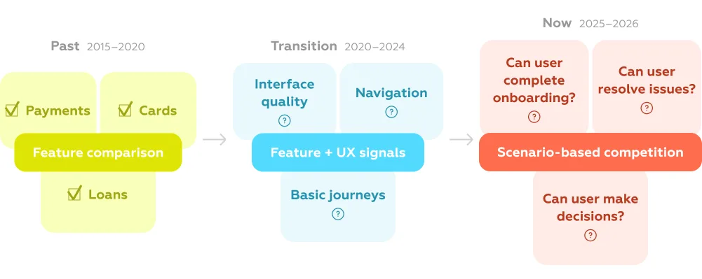
Instead, banks are moving toward experience benchmarking — comparing how effectively competitors enable users to complete key tasks: opening an account, resolving a failed payment, managing limits, or getting support in critical moments.
This shift has a direct impact on decision-making. Benchmarking is no longer a side activity for product teams — it is becoming a strategic instrument:
In this context, UX data stops being descriptive and becomes operational. The most advanced teams are already using benchmarking not as a report, but as a decision system — one that connects user experience directly to business outcomes.
And this is where the competitive landscape is being redefined.
If most banks already offer the same set of features, then comparing products by checklists becomes meaningless surprisingly fast.
A mobile app may support payments, onboarding, cards, support chat — just like every competitor. But this doesn’t answer the real question:
can a user actually complete their task smoothly, without friction, at every step?
This is where the competitive lens shifts from features to scenarios.
Feature parity has become the norm. In many markets, most core banking functionality is already standardized across leading players, shifting competition toward how effectively these features are delivered in real user scenarios (Deloitte, KPMG).
Instead of asking “Does the bank have this feature?”, leading teams are now asking:
These are not feature-level questions. They are scenario-level questions, and they expose a very different kind of competition.
This approach fundamentally changes how benchmarking works.
In scenario-based models, the product is decomposed into:
Each criterion reflects a concrete UX requirement — not opinion, but observable behavior. And importantly, these criteria are weighted based on how frequently and critically users encounter them.
This makes the evaluation system both granular and strategic at the same time.
A clear example is onboarding — one of the most standardized features across banks, yet one of the most inconsistent in execution. As shown in this analysis of onboarding UX in banking, even small gaps — unclear instructions, missing progress feedback, or poor error handling — can break the entire journey. The feature formally exists, but the user still fails to complete the task.

A similar pattern becomes visible in broader benchmarking studies, such as UX benchmarking services, where products are evaluated through a structured scenario model: user scenarios are broken down into tasks, then into hundreds of measurable criteria. These criteria are weighted based on how often and how critically users encounter them, and assessed using binary logic — whether the requirement is met or not. This approach removes subjectivity and allows banks to compare experiences at the level where real user success is determined.
The same pattern appears across markets:
products look similar on the surface, but behave very differently when users actually try to achieve their goals.
Scenario-based benchmarking captures this difference.
It allows teams to move from abstract comparisons to objective measurement of real user success — identifying not just who has what, but who delivers a better outcome.
And once competition is measured this way, it becomes much harder to ignore where you are truly behind.
Once competition shifts from features to execution, the differences between banks become much more subtle — but also much more impactful.
Across multiple studies, a consistent pattern emerges: leaders are not those who offer more functionality, but those who remove friction in the moments that matter most. These moments define whether a user completes a task, trusts the product, and continues using it.
Below are the key UX signals that increasingly determine competitive advantage — with real examples from market benchmarking.
In complex financial products, clarity becomes a feature in itself.
Users don’t just choose products — they evaluate conditions: pricing tiers, limits, commissions, eligibility rules. When this information is difficult to access or compare, decision-making slows down or stops entirely.
In benchmarking studies, one recurring issue is the gap between interface and product logic. Banks may promote “simple tariffs” or “clear conditions”, but in reality:
For example, in The State of Migrant Banking 2026, many banks formally support non-resident onboarding and international transfers — but fail to clearly communicate requirements, limits, or country coverage upfront. Users are forced to discover constraints mid-process, which directly impacts trust and completion rates.
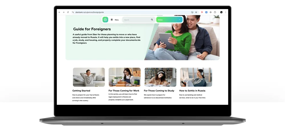
In contrast, best-in-class fintech solutions (highlighted in How we found ready-made fintech solutions) embed comparability into the interface itself — allowing users to quickly understand differences between products, evaluate options, and make decisions without leaving the flow.
As functionality grows, complexity becomes the main UX risk.
Many banks continue to expand their products by adding new features — but without restructuring the experience. This leads to overloaded interfaces and fragmented journeys.
Benchmarking shows that even when all necessary features are present, users still fail to complete tasks because:
In UX benchmarking services, this is visible at the criteria level: products lose points not for missing functionality, but for poor implementation details — unclear labels, extra steps, lack of guidance, or inconsistent logic.
A similar pattern appears in digital-only banking markets, such as in Digital-only bank KZ. Even among advanced digital players, the strongest products are not those with the most features, but those that simplify key scenarios — reducing steps, clarifying actions, and guiding users through the flow.
This creates a new competitive dynamic:
banks are no longer competing in “how much they offer”, but in how easy it is to use what they offer.
Another layer of differentiation is emerging around personalization — increasingly powered by AI.
But the shift is not just about recommending products. It’s about moving toward predictive UX, where the system actively supports user decisions.
In Top fintech trends for banks strategic advantage, one of the key trends is the development of interfaces that don’t just provide tools, but help interpret them:


This is especially visible in investment and financial planning scenarios, where users benefit from embedded explanations, forecasts, and contextual hints — effectively turning the interface into a decision-support system.
As a result, banks begin to compete not only in functionality, but in quality of guidance — how well they help users understand, choose, and act.
Even strong individual features don’t guarantee a strong product.
One of the most common findings across UX benchmarking studies is the gap between isolated excellence and end-to-end consistency.
A bank may have a well-designed onboarding flow or a strong payments interface — but still fail at the journey level. Users move across scenarios and channels, and this is where friction accumulates:
In The State of Migrant Banking 2026, this is particularly evident. Banks often support individual steps (e.g., identity verification, transfers), but fail to connect them into a seamless journey. Users encounter dead ends, unclear next steps, or repeated actions.

At the same time, benchmarking across markets shows that leaders design not just features, but continuous scenarios — where each step logically follows the previous one, and the user never has to “rebuild context”.
This is where real differentiation happens.
Not in isolated features, but in the ability to deliver a consistent, uninterrupted experience across the entire user journey.
Despite the shift in competition, many banks still rely on outdated approaches to understand their position in the market.
Most competitive analysis today is built around two familiar tools:
At first glance, this seems sufficient. But in practice, it creates a distorted picture of reality.
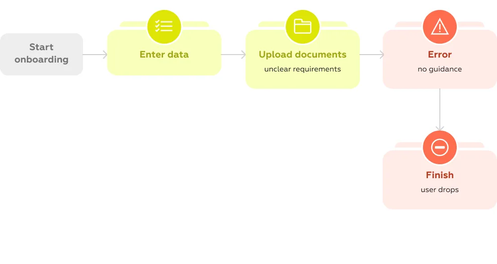
Feature comparisons only answer whether something exists — not whether it actually works for the user. Desk research shows interface layers, but misses what happens deeper in the journey: edge cases, errors, limitations, actual conditions of use.
This gap is well illustrated in studies like International Banking Benchmark 2025, where significant variation in UX quality and customer satisfaction persists across banks, even when their feature sets appear similar.
In other words, banks look equal on paper, but perform very differently in reality.
This leads to a critical blind spot:
traditional analysis fails to identify the actual UX gap.
Without scenario-level evaluation, teams cannot see:
As a result, decisions are often made on incomplete or misleading data. Investments go into adding new features instead of fixing broken journeys. Teams optimize what is visible — not what is critical.
At the same time, real user experience varies dramatically across the market.
Even within the same segment, banks show large differences in:
These differences directly affect business metrics — from conversion to retention — but remain invisible without deeper analysis.
This is the core limitation of traditional competitive analysis:
it operates at the surface level, while competition has already moved deeper — into the structure of user scenarios and the quality of their execution.
And until this gap in methodology is addressed, banks will continue to underestimate how far behind they actually are.
If traditional analysis stops at the surface, modern benchmarking goes much deeper — into the structure of real user behavior.
At its core, this approach treats user experience not as something abstract, but as a system that can be decomposed, measured, and compared.
It starts not with interfaces, but with user scenarios.
Instead of looking at features, the product is mapped through the situations users actually face: onboarding, making a payment, resolving a failed transaction, contacting support. Each scenario reflects a real intent — something the user is trying to achieve.
From there, each scenario is broken down into specific user tasks.
For example, onboarding is not a single action — it includes entering personal data, verifying identity, understanding requirements, handling errors, and completing the process. Every step becomes a separate unit of analysis.
The next layer is a system of criteria.
Each task is evaluated through detailed, observable criteria that define what “good UX” means in practice:
At scale, this results in hundreds of criteria — often 800–900+ per study — capturing details that are invisible in high-level reviews but critical for real user success.
Importantly, these criteria are not equal.
They are weighted based on frequency and criticality:
This allows teams to distinguish between minor imperfections and real blockers — and to prioritize accordingly.
Evaluation itself is typically binary: whether a criterion is met or not. This removes subjectivity and makes results comparable across products and markets.
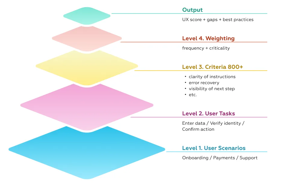
Finally, results are aggregated and compared across competitors.
At this stage, benchmarking becomes more than measurement. It reveals:
The outcome is not just a score, but a structured map of strengths, weaknesses, and opportunities.
This is what makes the approach valuable.
It transforms UX from a collection of insights into a decision-making system:
In practice, this is the difference between “knowing that something is wrong” and knowing exactly what to fix, in what order, and why it matters.
This methodology has been evolving in the market for over a decade. At Markswebb, this scenario-based benchmarking system has been applied since 2010 across banking, fintech, and digital ecosystems — turning complex user experience into a measurable, comparable, and actionable framework.
When benchmarking is done at the scenario level, the output changes dramatically.
Instead of abstract insights or generic recommendations, banks get a clear, structured understanding of their competitive position — and, more importantly, what to do about it.
At a practical level, this includes several layers of value.
First, benchmarking shows where the product stands relative to the market. Not in general terms, but across specific scenarios — onboarding, payments, support, daily operations. This makes it possible to see not only overall ranking, but also where exactly the product is strong or lagging.
Second, it reveals the true competitive landscape.
In many cases, the closest competitors are not the ones teams initially expect. Products with similar positioning may perform very differently in key scenarios, while unexpected players — often fintechs or digital-first banks — set the real UX standard.
Third, benchmarking uncovers concrete UX gaps.
Not at the level of “improve onboarding” or “simplify payments”, but at the level of specific steps and interactions:
And finally, it provides access to proven best practices — not theoretical ideas, but solutions already implemented by competitors and validated in real products.
These insights become especially tangible when looking at real market cases.
In The State of Migrant Banking 2026, benchmarking revealed a significant gap in specialized user scenarios. Many banks formally support key functions for non-residents — such as onboarding or international transfers — but fail in execution. Missing guidance, unclear requirements, and fragmented flows create friction exactly where users need the most support. As a result, the gap is not in functionality, but in the ability to complete the scenario.
In How we found ready-made fintech solutions, benchmarking across markets made it possible to identify transferable best practices. Solutions developed in one region — such as improved comparability of financial products or embedded decision support — can be adapted and implemented in another market, significantly accelerating product development without reinventing the wheel.
A similar effect is visible in Digital-only bank KZ, where digital-first players demonstrate how end-to-end experience design becomes a competitive advantage. These banks don’t just digitize existing processes — they rebuild them around user scenarios, reducing friction and increasing completion rates across key journeys.
Together, these cases highlight an important shift.
Benchmarking is no longer just about understanding competitors. It is about learning from the market in a structured way — identifying what already works, where gaps exist, and how to translate this into product decisions.
And this is what makes it a strategic tool, not just an analytical one.
At a certain level of maturity, benchmarking stops being an analytical exercise and becomes a strategic instrument.
The difference lies in how results are used.
If benchmarking is treated as a report, it answers the question: “Where are we today?”
If it is embedded into strategy, it answers a much more important one:
“What should we do next — and why?”
This shift is increasingly recognized across the industry. Firms like Deloitte and KPMG highlight benchmarking as a way to identify growth opportunities, prioritize transformation efforts, and guide long-term investment decisions — not just measure current performance.
In practice, this means translating UX insights into three key areas.
1. Product roadmap
Scenario-based benchmarking provides a structured backlog — not a list of ideas, but a prioritized set of actions tied to real user impact.
Teams can clearly see:
This turns roadmap planning from intuition-driven to evidence-based.
2. Investment decisions
Not all UX improvements are equal.
Benchmarking makes it possible to quantify the importance of each problem — based on frequency and criticality — and link it to business impact. This allows organizations to:
In this context, UX becomes part of financial decision-making, not just product design.
3. Positioning and competitive strategy
Understanding how the product performs across scenarios also informs market positioning.
Benchmarking reveals:
This enables a more deliberate strategy — choosing where to compete, and where to stand out.
To make this actionable, insights need to be structured.
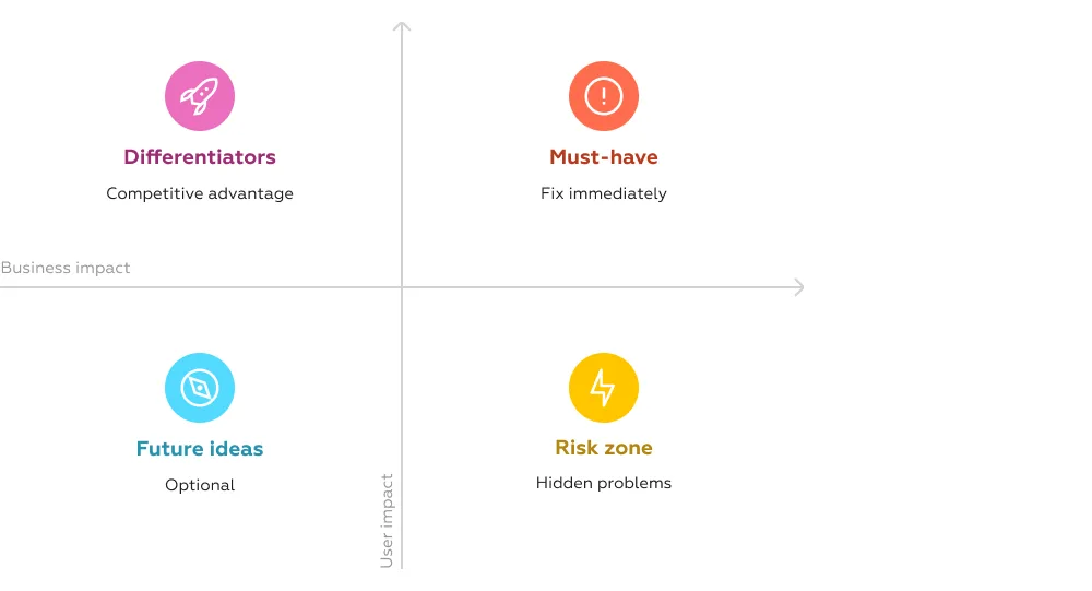
In advanced benchmarking approaches, all findings are typically grouped into three categories:
Crucially, these categories are not subjective. They are based on measurable impact and market context, allowing teams to prioritize with confidence.
This is how benchmarking turns into strategy.
At Markswebb, this logic is embedded into every benchmarking project: from identifying gaps to building a prioritized roadmap linked to business outcomes.
As a result, benchmarking doesn’t just explain the market — it becomes a tool to shape a product’s trajectory for the next 3+ years.
By 2026, the rules of competition in banking have fundamentally changed.
Products, features, and even pricing are no longer enough to stand out. What truly differentiates market leaders is how effectively they help users achieve their goals — across every scenario, every step, and every interaction.
This shifts the competitive battlefield to a deeper level.
Banks are no longer competing by what they offer, but by how well their products work in real life:
In this environment, intuition and surface-level analysis are no longer sufficient.
The winners are those who:
This is exactly why UX benchmarking is becoming a core strategic tool — not just for analysis, but for continuous product development and competitive positioning.
And as the market continues to evolve, the ability to turn user experience into measurable, actionable insight will define which banks lead — and which fall behind.
To explore how this approach works in practice, see UX benchmarking services — and how scenario-based evaluation can be applied to identify UX gaps, benchmark competitors, and build a data-driven product strategy.
We respond to all messages as soon as possible.
We’ve evolved dozens of successful financial services and are eager to prove that our expertise can be implemented in other industries and around the world. Have a look at our success stories!