
For many customers, the mobile web is not just a backup channel but an essential tool. It is the entry point when installing an app is inconvenient, when users switch devices, or when they simply want quick access without downloading software. Despite this importance, the mobile web channel often remains underdeveloped compared to mobile apps, leading to inconsistent user experiences and missed opportunities for banks.
Contents
Mobile Web Banking Rank 2025 is a comparative study of digital experience quality in the web versions of 11 largest banks in one Eastern European country. We included banks with the highest volumes of retail deposits and loans and the top-3 performers in the 2024 wave ranking.
Each web version is evaluated using two evaluation systems:
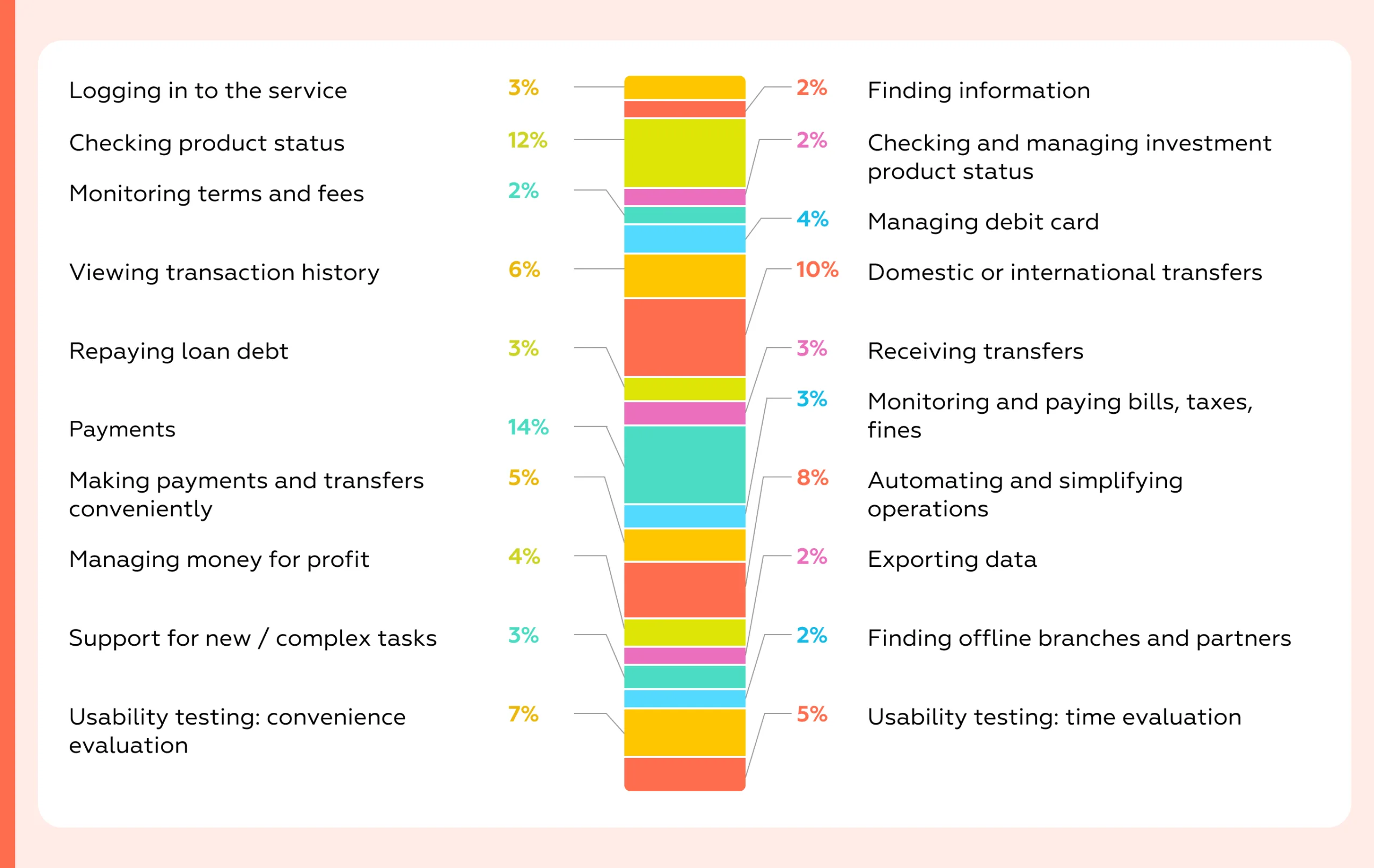
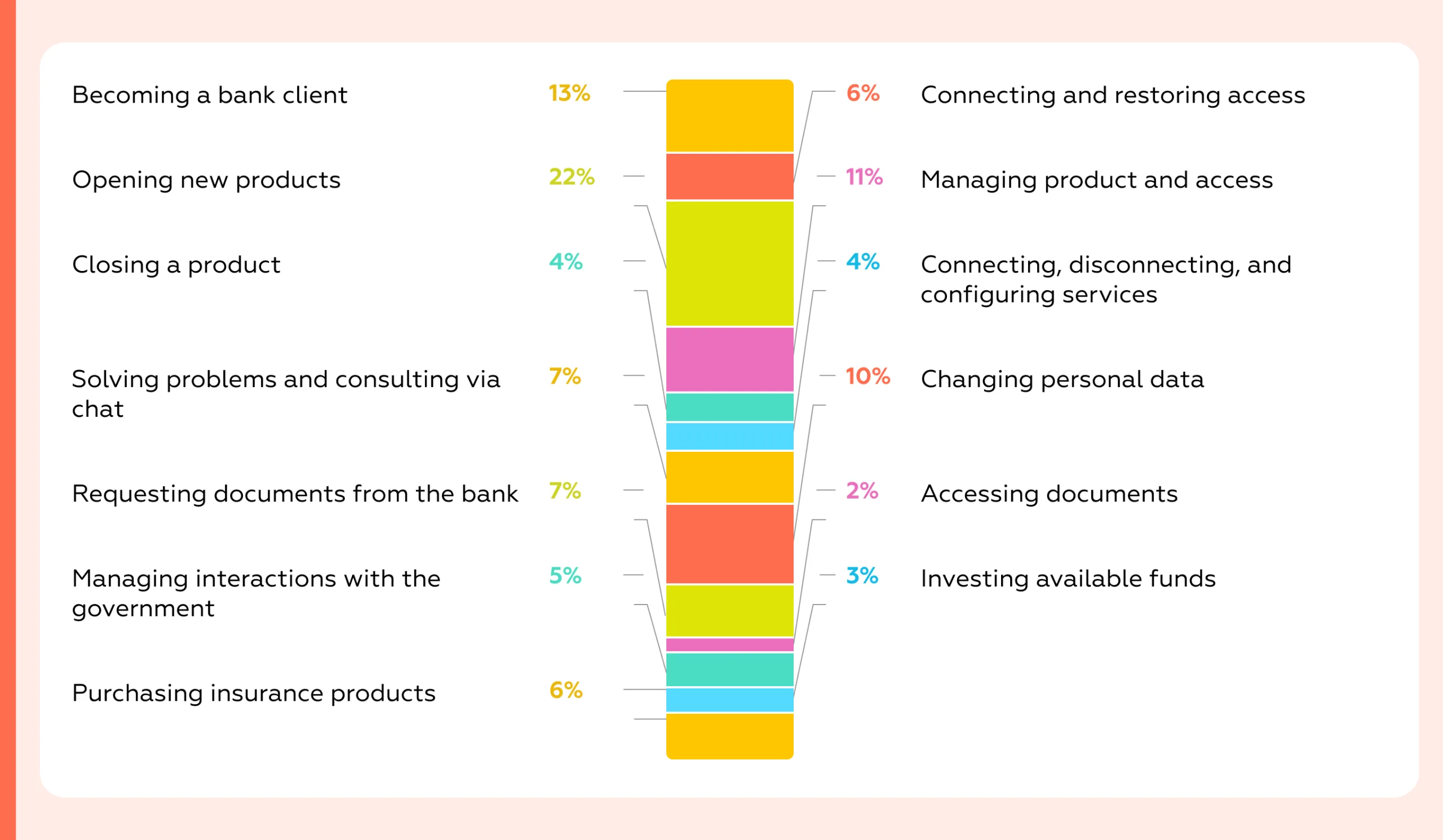
Both of them cover every customer scenario available in the browser version of internet banking on an iPhone; each scenario is broken down into specific tasks, whose characteristics are described by dozens of binary criteria — over 900 in total.
To capture the full picture of digital experience quality in the examined web versions, Markswebb researchers model all user scenarios themselves as part of a desk-based review and also run usability tests to incorporate real user experience into the scoring.
The research focuses on mass-market retail customers — people using banks’ mobile-web services to manage day-to-day finances. These users expect the same seamless experience they get in native apps; banks that fall short risk losing engagement to competitors.
The study does not assess product features of financial products, security, or technical issues/peculiarities of digital services.
Unlike general market reviews, Mobile Banking Rank 2025 delivers a formalized, systematic assessment of user experience using Markswebb’s proprietary evaluation framework. The study evaluates not only feature sets, but also how accessible, transparent, and usable those features are in real customer scenarios.
The research shows:
This page shares a portion of the study’s public results, while all insights and comparative analytics are available in the full report.
Use our benchmark-based evaluation system to reveal UX gaps, assess your app against market leaders, and identify opportunities to improve user satisfaction and conversion.
In this study, all mobile web banking versions are compared using Markswebb’s proprietary evaluation system. It is not based on user opinions; it’s built on a structured set of heuristics:
The system consists of hundreds of criteria that describe both what a customer can do in the digital service and how those capabilities are implemented — i.e., the functional properties and interface qualities that shape the customer experience. This creates a single frame of reference for objective comparison across services. It is resilient to subjectivity because all criteria are binary (met / not met).
For Mobile Web Banking Rank 2025, the evaluation system includes about 900 criteria:
In form, it’s a checklist used for a desk-based expert review: researchers model real customer scenarios and determine whether each criterion is satisfied. We do not involve customers in scoring the checklist, as that would reflect subjective, non-professional judgment. Instead, to capture user opinions and behavior, we run moderated UX tests with the target audience.
This year, we also added a series of expert interviews with CPOs of mobile web applications to understand how they navigate platform constraints, deepen our insight into team pain points, and track emerging trends.
The output is a detailed matrix with hundreds of parameters showing which tasks are fully supported and where functional or usability gaps remain. Because the dataset is extensive, we also perform substantial interpretation and analysis — these explanations form the core of the full research report.
Each web version receives scores calculated as the sum of met criteria multiplied by their weights. The final score reflects what capabilities the service provides and how easily and effectively customers can complete their tasks using them.
This approach transforms UX evaluation into a strategic management tool. Banks can not only see where their services lag but also understand why customers abandon key tasks and which specific improvements will deliver the greatest impact on engagement, loyalty, and revenue.
The strength of our approach lies in its ability to replace assumptions with evidence. Instead of relying on personal opinions, banks receive results grounded in a consistent and measurable framework, showing both immediate quick wins and long-term development priorities.
Using a standardized evaluation system turns a UX audit or benchmark into actionable work. We assess every step of the customer journey — onboarding, daily payments, deposits, and support — using the same criteria as Mobile Banking Rank 2025, so results are comparable across scenarios and over time. You get a clear map of where your service meets user expectations and where friction occurs, plus a prioritized list of fixes ranked by impact and effort. Each item links to concrete UI/UX examples from leading financial and e-commerce services to speed implementation.
For competitive analysis, the same system shows exactly how you rank against peers in each flow and which steps competitors complete more efficiently. This reveals specific growth opportunities: what to adopt, what to redesign, and where to create new value. Outputs include scorecards, a risk/opportunity heatmap, and a backlog-ready task list tied to product metrics (conversion, time-to-complete, retention, support load). In short, the system replaces opinions with comparable data and a clear plan that improves outcomes.
Because the system is standardized, results can be compared year-over-year, enabling banks to track progress in UX maturity and evaluate the effectiveness of their digital strategies.
The central finding is that mobile web apps increasingly trail native apps in everyday tasks, even though many pain points flagged in 2024 have been partially addressed. Re-login is smoother, search and in-app navigation are clearer, and investment statuses are more transparent. Yet the overall gap widened in 2025 in three areas that shape day-to-day value: discovering physical service points, onboarding, and money-management utilities.
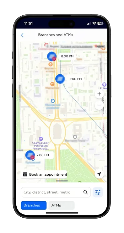
The most significant deficit is the branch/ATM locator, where web experiences are now more than 30 percentage points behind native — a Markswebb scoring gap calculated across the overlapping set of banks included in the latest waves of our web and native app studies — and worse year-over-year because several banks removed offline network maps from their web versions. In practical terms:
Usability tests explain why: vague section names with low visual prominence slow down discovery; map controls behave unpredictably compared with native interactions; and users take extra detours to complete the task. As a result, convenience metrics for the web are roughly 50% lower for this scenario, and the average completion time is 49 seconds longer.
The business implication is straightforward: even in mature digital markets, cash handling and branch visits persist. The best digital banks help customers succeed in those physical scenarios. When the web app underserves locator tasks, customers feel the friction immediately.
Onboarding is the second chronic gap. It matters on the web because it counteracts the perception that the browser channel is “reduced.” Feature onboarding — introducing new or unknown capabilities — is absent in 5 of 11 web apps and where present is roughly half as strong as in native. Three web apps provide no onboarding at all, and nine offer only limited onboarding for both new and existing customers. This directly affects adoption of helpful features and undermines the web channel’s credibility as a primary interface.
Reach out via WhatsApp, email, or the form below to learn more.
Money management for “gain”— automated savings and simple optimization — shows the third material deficit. Native covers about 90% of target scenarios versus 73% on the web. Spend-based round-ups or rules exist in only 4 of 11 web apps (7 of 11 native), and savings on incoming funds in just 2 of 11 (4 of 11 native). Combined with heavier foreign-exchange flows on the web — where not all institutions reach full parity — the channel delivers less day-to-day value for personal finance.
A telling detail: all native apps support a one-tap jump from rate view to exchange; only 8 of 11 web apps do. Displaying the live rate in the form before starting and auto-recalculating the counter-currency are also more consistent in native, which keeps the flow light and confidence high.
Some of these gaps reflect the browser’s constrained access to device features.
These constraints are not insurmountable. The leaders prompt add-to-home-screen consistently, broaden camera parsing to include card and phone numbers, and embed native-looking share actions directly in the interface.
There is encouraging movement in the “digital office” space. The gap between web and native in profile, settings, and contracts narrowed year-over-year — from roughly 11.8 to 9.4 points — as institutions invested in notifications management, personal-data updates, and investment operations.
However, push notifications remain the Achilles’ heel: web capabilities are still about three times weaker than native, and only one additional institution added web push in the last year. For customers who rely on native push, this means reverting to SMS or foregoing proactive alerts altogether, which degrades oversight and increases anxiety around money movement.
Contracts and documents show a similar pattern: 6 of 11 web apps do not expose loan agreements at all. Even where available, coverage is thinner than in native for deposits as well, sending more users to branches and increasing time-to-resolution and operational load.
Pre-login and first-time access are also weaker on the web. Overall coverage of key pre-login scenarios averages around 60% on the web versus 76% in native (according to Markswebb evaluation system), with the largest gap — over 20 percentage points — appearing in first-time login.
The net effect is more manual input, more errors, and less timely assistance precisely when newcomers need it most. The underlying causes are a mix of platform limitations and under-developed input-simplification patterns on the web, such as scanning, smart defaults, and inline guidance.
Closing the gap is feasible and commercially worthwhile. The playbook is clear: reinstate and modernize the branch/ATM locator with predictable map behavior, high-visibility entry points, one-tap routing, and nearby list views with distance and transit anchors; make FX flows as light as native by linking rates to exchange in one step, surfacing the live rate in-form, and auto-recalculating the counter-currency; implement structured onboarding for both new and existing customers with contextual nudges to dormant yet valuable features; bring parity to automated savings rules; and treat platform affordances as first-class product work by prompting add-to-home-screen, expanding camera parsing to common identifiers, and embedding a native-style share action. In digital office, prioritize web push where feasible and expose self-serve access to contracts with download and onward-share options.
The strategic takeaway is that native still leads on “feel” and flow speed — especially where device features matter most — but the web can recover much of the distance with focused investments in distribution, capture, sharing, onboarding, and personal-finance utilities. Executed well, the mobile web stops being a fallback and becomes a credible primary channel in its own right.
In this section, we’ve curated five examples to help your web app team—practical references for how key scenarios can be implemented in a user-friendly way. The full study includes 60+ best practices.
Users don’t need to open each location card: at the current zoom level they can see whether a branch/ATM is open and when it will be available. This sharply reduces steps and search time, helps quickly filter out unsuitable points, and increases confidence in the trip outcome. The map turns from a list of pins into a planning tool: without extra taps, users align geography, opening hours, and their own constraints.
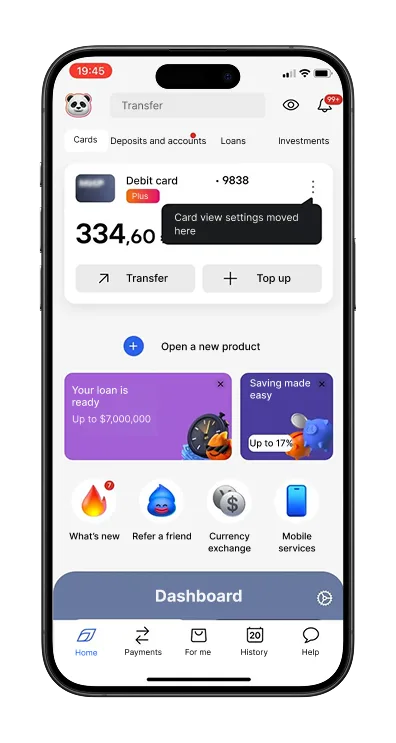
The “What’s New” section on the home screen contains stories about new features. Some stories include a direct jump to the relevant settings screen, which increases the likelihood that customers will try the new capability. This also saves time and lowers cognitive load: there’s no need to remember the navigation path — just follow the prompts and complete the action.
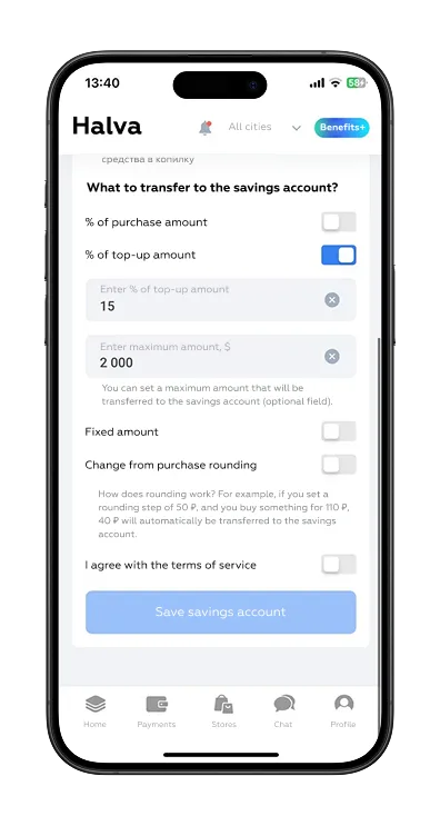
Uniquely among internet banks, auto-savings on incoming credits can be fine-tuned: choose a percentage of the credited amount, set a per-transfer cap, and define a target savings amount. Alongside the more common “from card spending” round-ups, this gives users a second, independent funding channel — for different goals and income rhythms — with better control over pace and faster progress toward targets.
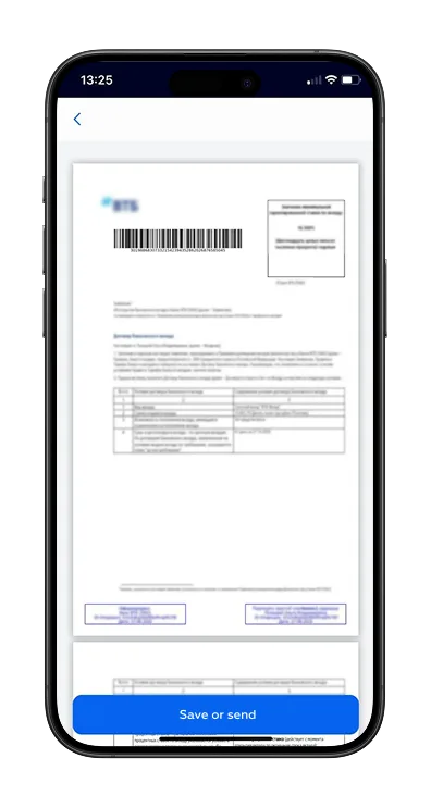
From the deposit screen, users can open the signed deposit placement agreement. It contains detailed terms and can be saved or shared via the iOS share sheet. A share button in the interface brings the experience closer to native apps. The path to the document, however, is less than optimal: users must scroll through a list of documents across different products.
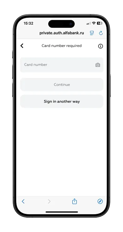
Signing in requires only a mobile phone number, a card number (which can be scanned with the camera for faster entry), and an SMS code. No additional credentials are needed. Card scanning helps avoid errors when entering the 16-digit number and saves time. Since users usually have both their phone and card on hand, entering the data is easy and the flow feels straightforward.
The Mobile Web Banking Rank 2025 shows that while the mobile web is gaining importance as a fully fledged digital channel, UX maturity remains uneven across the market. Some banks are successfully treating the mobile web as an equal to mobile apps, delivering seamless onboarding, transparent transactions, and reliable support. Others continue to see it as a secondary channel, which results in inconsistent design, hidden fees, or limited functionality.
Markswebb’s evaluation system provides the tools to:
Be the one who invests in UX, adopts best practices and ensures transparency. This approach will not only improve customer satisfaction but also unlock direct business benefits: higher conversion in payments, stronger retention through deposits, and lower churn thanks to trust-building support flows.
Contact us via WhatsApp, send an email, or fill out the form below to learn more.
We’ve evolved dozens of successful financial services and are eager to prove that our expertise can be implemented in other industries and around the world. Have a look at our success stories!
From research and analysis to strategy and design, we help our clients successfully reach their customers through digital services.


