
In digital finance, the distance between download and first transaction is often where most users disappear. Mobile banking and investment apps spend heavily on acquisition campaigns, yet many new customers never make it past the opening screens.
The reason is simple: onboarding, the process that should welcome users, often feels more like an obstacle course. Lengthy forms, rigid KYC checks, and unclear instructions dominate the experience. Instead of discovering value, users encounter friction, delays, and anxiety.
At Markswebb, our research consistently shows that onboarding is the weakest point in the customer journey. It is where trust is either built or broken. Apps that approach this stage purely as a compliance requirement experience high abandonment rates. Those that design onboarding as a user-centric journey, however, succeed in activating customers faster and keeping them engaged longer.
Contents
For most product teams, onboarding is still seen as a checklist: verify identity, collect documents, confirm account details. It’s treated as an unavoidable cost of operating in a regulated industry. But when designed this way, onboarding becomes a chore — something users must endure before they can access any meaningful features.
Our research shows that this mindset misses a critical opportunity. Onboarding is not only about compliance; it is the first real chance to shape how users feel about the product. A confusing form or an unexplained security step doesn’t just slow people down — it signals bureaucracy, indifference, and risk.
By contrast, when onboarding is reframed as an experience, it becomes the emotional foundation of the customer journey. A clear, supportive flow reassures users at the moment they are most uncertain. A quick demonstration of value motivates them to continue. A conversational tone humanizes the interaction and builds trust.
Finance apps that succeed in activation treat onboarding as the start of a relationship, not an administrative gate. They design flows that not only meet regulatory standards but also deliver clarity, confidence, and early wins.
In our evaluations of mobile banking and investment services, we see a consistent gap between apps that convert and those that lose users at the door. The difference is rarely about regulation — most apps face similar requirements. It’s about how those requirements are presented. High-performing apps share three UX patterns that transform onboarding from a hurdle into a guided path:
1. Progressive disclosure
The human brain handles complexity better when it’s broken into manageable pieces. Apps that split KYC into short, clearly labeled steps with a visible progress bar reduce the sense of effort. Each step feels achievable, and users stay motivated because they know exactly how much is left. Without this, long unstructured forms often lead to abandonment.
2. Contextual education
Many users don’t object to providing data — they object to not knowing why. Strong onboarding experiences explain each request in the moment: why a selfie is needed, why linking a card improves security, why income details unlock tailored offers. This just-in-time education reframes compliance as a benefit and reduces suspicion.
3. Early value demonstration
Onboarding flows that delay access until every box is ticked risk losing users before they ever experience value. Best-in-class apps provide a preview: a demo dashboard, a virtual card, or a simulated balance. Even if features are limited, this early payoff builds momentum. Users feel rewarded for their effort and are more motivated to complete the process.
These patterns don’t eliminate regulatory requirements. They translate them into user-friendly journeys, balancing legal necessity with emotional reassurance. That balance is what determines whether a new user becomes an active customer.
Real-world cases show how these UX patterns are applied in practice. Leading apps don’t reinvent regulation — they redesign the way users experience it.
1. Revolut – Step-by-step KYC flow (Progressive disclosure)
Why it matters: Identity verification is one of the biggest drop-off points. Without structure, it feels endless.
Best practice: Revolut divides KYC into micro-steps with a progress bar. Each screen focuses on a single task, and users always know how many steps remain. This transforms a regulatory process into a transparent journey that feels achievable.

2. Chime – Transparent onboarding messaging (Contextual education)
Why it matters: Sensitive data requests often trigger hesitation. Without context, users question trustworthiness.
Best practice: Chime attaches simple explanations to each request — for example, “We ask this to protect your account.” By turning compliance into a customer benefit, Chime reduces friction and reassures users at the riskiest moment.

3. Bank Investments – “Easy Start” demo mode (Early value demonstration)
Why it matters: Users who see value early are more likely to finish setup and transact.
Best practice: One European Bank offers a demo dashboard with simulated balances and basic investment features before verification is complete. This early exposure builds motivation and gives users a sense of ownership.
4. Monzo – Clear language and microcopy (Reducing cognitive load)
Why it matters: Legalistic or technical copy increases confusion and abandonment.
Best practice: Monzo uses conversational, human language in onboarding: “We’ll need a quick selfie to keep your account secure.” The tone reduces anxiety and makes requirements feel natural.

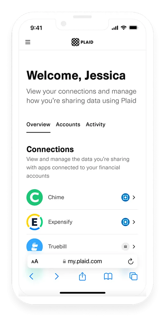
5. Plaid integrations – Instant account linking (Early convenience)
Why it matters: Delays in connecting accounts undermine momentum at the most fragile point of onboarding.
Best practice: Apps that integrate Plaid enable users to link external accounts in seconds. The language emphasizes control (“securely connect your account”), reinforcing trust while delivering speed.
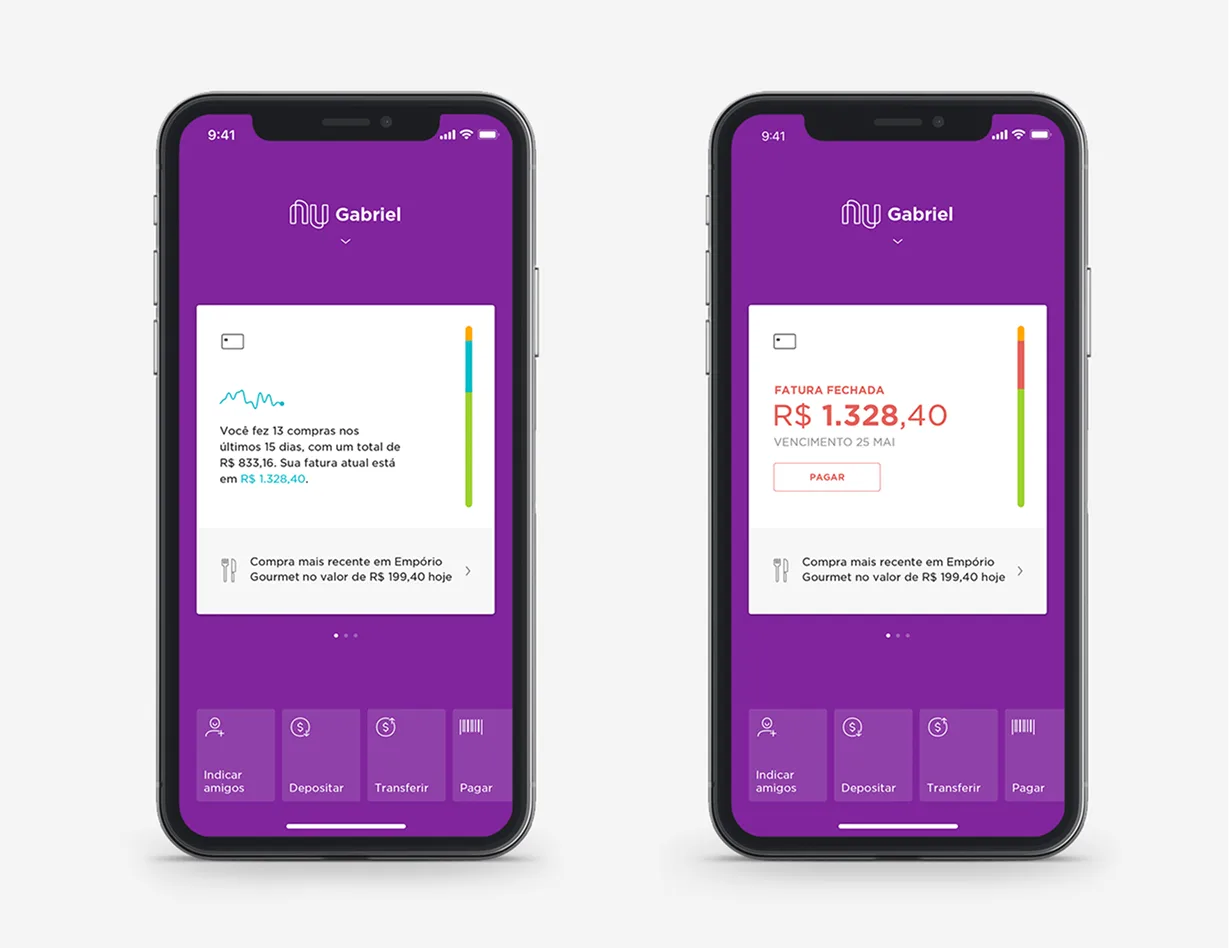
6. Nubank (Brazil) – Personalized onboarding paths (Tailored experience)
Why it matters: A one-size-fits-all flow creates unnecessary steps for many users.
Best practice: Nubank adapts onboarding based on the customer’s goal (credit vs. savings). This personalization reduces irrelevant steps and makes the first experience feel tailored and efficient.
These examples prove that compliance-driven flows don’t have to feel bureaucratic. With the right UX, they can become clear, engaging, and even motivating.
Onboarding may look like a set of technical steps, but in practice it is one of the most critical drivers of business performance. The way these first screens are designed directly affects conversion, retention, and the overall profitability of digital banking and investment services.
In short: onboarding is not just a regulatory necessity — it is a profit lever. Done right, it strengthens both the customer relationship and the business model.
Transforming onboarding into a high-conversion, trust-building experience requires deliberate design choices. Based on our research and best practices, we recommend the following steps:
By combining these practices, product teams can move beyond compliance and create onboarding journeys that deliver both business impact and user confidence.
Onboarding in finance is moving from being a static, one-time hurdle to becoming a dynamic, adaptive experience. As competition intensifies, banks and fintechs are realizing that the first few minutes with a customer can define the entire relationship. This is pushing the industry toward new design approaches that combine personalization, automation, and emotional reassurance.
We already see the shift in three directions:
The apps that succeed will be those that treat onboarding as a strategic differentiator. Instead of minimizing the importance of the first experience, they will design it as the moment where loyalty, confidence, and engagement begin.
Onboarding in finance apps is more than a regulatory gateway — it is the first defining moment of the customer relationship. Done poorly, it creates friction, distrust, and abandonment. Done well, it builds confidence, demonstrates value, and motivates users to engage.
Our research at Markswebb shows that the difference comes down to design choices. Apps that apply progressive disclosure, contextual education, and early value demonstration consistently achieve higher conversion rates and stronger customer trust. Real-world examples from Revolut, Chime, Tinkoff, Monzo, Plaid, and Nubank illustrate how these patterns can be implemented effectively, turning compliance-driven flows into user-centered experiences.
The business case is clear: better onboarding means lower drop-off, faster time to first transaction, reduced support costs, and improved lifetime value. The emotional case is just as strong: users feel guided, reassured, and in control from the very first interaction.
For product teams, the challenge is not whether to invest in onboarding, but how to reimagine it. The future belongs to services that see onboarding not as a chore, but as a strategic lever — a moment to earn trust, showcase value, and set the tone for long-term engagement.
We respond to all messages as soon as possible.
We’ve evolved dozens of successful financial services and are eager to prove that our expertise can be implemented in other industries and around the world. Have a look at our success stories!