
Contents
Banks spend billions every year on digital transformation. Mobile banking apps have become the centerpiece of this investment — the primary place where customers check balances, transfer money, manage cards, and interact with financial services.
Yet despite this massive spending, 55% of banks in Eastern Europe still fail to deliver basic user scenarios, according to internal data from the Markswebb evaluation framework.
To assess the situation, we mapped 31 groups of core banking scenarios and evaluated 22 banks using a scoring system from 0 to 100%, reflecting the real user experience. The score was calculated based on binary criteria – whether the necessary functionality for completing a scenario is available or not.
We defined 75% scenario coverage as the threshold for a solid user experience.
As a result, 12 out of 22 banks scored below 75%, meaning that more than half of the analyzed mobile banking apps have significant gaps in fundamental user journeys. At the same time, only one bank achieved a score above 90% for basic scenarios.
The most problematic scenarios identified in the research are presented in the table below*.
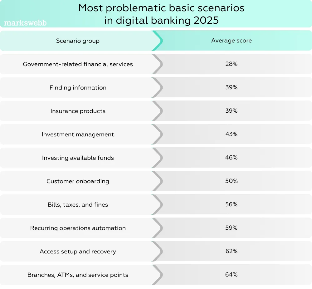
*According to Markswebb's Mobile Banking Rank 2025
Simple actions — such as understanding whether a payment went through, finding how to cancel a recurring charge, or locating where to manage a card — often require navigating multiple menus or interpreting unclear system feedback. In financial interfaces, these small usability failures quickly turn into a much bigger problem: loss of trust. When users cannot confidently complete critical actions, they start doubting the reliability of the system itself.
Research across digital banking products shows that these issues are not rare edge cases but recurring patterns. Banking apps frequently suffer from confusing navigation, overloaded dashboards, hidden settings, and unnecessarily complex transaction flows.
These design decisions make everyday financial tasks harder than they should be — leading to frustration, errors, and abandoned actions. Similar UX challenges appear in digital wallet ecosystems, where payment flows often become overloaded with features and options. We explored this problem in our analysis of smart wallets UX.
To better understand this pattern, we analyzed UX issues across well-known banking apps and documented recurring problems behind them. The result is a structured database of real product cases — the UX Problems Guide.
In this article, we explore several of the most common UX failures found in popular banking apps, explain why they happen, and show how these small design issues quietly cost banks user trust, engagement, and ultimately revenue.
Before discussing systemic UX failures in banking, it helps to look at specific user journeys where these problems actually appear.
Many usability issues in financial apps become visible not on the homepage or dashboard, but inside critical task flows — moments when users need to complete an important financial action quickly and confidently. Sending money, managing cards, or verifying identity are all high-stakes interactions where even small interface gaps can create hesitation or break the flow entirely.
Across banking apps, these problems rarely appear as isolated mistakes. Instead, they emerge as recurring UX patterns tied to particular use cases. The same friction points repeat across different products, suggesting that many banks are making similar design decisions — and repeating the same usability pitfalls.
Below we examine several real scenarios where these failures become most visible.
Example bank: Multiple banking apps show this pattern in international transfer flows. A good reference implementation can be seen in First Abu Dhabi Bank (FAB).
A user needs to make an international transfer.
During the process, the interface asks them to choose how the transfer fee will be paid. The options typically include:
At first glance, the choice looks simple. But in many banking interfaces, the actual cost of each option is not displayed.

This forces the user to make a financial decision without understanding the financial consequences. Will the sender pay €5 or €35? Will intermediary banks deduct additional charges? Will the recipient receive less money than expected?
Without this information, the user must either:
Both outcomes introduce unnecessary friction into what should be a straightforward transaction.
This design pattern is widely criticized in fintech UX research because cost visibility is essential for financial decision-making. When fees are hidden or unclear, users hesitate, double-check information outside the app, or cancel the action entirely. Research on financial interface usability consistently shows that unclear pricing structures reduce trust and increase task abandonment in payment flows.
A stronger implementation can be seen in the international transfer flow of Abu Dhabi Commercial Bank.
In the ADCB interface, users are still given the same options for handling transfer fees — paying the fee themselves or sharing it with the beneficiary. However, the interface adds clear contextual explanations for each option.
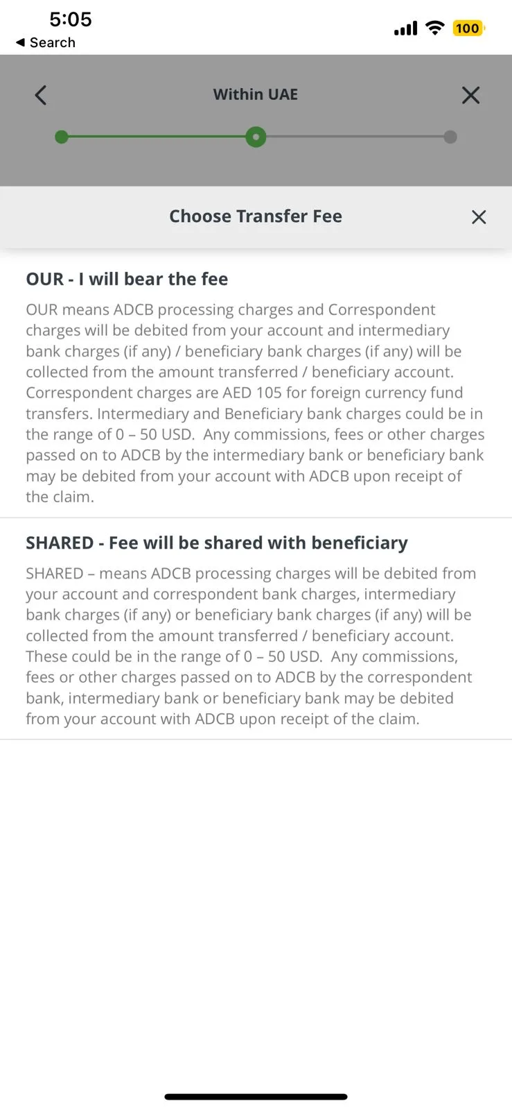
For example, the screen includes:
This approach changes the interaction from a guess into an informed financial decision.
Instead of forcing users to search for information or accept uncertainty, the interface provides transparency at the exact moment when the decision must be made.
Transparency in pricing and fees is a major factor influencing trust and completion rates in digital financial products.
At the same time, transparency strongly influences adoption: 78% of fintech users say clear pricing and transparency are critical factors for trust in financial products.
For international transfers — where intermediary bank fees and FX costs already create uncertainty — hiding costs at the decision moment significantly increases hesitation and task abandonment.
This makes fee visibility at the exact moment of choice one of the most important UX principles in international transfer interfaces. You can learn more about this issue from our UX Problems Guide video series.
Example bank: This issue can be observed in the international transfer flow of Mashreq Bank.
Consider a user who regularly sends international transfers and is highly sensitive to transaction fees. Before committing to the payment, they want to clearly understand the exact cost of the transfer.
In the transfer interface of Mashreq Bank, the user fills in all required fields — recipient details, transfer amount, and payment information — and proceeds through the flow.
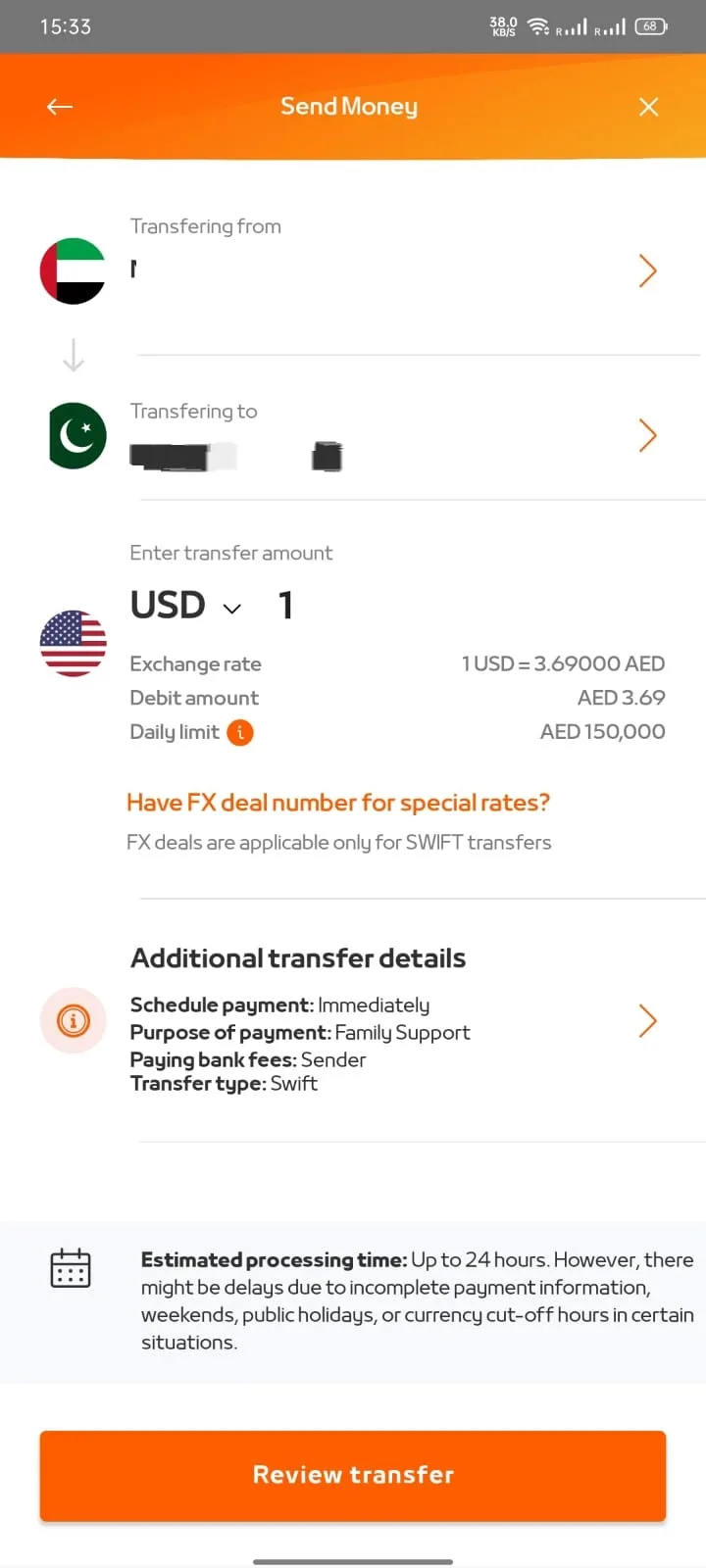
However, the actual commission is not shown during the form-filling stage.
Instead, the fee becomes visible only on the final confirmation screen, after the user has already submitted the transfer request for processing.
This creates a problematic interaction pattern. Users must move through the entire transfer process without knowing the real cost of the transaction.
At this point, they face two undesirable outcomes:
Both outcomes increase friction in the user journey and introduce anxiety around financial decisions. For users who frequently transfer money internationally, the lack of early fee visibility can quickly undermine trust in the platform.
This problem reflects a broader UX challenge in financial interfaces: critical financial information is often disclosed too late in the interaction flow, when the user has already invested effort in completing the task.
Research on fintech usability highlights that late disclosure of costs significantly increases user hesitation and abandonment in payment flows, particularly when dealing with international transfers where fees can vary widely.
A stronger implementation can be seen in the international transfer flow of Al Hilal Bank.
In this interface, transaction costs are displayed immediately after the user enters the transfer amount, well before the final confirmation step.

This seemingly small design change has a significant impact on usability. By revealing the fee early in the process, the interface allows users to:
Instead of discovering fees at the last moment, users gain proactive transparency, which supports confident financial decision-making.
Transparency in pricing strongly affects whether users complete financial transactions.
When cost information appears only on the final confirmation screen, users have already invested effort into the flow. Discovering the fee at that moment often triggers last-second cancellations, repeated attempts, or complete abandonment of the transaction.
For international transfers — where fees can vary between sending banks, correspondent banks, and FX conversions — early fee visibility becomes a critical usability factor.
We discuss similar patterns of late cost disclosure and payment flow friction in the UX Problems Guide video series.
International transfers remain one of the most complicated flows in many banking apps. Our analysis of expats transfers shows how poorly designed transfer flows can significantly increase friction for users sending money abroad.
Example product: A similar issue can occur in the transfer acceptance flow of PayPal.
A user opens the PayPal app and notices that they have received a new incoming transfer.
The next step is simple: accept the transfer and choose the option “Keep it in PayPal.”
However, after pressing the button, the interface becomes stuck on a loading indicator. The screen remains frozen for several minutes with no feedback or status update.
Annotated screencast:
From the user’s perspective, several questions immediately arise:
With no feedback or progress information, the user is forced to navigate back to the previous screen and attempt the process again.
Even though the core functionality technically exists, the experience breaks down at a critical moment. Instead of a quick confirmation, the user encounters uncertainty, wasted time, and frustration.
In financial products, these failures are particularly damaging because they occur at the exact moment when users expect reliability and clarity. When the interface freezes during a transaction, users begin to question whether their money is safe or whether the action has been executed correctly.
Research on payment UX shows that unclear system feedback and loading states are a major source of trust erosion in financial apps, especially during transaction confirmation flows.
A stronger implementation can be seen in the transfer flow of Venmo.
When a user receives a transfer request in Venmo, it appears as a clear banner notification within the app.
Original screencast:
The user can accept the transfer with a single action, and the system immediately confirms the result of the transaction.
The interface then provides a reliable confirmation message, clearly indicating that the transfer has been successfully accepted.
This approach ensures that the user always understands:
System responsiveness is critical in financial transactions. Usability research shows that users expect immediate feedback during important actions:
In digital banking, delays are even more damaging because users become unsure about the state of their money.
Research also shows that 67% of users consider speed and reliability key factors in digital banking experience, while 40% report frustration when financial apps freeze or respond slowly during transactions.
This makes clear system feedback and fast confirmation states essential for payment UX.
We explore similar UX problems related to broken transaction states and unclear system feedback in the UX Problems Guide video series.
The examples above show only a small fraction of the usability issues that exist in digital banking interfaces.
In reality, large financial institutions accumulate years of UX technical debt. New features are added on top of legacy interaction patterns, product teams work in silos, and critical user journeys slowly become overloaded with friction.
We see this pattern regularly when banks come to Markswebb for digital audits. Teams often ask us to help prioritize their product backlog, because usability issues have grown into hundreds of small and large problems scattered across the product.
Some of them are surprisingly simple:
Others are deeper structural issues tied to navigation, user journey design, or system architecture.
But the important insight is this: even the biggest players in digital banking make the same UX mistakes.
These problems appear across markets and institutions because many product teams rely on similar design patterns — without fully understanding how those patterns affect digital banking UX, mobile banking usability, and customer experience in banking.
The good news is that you don’t have to repeat these mistakes.
At Markswebb, we analyzed hundreds of real interface cases across banking, fintech, and digital services and compiled them into a structured resource — the UX Problems Guide.
The guide documents recurring usability issues in finance, including:
If product teams used a simple tool like this earlier in the design process, many of these problems could be prevented — saving development effort, reducing customer frustration, and improving key metrics such as task completion, user retention, and trust in financial products.
Another critical benefit is backlog prioritization.
Some UX issues are quick wins — small interface fixes that immediately improve usability. Others require deeper research, such as user journey mapping in banking or redesigning complex interaction flows. A structured understanding of UX problems helps teams decide what should be fixed immediately and what requires strategic redesign.
If you work on digital banking UX, fintech products, or financial platforms, you can explore the full dataset and examples in our guide.
It contains real cases of UX issues in finance, practical design solutions, and patterns that repeatedly appear in banking apps around the world.
Download the guide:
or
Explore the dataset of UX problems in digital products.
We respond to all messages as soon as possible.
We’ve evolved dozens of successful financial services and are eager to prove that our expertise can be implemented in other industries and around the world. Have a look at our success stories!