As the customer base grows, attracting, engaging, and retaining users becomes increasingly complex. Brands turn to loyalty programs to drive purchases and encourage ongoing activity. We studied the loyalty programs of two global leaders — Starbucks and Sephora — and in this article we share the best practices that not only improve customer experience but also deliver measurable business impact. Our analysis covers both the structure of these loyalty programs — their mechanics and benefits — and the mobile apps that serve as the primary interface for managing them.
We selected Starbucks and Sephora as examples of brands with extensive geographic reach and strong global communities of loyal customers. While the first point of contact with a loyalty program often happens offline, in-store, our focus is on the digital channel — the mobile app. For both companies, the app plays a critical role in online ordering and in managing the loyalty program, making it the key touchpoint in the customer journey.
Contents
However, the success of a loyalty program is not defined solely by its mechanics or by the UX of its mobile app. Both factors play a critical role, complementing each other in different ways:
We begin with an overview of the programs themselves — what makes them stand out, the privileges they offer, and how customers can access them. For this analysis, we focus on the conditions in the United States.
In addition to points, both programs offer birthday rewards and a set of extra privileges:
Each brand has its own mobile app that serves as the main interface for managing the loyalty program. The program is placed in a dedicated section of the app, while key information and access to its features are also integrated across related customer journeys.
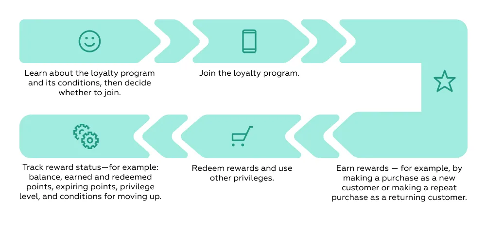
Steps:
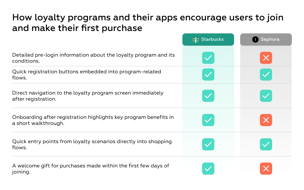
For a brand, this stage is critical: it is the moment when casual shoppers or new app users can be converted into program participants. The higher the conversion into registration, the larger the base of loyal customers that can later be engaged through personalized offers and retention mechanics. That is why it is essential to present the benefits of the program clearly and in one place — so the user immediately understands its value, becomes interested, and is motivated to join.
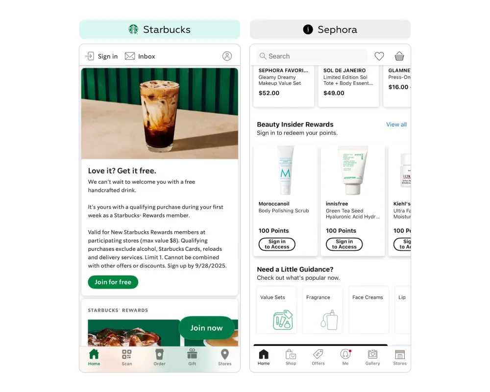
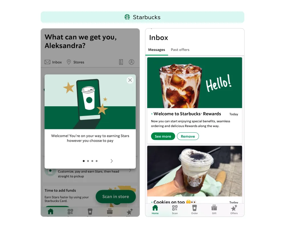
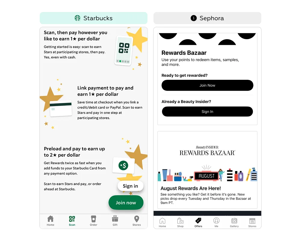
In the pre-login zone, both services introduce users to their loyalty programs and highlight key conditions — what privileges exist, and how they can be earned and spent. However, their approaches differ.
The absence of centralized information makes the decision process more difficult: users are not shown the full range of benefits, and the motivation to register may never form. At the same time, every loyalty-related block includes a quick entry point to registration — useful if the user has already decided to join or wants to learn more details.
For a first-time user, it is essential to quickly grasp the value of the loyalty program and register without unnecessary effort. If registration is available only in a single place, conversion rates drop: interest exists, but the step toward joining is never taken. The solution is to embed multiple entry points across different scenarios.
Starbucks:
Sephora:
This approach communicates the program’s value in the context of a specific offer, while keeping the registration button always within reach. It lowers the entry barrier, makes joining feel like a natural part of the customer journey, and increases conversion into active members.
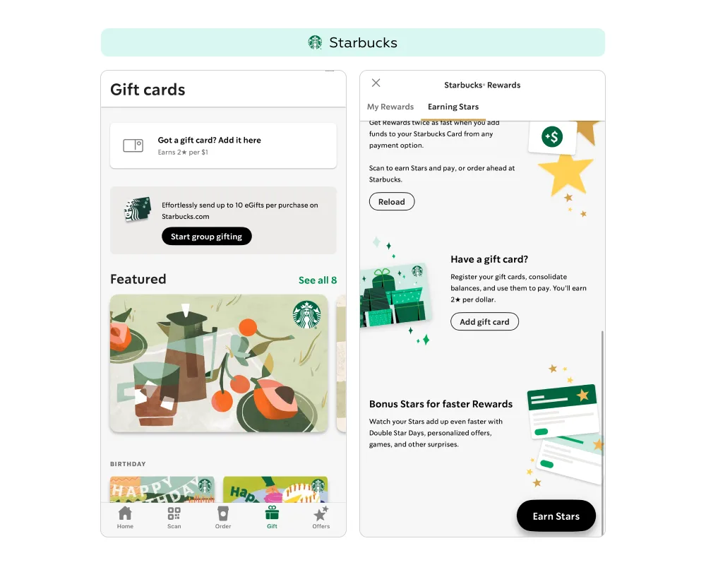
Referral mechanics with bonuses for both sides can help attract new customers, but they do not remove the main barrier — the difficulty of making the first contact with the brand and understanding the program’s value. Starbucks and Sephora do not offer referral programs. However, both provide gift cards; Starbucks goes further by linking them with its loyalty program, offering additional privileges to gift card holders.
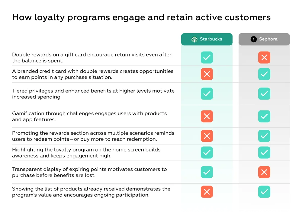
At Starbucks, new customer engagement is stimulated through the gift card mechanism. When recipients use the card to pay for purchases, they earn double stars on all spending made with it.
This approach allows new customers to accumulate points faster and feel an extra motivation for repeat purchases, strengthening engagement with the loyalty program. Double rewards from the gift card lower the barrier to first contact with the brand and create a positive initial experience, which in the long run can foster stronger loyalty. Once the card balance is spent, the customer already has a portion of accumulated stars — enough to redeem a first reward or keep collecting toward a more valuable one. This encourages them to return and gradually transition into a regular customer, while for the business it provides a natural way to grow the base of active members.
Steps:
After registering in the Sephora and Starbucks apps, all users are automatically enrolled in the loyalty program and gain access to available privileges.
At this stage, the service’s main task is to make the process as simple as possible so more users complete registration and become program members. Both Sephora and Starbucks manage this well: only a name, surname, and email are required.
Registration also gives the brand an opportunity to collect data for personalization, such as a birthdate for birthday rewards. Sephora integrates this field directly into the registration form, with a short explanation of why it is needed. Starbucks, however, only allows users to add their birthdate later in the profile, without highlighting the benefit — reducing the likelihood that customers will enter it and claim their gift.
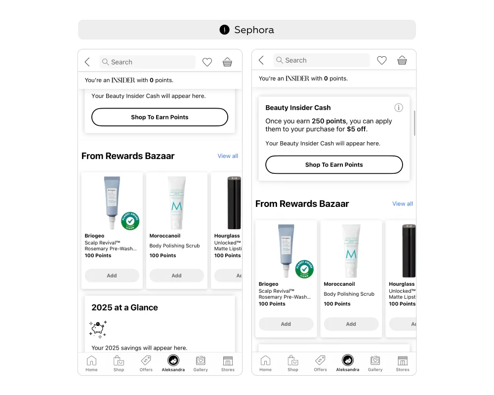
After completing registration, users are directed to the loyalty program section, where they see their point balance and gain access to conditions and privileges. This is the moment when the service can demonstrate the value of participation and motivate customers to make their first purchase.
At the entry stage of a loyalty program, the main risk is losing motivation due to uncertainty. If users do not understand how the program works, how many points they have, or which actions lead to rewards, they quickly lose interest. To prevent this, the interface should immediately display key information: status, balance, progress, and upcoming benefits.
This approach reduces uncertainty, helps users quickly orient themselves, and turns registration into the first step toward engagement: status + progress + motivation (challenges, rewards) → regular program usage.
A short onboarding flow helps retain the interest of new members, explains the core features of the program, and conveys its value immediately after registration. This increases the likelihood of a first purchase and encourages regular interaction with the brand. Sephora does not provide onboarding.
At Starbucks, a welcome pop-up appears after registration with a series of slides explaining how to earn stars, how to redeem them, how to accelerate accumulation, and what privileges are available to members. The onboarding can be closed at any time and revisited later through the How it Works button in Rewards → Earning Stars.
Additionally, the notifications section on the home screen includes a detailed message outlining program conditions, with an Order Now button that allows users to place their first order and start earning stars right away.
This “multi-layered” onboarding combines a quick overview with in-depth instructions, adapting to different user scenarios: those who prefer to learn by doing and those who want to study all the details in advance. The pop-up right after registration creates the feeling of a first step toward rewards, while the detailed guide in notifications reinforces confidence that users understand the rules and can consciously begin using the program.
Steps:
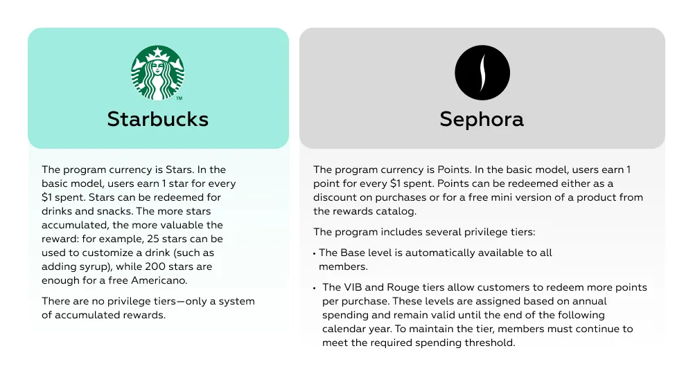
Both programs award 1 point for every dollar spent. However, if loyalty programs rely only on this basic rule, their appeal gradually diminishes: users get used to the mechanic, stop perceiving it as valuable, and purchase frequency declines. To maintain interest, brands enhance the standard system with additional products, services, and mechanics that allow customers to earn more points.
In the Starbucks app, users have access to a digital branded card. By topping it up with their personal card and paying for orders through it, customers earn double stars.
Sephora complements the base mechanic with a broader set of options:
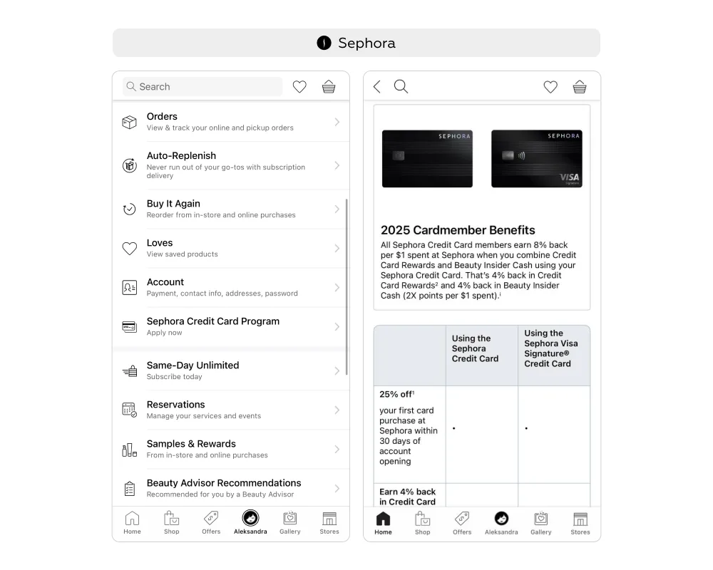
Sephora program members can apply for the Sephora Credit Card, which expands the benefits of participation: it earns 2 points for every dollar spent instead of the standard one and provides exclusive discounts, such as 25% off the first purchase.
Access to the card section is integrated directly into the member profile and highlighted on the home screen as a banner. The interface emphasizes that Credit Card Rewards stack with the base program: points earned with the card are credited to the same account and can be redeemed in the Rewards Bazaar or applied through Beauty Insider Cash.
The card becomes a powerful driver of engagement:
For the brand, this translates into not only higher purchase activity but also stronger long-term relationships with customers.
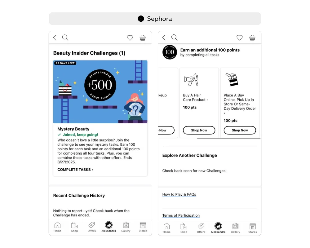
In the Sephora app, the loyalty program is enhanced with a challenges mechanic — sets of tasks that award users with bonus points upon completion. Tasks can be tied to purchases (e.g., buying a haircare product) or to in-app activity (e.g., adding an item to the wishlist).
Challenges are available in the Offers tab and in the profile under Beauty Insider Challenges. Each challenge page displays the conditions, a deadline with a countdown, and a task list with the corresponding rewards. To participate, users tap Join Challenge, which unlocks the full list of tasks and triggers a confirmation pop-up.
Key features of the mechanic:
Active and completed challenges are stored in the profile history, reinforcing a sense of progress and control.
This form of gamification turns the loyalty program into a game: users receive instant rewards for actions, track visible results, and strive to complete all tasks for the final bonus. Time-limited missions add excitement, while the progress system makes engagement purposeful and consistent.
Steps:
In both services, points can be exchanged for free products. From a service perspective, this is the moment when the program becomes “alive”: once customers redeem points and receive a tangible reward, the value of participation becomes clear. This encourages them to keep collecting points for the next reward and increases the likelihood of repeat purchases.
One of the key challenges of loyalty programs is that users often do not understand what their accumulated points can actually be spent on or what their real value is. If checking the “points price” requires navigating into separate sections or taking extra steps, the value of rewards becomes abstract. As a result, motivation to redeem decreases, and the conversion of points into purchases drops.
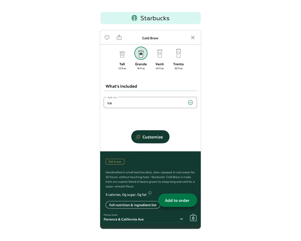
At Starbucks, stars can be redeemed for drink upgrades (e.g., adding syrup for 25 stars), full drinks or snacks (e.g., a sandwich for 300 stars), and branded merchandise (e.g., a cup for 400 stars). Each product available for redemption displays its loyalty price alongside the standard price directly in the product card. This solution:
To use stars, it is enough to add the item to the cart and choose to pay with stars, or simply tell the barista when ordering in-store.
This simple and visual approach turns points into a tangible tool for purchase activity and reduces the risk of them “sitting idle” without being redeemed.
If bonuses can only be used in a single format — for example, redeemed for fixed products or applied solely as discounts — the value of the program decreases over time. Points begin to feel like a limited resource, and the motivation to accumulate them gradually weakens.
Sephora Beauty Insider addresses this by offering two redemption options:
This approach transforms points from abstract numbers into a practical tool. Customers can decide whether to spend their balance on exclusive products or gain direct financial value. The flexibility boosts engagement, creates a sense of control, and makes participation in the program feel truly meaningful.
Loyalty program members may forget about the rewards section or struggle to locate it. As a result, points accumulate but remain unused, reducing engagement and weakening the program’s business value. To overcome this barrier, it is important to integrate access to rewards into multiple key interface points, keeping the section “within reach” across different scenarios.
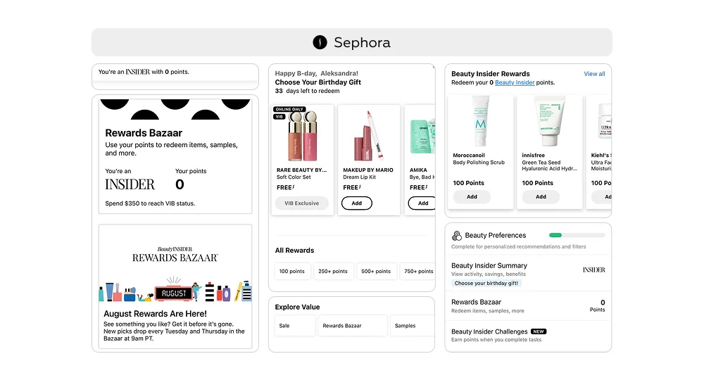
In the Sephora app, navigation to the Rewards Bazaar is embedded into three main tabs: the home screen, Offers, and Me.
Repeating navigation elements act as subtle prompts, gently reminding users of available opportunities without creating pressure or the sense of intrusive advertising.
This approach also reduces cognitive load—users naturally expect rewards to be connected with offers, their personal profile, and the home screen, so they can easily find the section without extra effort.
When exploring the terms of a loyalty program, it is not enough to simply explain the benefits — users should immediately be given tools to act on them. If information and actions are separated, motivation weakens: people understand the value but postpone the step toward realizing it.
At Starbucks, this is solved through the integration of information and action. On the Details → Earning Stars screen, the app explains how to earn rewards and places actionable buttons right alongside: Link payment, Reload, and Add gift card. Users don’t waste time searching — they can instantly link a card, top up their balance, and start earning more stars.
At Sephora, the Beauty Insider section, where customers learn about program terms, includes a Shop To Earn Points button leading directly to the product catalog. In other words, the path from information to action is built into a single flow.
This design lowers the barrier between understanding the value and acting on it, accelerates the first step toward active program participation, and increases conversion into purchases and point accumulation.
One way to engage customers in a loyalty program is to give them a safe opportunity to try products through samples. With high-priced items, users often hesitate: is it worth spending a significant amount if they are unsure the product will suit them? Samples redeemed with points help overcome this barrier — customers can test a miniature version without risk.
However, if users receive a sample but do not see a convenient path to purchasing the full-size product, the business value of the mechanic decreases: testing does not translate into a purchase. That is why it is crucial to embed direct navigation from the sample to the product page.
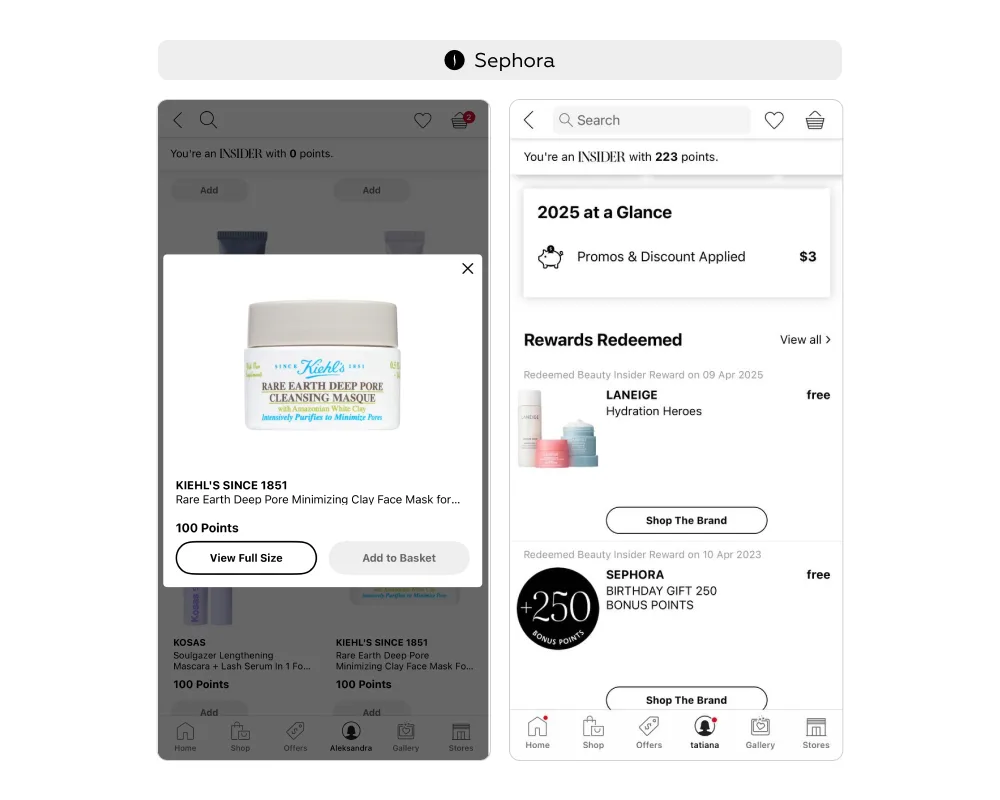
In Sephora’s loyalty program, members can redeem samples as rewards. When doing so, the interface offers a direct link to the full-size product page, where users can view details and read reviews — helping them make more informed decisions. In the Rewards Redeemed section, a Shop the Brand button directs customers to the catalog of full-size products from the same brand.
This creates a seamless journey: from safe product trial via miniature, to confident purchase of the full version — reducing barriers for the user while driving tangible business outcomes.
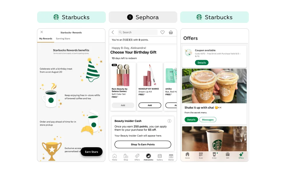
A birthday is a powerful moment to strengthen emotional connection with customers. At Sephora, users can choose from one of several sets of mini products (6–8 options depending on program tier). At Starbucks, loyal customers receive a free drink or snack of their choice. These gifts are perceived as genuine value: Sephora’s encourage product discovery and trial, while Starbucks’ integrate naturally into the everyday visit, creating a positive association with the brand.
Equally important is the post-registration stage, when customers should be nudged toward their first order. At Starbucks, this is addressed through a welcome offer: within a few days after registration, a coupon for a free drink with the first purchase (in-store or online) appears in the Offers tab. The limited validity period (e.g., Valid 8/5–8/12) creates urgency and reduces the risk of postponement.
This approach turns registration into the first step of active engagement: gifts and special offers establish program value immediately, reinforce positive emotions, and motivate customers to make regular purchases.
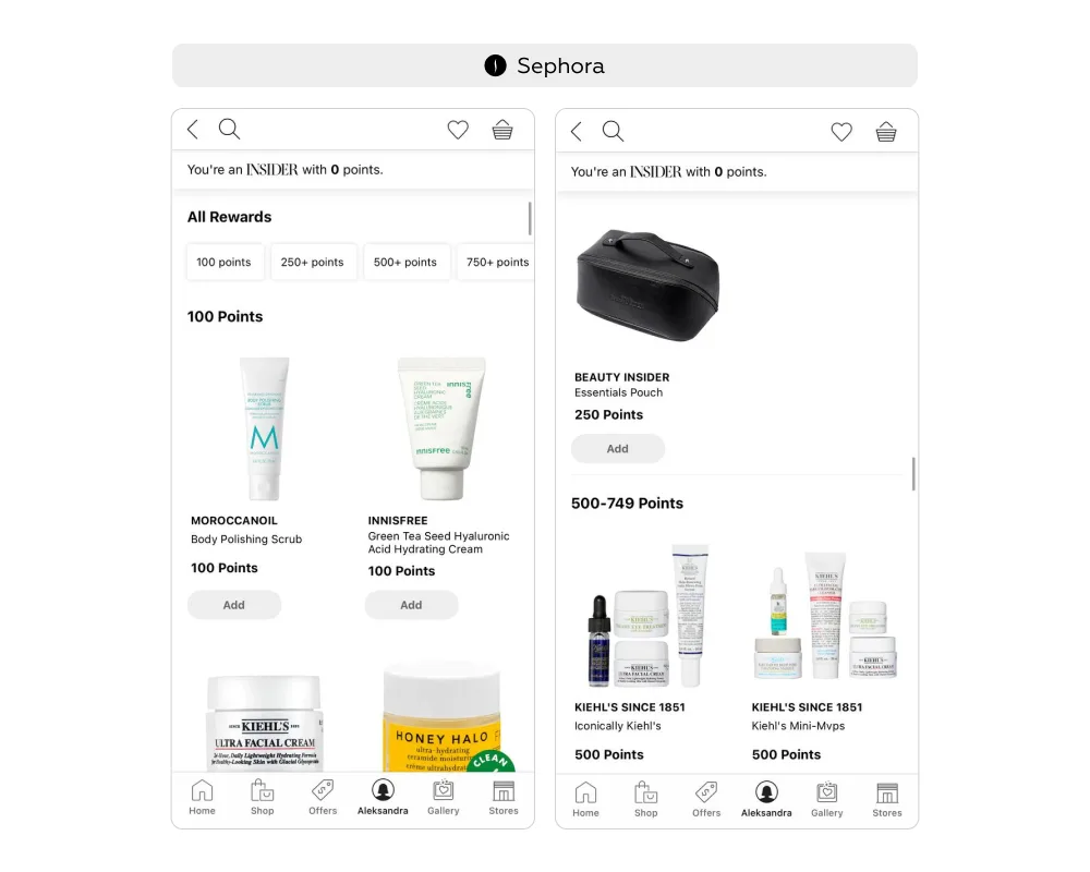
The need to manually search for suitable products and match them with the available points balance can discourage users from redeeming rewards. As a result, part of the accumulated points remains unused, and the conversion of points into actual orders declines.
In Sephora’s loyalty program, this issue is addressed through a navigation mechanism in the Rewards Bazaar. Products are grouped by the number of points required. On the rewards list screen, a navigation menu organizes items by cost (e.g., 100 Points, 250+ Points), functioning like an interactive table of contents. Tapping a specific range smoothly scrolls the user to the corresponding section of the catalog, where all available items for that points level are displayed.
The solution combines the strengths of filtering and a linear catalog. On the one hand, users can instantly see which rewards match their current balance, making available options stand out. On the other, the catalog structure remains intact, allowing easy comparison of items across different point categories.
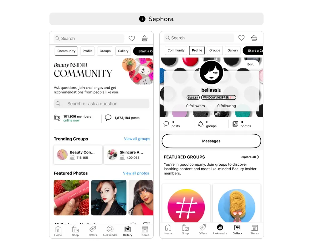
For loyalty programs, sustaining customer interest requires more than bonuses and discounts — it also depends on building an emotional connection with the brand. One effective way to achieve this is by creating spaces for communication and experience sharing.
In the Sephora app, this is addressed through the Beauty Insider Community. Anyone can browse the section, but only loyalty program members can publish posts, leave comments, and interact with others.
The community includes several zones:
This setup fosters an ecosystem of trust. Unlike open social networks, it creates a safe environment where communication is focused on real product experiences. Users gain credible reviews, personalized recommendations, and a sense of belonging to a like-minded community.
For Sephora, this is not only a way to strengthen loyalty but also a driver of engagement: active participation in the community becomes an exclusive program privilege, motivating customers to register and remain active members.
Steps:
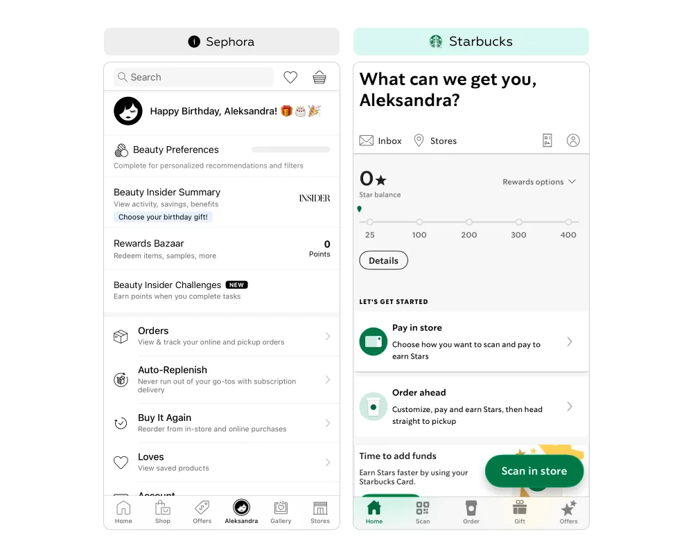
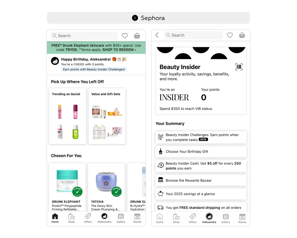
At this stage, the service has the opportunity to clearly demonstrate the value already gained by the customer. By showing bonus balances and privilege levels, the app can motivate further purchases. From the user’s perspective, transparent conditions and clear status information help form an accurate understanding of their current situation — for example, what rewards are available and how to unlock more benefits.
In both apps, loyalty balance is treated as a high-priority element: key information is displayed directly on the home screen, with additional entry points leading to more detailed views.
Sephora
Starbucks
For both new and existing loyalty program members, it is essential to always see their current status and balance. If this information is hidden deep in the interface, motivation drops. The optimal solution is to place it directly on the home screen and pair it with clear calls to action.
In the Sephora app, this is achieved through a personalized banner that simultaneously:
The banner delivers instant transparency: users immediately understand where they stand in the program without taking extra steps. At the same time, it does not limit navigation — tapping the banner leads to the profile, where all participation options are consolidated.
The banner also adapts to context, for example by displaying birthday greetings, which reinforces personalization. This solution effectively combines a promotional role (reminding about the program) with practical value (quick access to personal data and engagement tools).
As a result, users gain both clarity and motivation to act, while the brand benefits from increased program engagement.
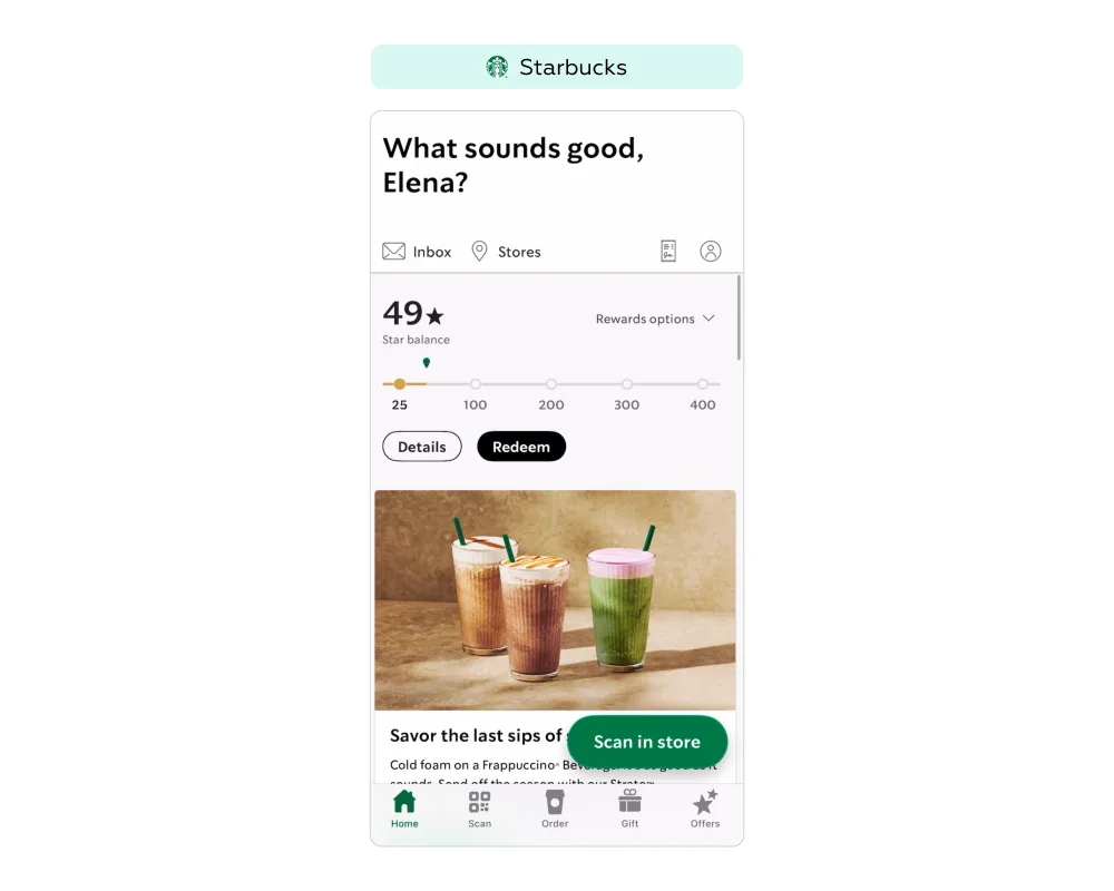
In loyalty programs, it is not enough to simply display the current points balance — the path to the next reward must also be made clear. When progress remains abstract, motivation declines: customers struggle to assess how much effort is needed to reach a reward and are more likely to postpone participation.
On the home screen of the app, a progress bar with visual markers is implemented at key reward levels (25, 100, 200, 300, 400 stars). Each marker corresponds to a specific reward. Above the bar, a Rewards Options button provides quick access to a list of items available for redemption at different point thresholds.
For users, this design works like a visual roadmap. At a glance, they see how many stars they have, how far they are from the next reward, and what rewards are available in the program — without navigating to other screens. For example, a customer with 180 stars instantly understands that only 20 more are needed for a free drink (200 stars). This creates a healthy motivation to place an additional order and close the gap.
Because it is placed on the home screen, the progress bar reinforces awareness of the program each time the app is opened, helping sustain ongoing engagement.
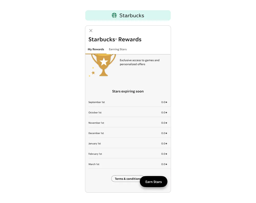
In loyalty programs, it is essential to strike the right balance between motivation and transparency. If customers are not aware that rewards have an expiration date, the risk of disappointment and distrust toward the brand increases. That is why it is critical to clearly communicate when bonuses will expire.
In the My Rewards section of Starbucks Rewards, where users can see their points and redemption options, a Stars expiring soon block visualizes upcoming expirations. The screen displays a month-by-month table with specific dates (e.g., September 1, October 1) and the number of stars scheduled to expire in each period. Even if the current balance is zero, the system still shows how the mechanism works — building user awareness that future stars will have a limited validity period.
For customers, this transparency translates into a sense of control. By knowing the exact expiration dates, they can plan purchases to use stars before they disappear. This is especially valuable for users saving up for larger rewards: if they see that part of their balance is about to expire, they are more likely to place an additional order to preserve progress.
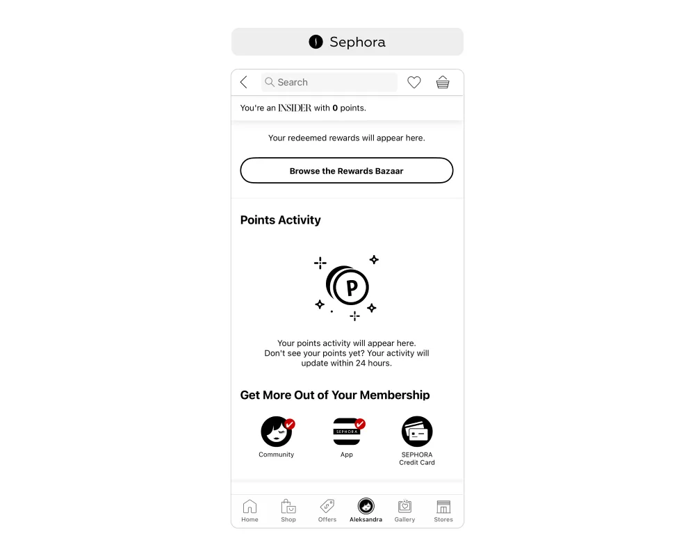
If points do not appear in the account immediately after a purchase, program members — especially new ones — may start to doubt whether their points were lost or whether the system is malfunctioning. This leads to increased distrust in the program and a higher volume of support requests. To prevent this, it is essential to explain the rules and timelines for point accrual in advance.
In the Sephora app, this is solved with a clear communication system: in the Points Activity section of the profile, users are informed that points for completed actions may take up to 24 hours to appear. For customers, this removes unnecessary doubt — they understand that their points are not lost, but are simply being processed by the system.
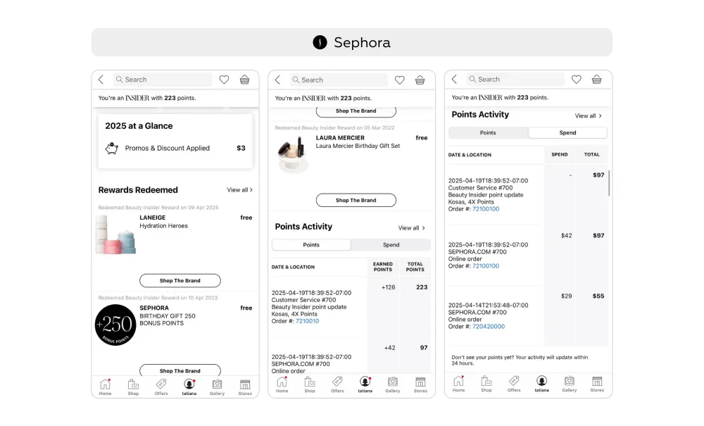
In loyalty programs, it is important not only to give users the opportunity to earn bonuses but also to show the real value they have already gained. When points remain abstract numbers, customers find it harder to appreciate their significance and evaluate the results of participation.
In the Sephora app, the Beauty Insider program demonstrates cumulative value in several ways:
Showing redeemed rewards as product cards transforms abstract points into tangible benefits — users can instantly see which products they have already received for free thanks to the program. This approach strengthens engagement: program value is framed not as a promise but as proof already delivered, motivating users to participate more actively and make additional purchases. Transparent tracking of earned and redeemed points further creates a sense of full control: bonuses do not appear randomly but are clearly tied to customer activity.
To discuss how we can support your service, fill out the form below or contact us through your preferred messenger: Telegram / WhatsApp.
We’ve evolved dozens of successful financial services and are eager to prove that our expertise can be implemented in other industries and around the world. Have a look at our success stories!
From research and analysis to strategy and design, we help our clients successfully reach their customers through digital services.