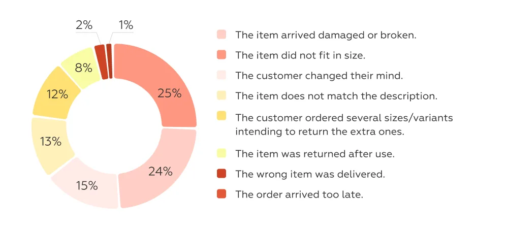
Returns remain one of the biggest pain points in online retail. According to Outvio, four out of five key reasons for returns are linked to the product selection stage. This means that the work of reducing returns begins long before the customer clicks Place Order. Well-designed UX solutions at this stage make the choice more transparent, help customers align expectations with reality, and reduce the likelihood of mistakes.
We analyzed 25 mobile apps of leading e-commerce players in Western Europe and globally, across four categories where return risk is especially sensitive to accuracy of selection, and identified 14 UX solutions that can significantly reduce it.
Each return is not only a direct cost — reverse logistics and product handling — but also an indirect loss: a poorer customer experience, frozen working capital, and declining margins. In 2024, almost one in six online purchases worldwide was returned — an average of 16.9% (NRF, Happy Returns). In Western Europe, the fashion category stands out: returns reach 30–45% on marketplaces and 15–25% on brand websites (Shift).
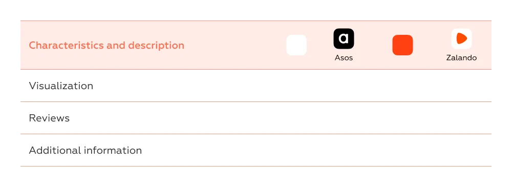
Our research focuses on four categories of online stores:
Contents
We identified four areas where the main causes of incorrect product choice can be directly linked to specific UX solutions and their measurable impact. Implementing these solutions allows retailers to reduce returns with predictable effects and track the results in numbers.
Cross-cutting performance indicators that show whether UX solutions help customers make fewer mistakes:
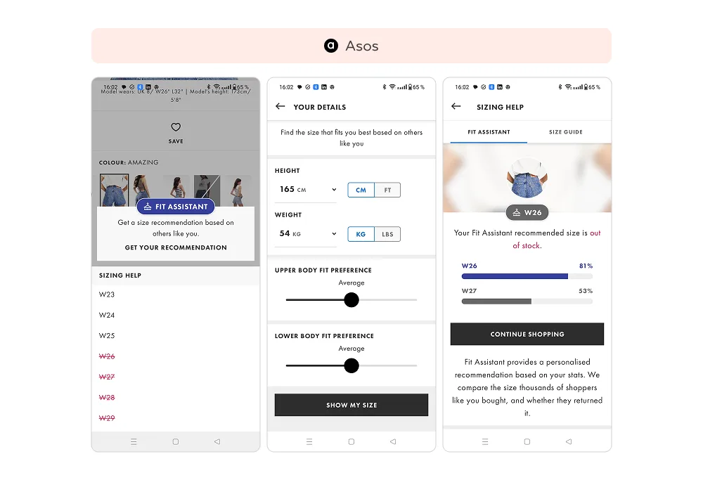
At ASOS, size selection happens automatically. Users enter their height, weight, and fit preferences for tops and bottoms. Based on purchase and return data, the algorithm suggests the most suitable size without requiring the user to check charts.
With such a vast assortment, it is easy to make a mistake when choosing. Zalando addresses this with an AI assistant that clarifies the request, accounts for body parameters, seasonality, and purpose, and then suggests the most suitable options.
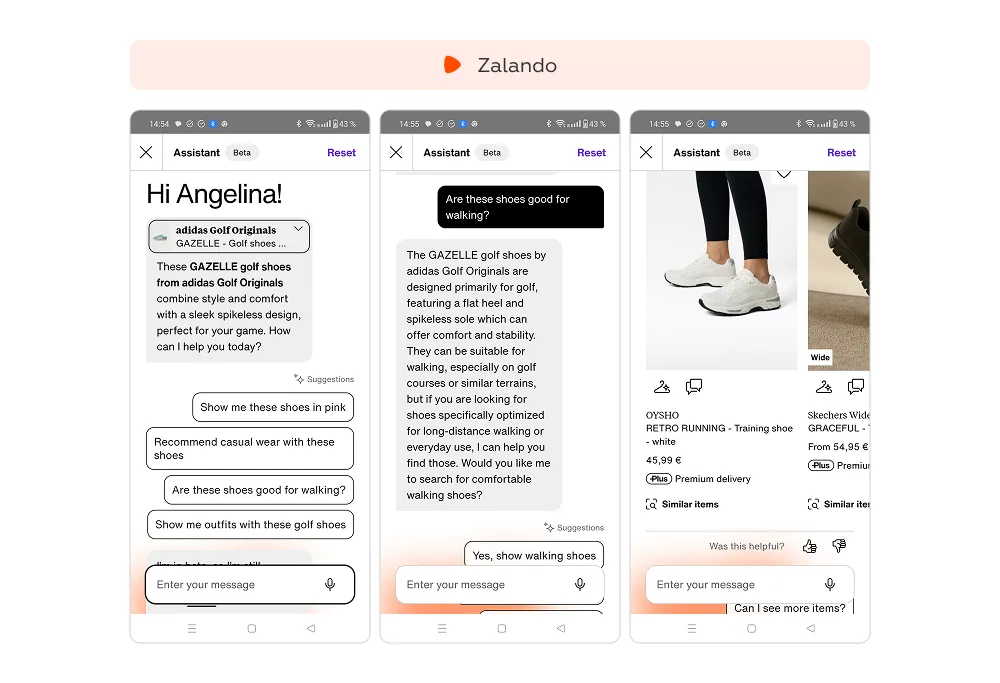
Other European retailers are also rethinking the user journey, introducing UX solutions that make product choice more transparent and minimize the risk of returns.
In many apps, choosing a size requires opening a separate chart since each brand uses its own standards. Displaying key measurements — such as height, bust, waist, or foot length — directly in the product card removes this barrier, simplifies the process, and reduces the risk of selection errors.
In categories with numerous technical specifications, customers often struggle to make the right choice. An AI-powered assistant that highlights key differences helps users quickly identify which product best fits their needs, reducing the risk of purchasing the wrong model and returning it later.
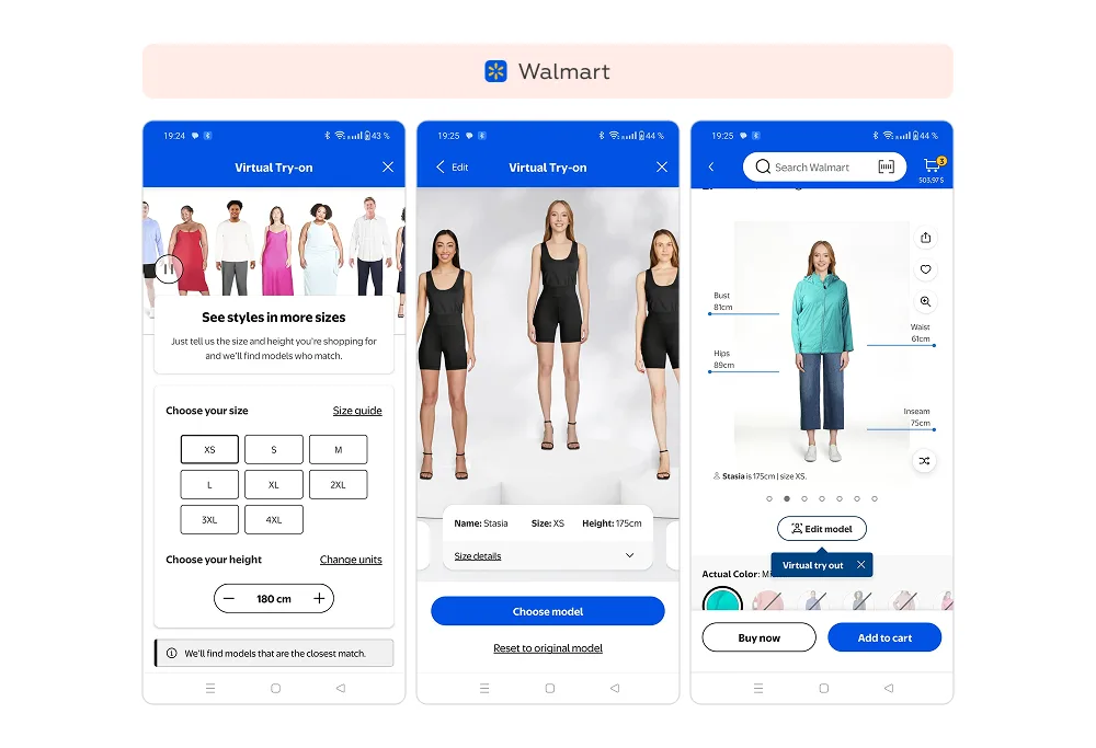
To simplify size choice, Walmart lets customers “try on” clothing using a virtual model with a similar body shape. After entering height and size, the system generates body types close to the customer’s own. This turns clothing measurements into a clear visual experience.
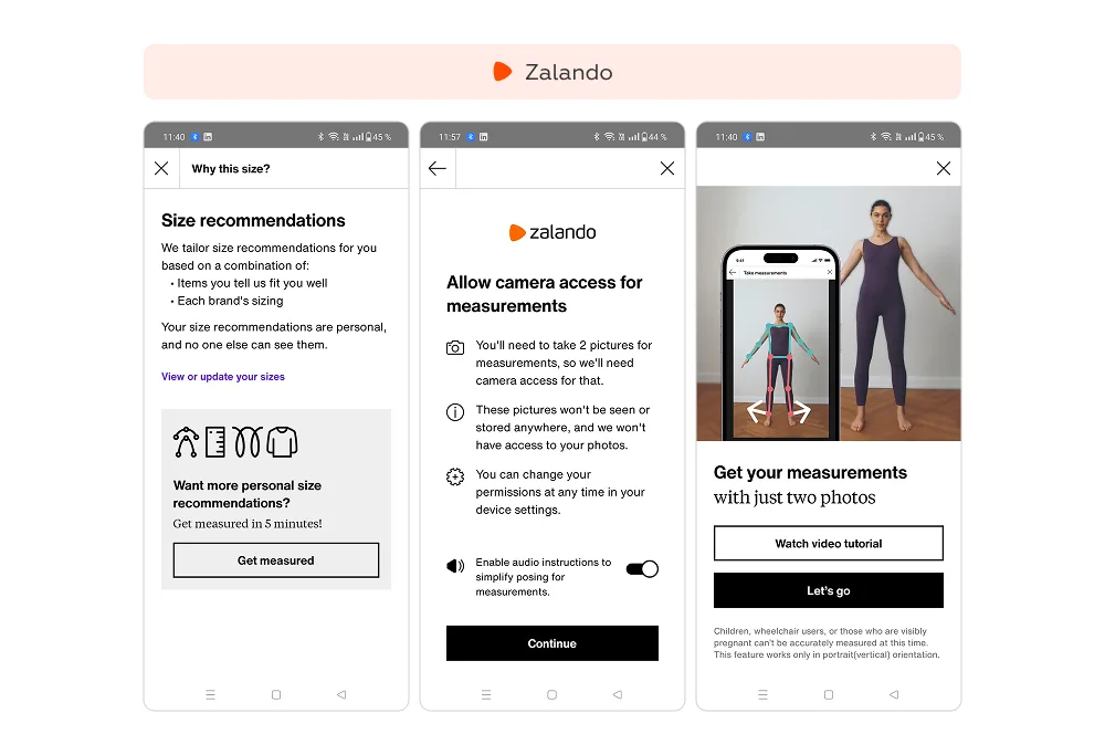
Zalando also offers users the option to create a personal 3D avatar from two photos. The algorithm builds a digital copy of the body, showing how clothes fit not just by size but also by proportions — shoulders, waist, length. While this tool requires more engagement, it provides the most accurate preview of fit.
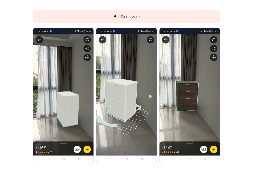
Amazon allows customers to see how furniture or appliances will look in their homes. Using the smartphone camera, the product is placed into real space, with live updates for model and color changes — including price adjustments.
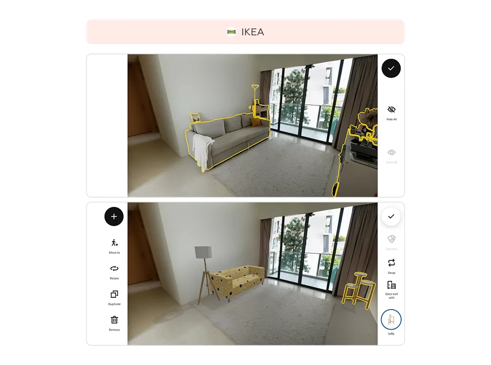
In the IKEA app, the Scan Your Room feature lets users “clear” their space of existing furniture and arrange new items from the catalog. Customers can adjust size, color, and modifications to see how products match together. This takes slightly longer than standard browsing but gives far greater confidence in the final choice.
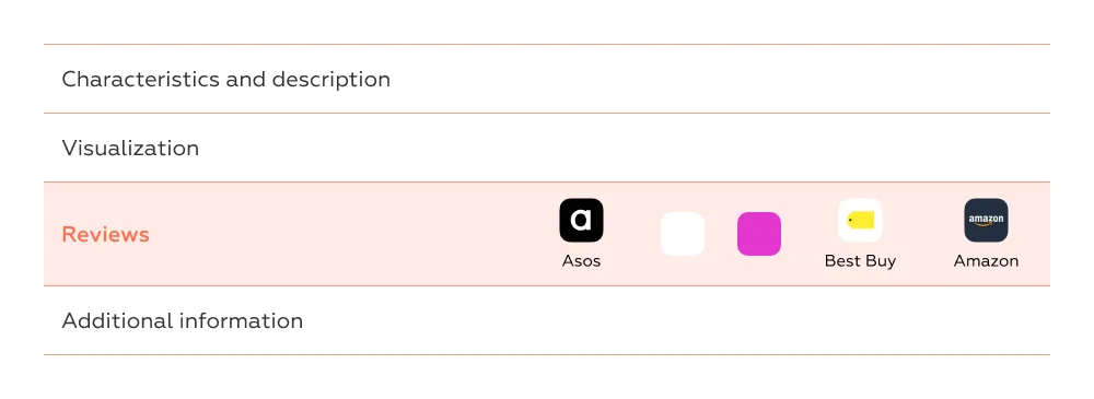
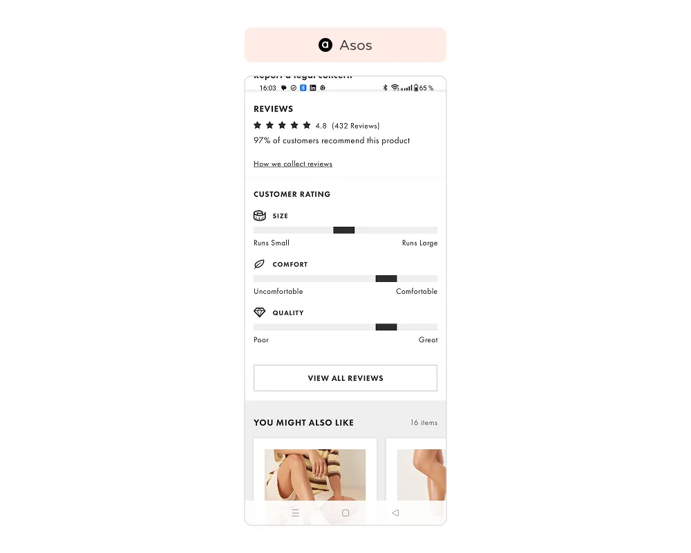
On ASOS, product cards display aggregated ratings as visual indicators. Customers can instantly see how others rated size accuracy, comfort (for shoes), and quality — without reading dozens of comments.
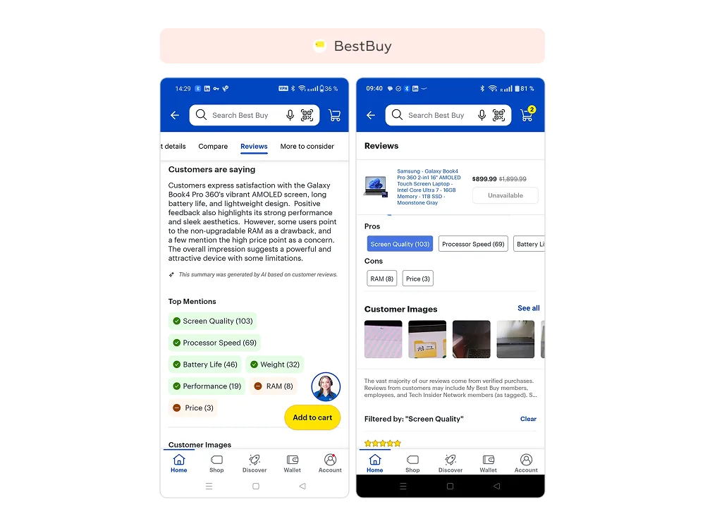
At Best Buy, the reviews tab opens with a short AI-generated digest. Users immediately see the main themes — such as “screen,” “speed,” or “battery life.” Positive and negative aspects are color-coded and accompanied by mention counts. With a single click, users can dive into relevant full reviews.
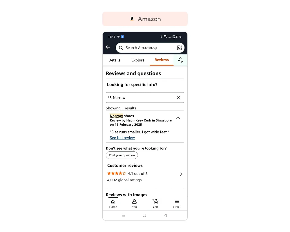
Amazon enables users to search reviews by keywords. A customer can type in “noise,” “battery,” or “fit,” and the system highlights relevant comments. This makes it easier to verify the exact characteristics that matter most for the purchase decision.
Across Europe, e-commerce leaders are improving UX to help customers choose with confidence — reducing uncertainty before checkout and cutting return rates.
Users can sort reviews so the most helpful ones appear first — typically those with author details, photos, and specific fit notes. Key attributes such as measurements and color are highlighted in separate lines, making information faster to scan.
Users can switch to “photo only” or “video only” review mode. Text comments are hidden, leaving only visual content, which helps quickly assess how the product looks in real life.
In the product card, a dedicated More about price block can display the lowest available price and the number of sellers. With one click, users can compare alternative offers before completing the purchase. This reduces the risk of returns caused by finding a cheaper option elsewhere and helps customers make more informed decisions.
All of the solutions reviewed aim at one thing: reducing the uncertainty customers face when making a choice. Well-designed UX helps shape realistic expectations before the purchase. When users clearly understand what they are getting, the likelihood of returns decreases.
For businesses, this means not only savings on logistics and improved margins but also stronger customer trust.
To discuss how we can support your service, fill out the form below or contact us through your preferred messenger: Telegram / WhatsApp.
We respond to all messages as soon as possible.
We’ve evolved dozens of successful financial services and are eager to prove that our expertise can be implemented in other industries and around the world. Have a look at our success stories!