
Mobile commerce is no longer a fast-growing channel — it has become the default environment where digital revenue is won or lost. By 2026, users don’t “switch to mobile” anymore; they start, evaluate, and complete purchases within mobile-first ecosystems shaped by super apps, embedded payments, and frictionless identity layers. Expectations have quietly but radically shifted: speed is assumed, trust is fragile, and even minor UX gaps now translate directly into measurable revenue loss.
At the same time, competition is no longer defined by direct peers. Users compare your experience with the smoothest interaction they’ve had anywhere — whether that’s a marketplace, a fintech app, or a social commerce flow. This raises the bar for mobile UX to a level where incremental improvements are not enough: products need to be intentionally designed for mobile behaviors, constraints, and decision-making patterns.
This is where UX becomes a business-critical lever in m-commerce. Not as a layer of interface polish, but as a system that shapes conversion, retention, and long-term customer value.
In the next section, we’ll look at how exactly user experience impacts key m-commerce metrics — and why even small friction points scale into significant losses.
Contents
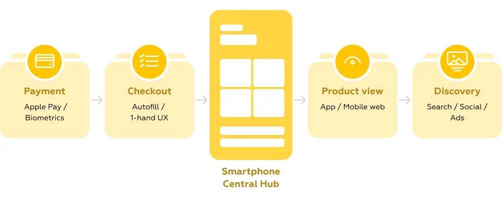
Mobile commerce, or m-commerce, refers to any purchase or financial transaction completed through a mobile device — primarily smartphones. While it is technically a subset of e-commerce, the difference is no longer just about screen size. M-commerce is built around entirely different user behaviors: shorter sessions, fragmented attention, and a strong expectation of instant results.
In practice, m-commerce covers everything from browsing products on a mobile website to completing a purchase inside an app or paying in a physical store using a phone. And its importance keeps growing: mobile commerce is expected to account for over 60% of global e-commerce sales by 2027. This shift is not just quantitative — it reflects a deeper transformation in how users discover, evaluate, and buy products in real time.
What makes m-commerce fundamentally different is that it leverages the native capabilities of mobile devices rather than simply adapting desktop experiences. Location awareness, biometric authentication, and built-in payment systems allow brands to reduce friction and compress the path to purchase into just a few taps.
Key features that define m-commerce today include:
At the same time, m-commerce spans a wide ecosystem of interaction models — many of which users now perceive as interchangeable parts of a single journey.
The most common m-commerce formats include:
For businesses, this means one thing: mobile is no longer a channel — it is the primary interface with the customer. Poorly designed mobile flows directly impact conversion, increasing drop-offs at every step of the journey.
For users, the expectation is equally clear. M-commerce should feel effortless — integrated into daily routines, synchronized with payment tools, and fast enough to support decisions made in seconds.
Mobile-first is not a design trend — it’s a constraint that defines success in m-commerce. When teams start with desktop and later adapt flows for smaller screens, they inherit unnecessary complexity: overloaded navigation, duplicated elements, and unclear priorities. In contrast, mobile-first architecture forces focus — fewer entry points, clearer hierarchy, and faster paths to action.
Navigation is where this difference becomes most visible. Endless scrolling can work for inspiration-driven browsing, but without clear structure it quickly turns into fatigue. At the same time, hiding key sections behind a hamburger menu reduces product discovery — in some cases by 20–30%, according to Mobile Banking Rank 2025.
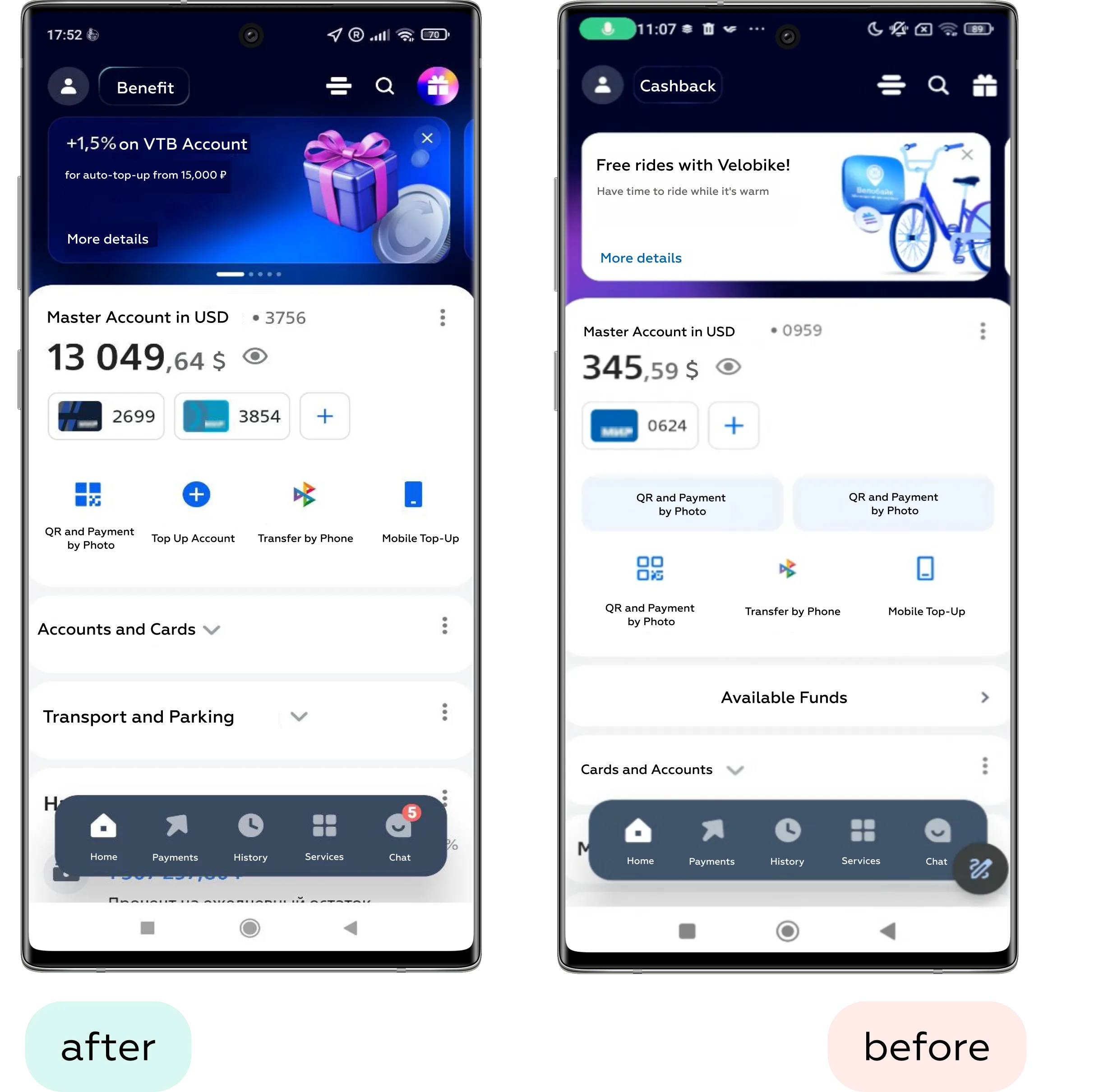
What works better is visible, thumb-friendly navigation: bottom tab bars, quick category shortcuts, and hybrid patterns where users can both browse and jump directly to sections.
Search, meanwhile, has evolved into a primary interaction model. On mobile, users often skip navigation entirely if they have even a vague intent. Leading products reduce the effort of “formulating a query” by introducing autocomplete, voice, and visual search. For example, platforms like Pinterest allow users to search using images — effectively turning discovery into a one-tap action.
In practice, strong information architecture in m-commerce is less about structure itself and more about minimizing the time between intent and product discovery.
Product discovery on mobile is a balancing act between speed and clarity. Users don’t browse as patiently as on desktop — they scan, compare, and decide within seconds. This makes product lists and product pages a critical layer where even small UX decisions directly impact conversion.
One of the main friction points is filtering. Systems designed for desktop often become too complex on mobile: too many options, unclear prioritization, and interactions that require excessive effort. Effective solutions simplify access and reduce cognitive load instead of replicating full catalog logic.
What works better in mobile filtering:
Visual content becomes the primary decision-making tool. Instead of reading, users rely on fast visual validation — which makes content format and interaction quality critical.
Key patterns for visual content:
The product page itself should minimize hesitation and guide users toward action. The goal is not to show everything at once, but to reduce cognitive load at the moment of decision.
Effective product page patterns:
A common pitfall appears when discovery and action are disconnected.
Use case: A user searches for a specific item — for example, a croissant — expecting to quickly find and add it to the cart. After entering the query, they see suggested results from multiple shops. The interface implies that these are direct shortcuts to the product, but tapping them redirects the user to a general catalog instead. This creates a mismatch between expectation and outcome, forcing the user to restart the search within the shop and increasing frustration.
Best-in-class solutions eliminate this gap. For example, in Uber Eats, search results don’t just show where an item is available — they act as direct entry points to the product itself. Users can tap a result, land on the exact item page, and add it to the cart within seconds.
This seemingly small difference — linking intent directly to action — is what defines effective product discovery in m-commerce.
Checkout is the most sensitive stage of the m-commerce journey. This is where user intent peaks — and where even small UX issues can lead to immediate drop-off. In many products, the checkout funnel remains the narrowest point, not because users lack intent, but because the experience introduces unnecessary friction.
One of the biggest barriers is forced registration. Requiring users to create an account before completing a purchase interrupts momentum and adds effort at the worst possible moment. In mobile contexts, where speed and convenience are expected, guest checkout is no longer optional — it is a baseline requirement.
Form design is another critical factor. Poor input experiences can quickly turn a simple task into a frustrating one, especially on small screens. High-performing checkout flows reduce manual effort and adapt to the user’s context.
What improves mobile checkout forms:
Equally important is designing for physical interaction. Most users navigate checkout with one hand, which makes thumb reach a key constraint rather than a minor detail.
Thumb-friendly design patterns:
A common issue in checkout flows is poor information hierarchy — especially when it comes to order review.
Use case: A user wants to review their cart and verify the accuracy of their order before checking out.
Problem: The checkout page is cluttered with secondary details and lacks clear structure. Critical information — the actual order contents — is either hidden or minimized. Instead, less important elements (such as tips or additional options) are visually emphasized and placed higher on the screen. As a result, users may overlook what they are actually purchasing, increasing the risk of errors and reducing confidence.
Best-in-class solutions prioritize clarity at this step. In Uber Eats, users are presented with a clear and structured overview of their cart before completing the order. The interface highlights selected items, quantities, and key details, allowing users to quickly verify and adjust their choices. This simple but critical step reinforces trust and ensures that users proceed with confidence.
In m-commerce, checkout is not just about completing a transaction — it’s about removing doubt at the final moment of decision.
Payment is the final and most decisive step in the m-commerce journey. At this point, users are ready to convert — but only if the process feels fast, reliable, and secure. Any friction or uncertainty here directly impacts completion rates.
Mobile wallets have fundamentally changed expectations. Solutions like Apple Pay and Google Pay are no longer optional add-ons — they are expected defaults. By eliminating manual input and enabling one-tap confirmation, they can reduce checkout time from minutes to seconds.
What makes mobile payments effective:
Biometric authentication reinforces this experience. Face ID or fingerprint confirmation replaces passwords while increasing both speed and perceived security — a rare combination that directly benefits conversion.
At the same time, trust must be clearly communicated, especially on small screens where space is limited. Users need reassurance at a glance, without being overwhelmed by technical details.
Effective trust signals in mobile checkout:
A common failure occurs when payment flows are fragmented or unintuitive.
Use case: A user wants to place an order for the first time in a food delivery app.
Problem: After reviewing the cart and moving to checkout, the user is prompted to select a payment method — but the interface does not respond or clearly guide them forward. The only workaround is to leave the flow, navigate to a separate profile section, and add payment details there. This breaks the flow, increases effort, and creates uncertainty about whether the order can be completed at all.
Best-in-class experiences keep everything within a single, coherent flow. In Wolt, users can review their order, select a payment method, and add a new card directly within the checkout screen. All essential actions are available in one place, reducing friction and keeping the user focused on completing the purchase.
In m-commerce, payment UX is not just about processing transactions — it’s about maintaining momentum and reinforcing trust at the most critical moment.
Micro-interactions shape how responsive and reliable a product feels. In m-commerce, where users expect immediate feedback and seamless flows, these small details often determine whether the experience feels smooth or frustrating.
Feedback is the foundation. Every user action — adding an item to the cart, applying a filter, completing a payment — should trigger an instant and clear response. This can be visual, and in mobile contexts, enhanced with haptic feedback to reinforce successful actions.
Effective feedback patterns:
Handling system states is equally important. Poorly designed loading and error states can break the flow, even if the core functionality works perfectly.
Key UI state improvements:
Animation plays a supporting but critical role. When used correctly, it helps users maintain context and understand transitions between steps.
Where animation adds value:
A common issue arises when interactions are ambiguous and lack clear signals.
Use case: A user is searching for a flat in map view and wants to explore each option in detail.
Problem: After tapping a location pin, the user opens a property card and tries to swipe through images. Instead of seeing more photos of the same listing, the interface switches to a different property. The behavior is unclear: some apps use swipe for image galleries, others for navigating between listings. This inconsistency forces users to slow down and re-learn interactions, increasing cognitive load and confusion.
Best-in-class solutions remove this ambiguity through clear visual cues. In Agoda, the interface explicitly indicates that swiping will navigate between properties, aligning interaction with expectation. In contrast, apps like Airbnb use pagination indicators (dots) to show that swiping will reveal more photos within the same listing.
These small but precise signals make interactions predictable — and in m-commerce, predictability is what keeps users moving forward without hesitation.
Performance is one of the few UX factors that directly correlates with revenue. In m-commerce, where users expect instant responses, even small delays can have a measurable impact: a 1-second slowdown can reduce conversion by 7–20% depending on the context.
This makes performance not just a technical concern, but a design responsibility. Decisions about images, interactions, and architecture all influence how fast a product feels.
Modern approaches aim to balance richness and speed. Progressive Web Apps (PWAs), for example, combine the reach of websites with app-like performance and offline capabilities. Image optimization techniques like WebP and lazy loading ensure that users only load what they actually need.
Reliability is just as important as speed. In real-world mobile conditions — unstable connections, interruptions — users expect continuity. Features like saving the cart or preserving session state can prevent lost purchases and frustration.
In Markswebb’s e-grocery and ecosystem research, performance improvements consistently correlate with higher activation and retention.
In m-commerce, speed is not a feature. It is the foundation that everything else depends on.
M-commerce is evolving beyond screens and static interfaces. The next generation of UX is shaped by technologies that reduce effort even further — or remove the interface altogether.
Voice commerce is one of the clearest signals of this shift. Instead of navigating menus or typing queries, users interact through natural language — asking, уточняя, and completing purchases conversationally. This changes the role of UX from interface design to flow orchestration: structuring intent, guiding decisions, and reducing ambiguity without visual cues. (We explored this direction in more detail in our Conversational UI materials.)
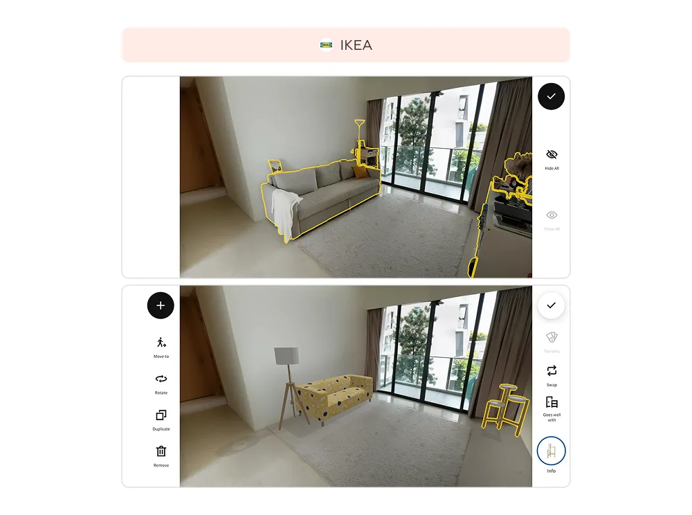
At the same time, augmented reality is redefining how users evaluate products. Instead of imagining how something might look, users can see it directly in their context. For example, in the IKEA Place app, users can scan their room, remove existing furniture, and place new items from the catalog to test combinations, sizes, and colors. This takes slightly more time than traditional browsing — but significantly increases confidence in the final decision. Similar approaches are already used in beauty and fashion, where virtual try-ons reduce uncertainty and returns.
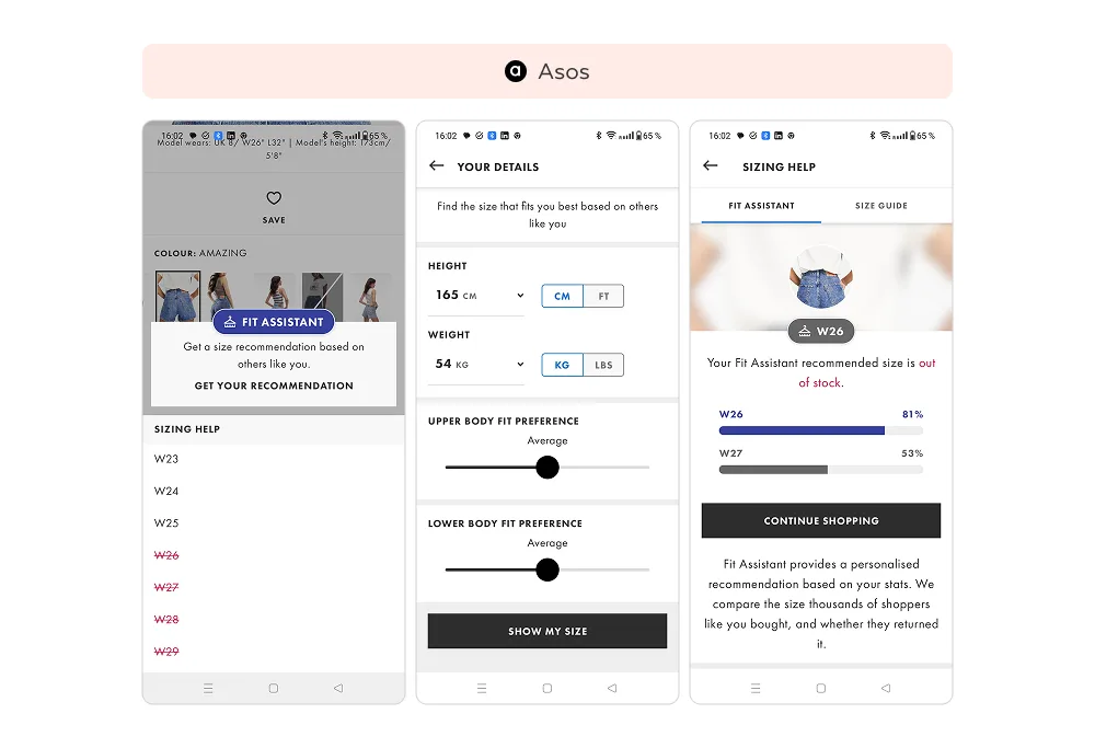
Personalization is also becoming more proactive and less visible. Instead of reacting to user input, interfaces adapt dynamically based on behavior, context, and history. In ASOS, for example, users receive size recommendations based on their body parameters and past purchases — eliminating the need to interpret size charts. This kind of hyper-personalization reduces cognitive load and shortens decision time, making the experience feel almost effortless.
Another emerging trend is predictive UX — where systems anticipate user needs before explicit interaction. This includes pre-filled carts, timely reminders, contextual offers, and adaptive interfaces that change depending on location, time, or intent. Instead of navigating a product, users are guided through a pre-optimized path.
What unites all these trends is a common direction: reducing the distance between intent and action. Whether through voice, AR, or predictive systems, m-commerce UX is moving toward experiences that are faster, more intuitive, and increasingly invisible.
For businesses, this raises the bar once again. Competing in m-commerce is no longer about optimizing individual screens — it’s about designing systems that understand users, adapt in real time, and remove friction before it even appears.
Use this checklist as a fast way to evaluate whether your mobile experience supports conversion — or silently blocks it.
If multiple answers are “no,” UX is likely limiting your m-commerce performance more than you expect.
Why is UX critical in m-commerce?
Mobile users have low tolerance for friction — even small issues quickly lead to drop-offs.
What is the most common mistake?
Designing for desktop first instead of mobile-first experiences.
How does UX improve conversion?
By reducing friction in navigation, product selection, and especially checkout.
Do mobile wallets matter?
Yes. Tools like Apple Pay significantly speed up checkout and increase completion rates.
What’s next in m-commerce UX?
Voice interfaces, AR, and predictive personalization that reduce effort and decision time.
We respond to all messages as soon as possible.
We’ve evolved dozens of successful financial services and are eager to prove that our expertise can be implemented in other industries and around the world. Have a look at our success stories!