
What are UX metrics in 2026? UX metrics are measurable indicators that reflect how user experience impacts product performance, including conversion, efficiency, retention, and operational cost.
Based on the latest data, UX Metrics for business impact 2026 have fundamentally shifted. It’s no longer enough to track engagement for its own sake. In the current landscape – where AI is automating interactions and user patience is at an all-time low – the metrics that matter are those directly tied to efficiency, habit formation, and financial outcomes.
Contents
There’s a noticeable shift happening in how teams evaluate UX performance. Metrics like load time or TTFB haven’t disappeared — but they’ve lost their central role. In 2026, what matters more is how the interface behaves after the screen is already loaded. Among modern UX Metrics, responsiveness measured by INP has become one of the most critical factors.
This is where Interaction to Next Paint (INP) comes in.
INP measures the delay between a user action — tap, click, typing — and the moment the interface visibly responds. Not in theory, not in logs, but in what the user actually perceives. And that makes it fundamentally different from traditional performance metrics.
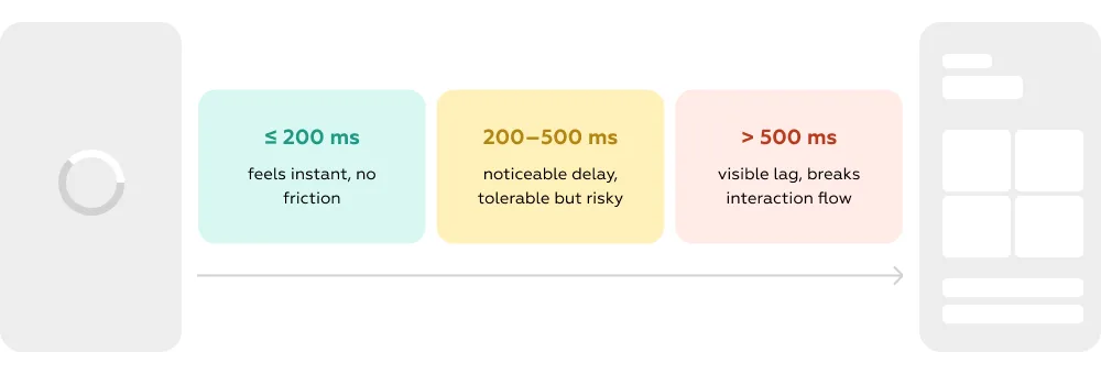
From a user’s perspective, every interaction is a micro-decision point. They act — and expect an immediate reaction.
If nothing happens, even for a fraction of a second, the system enters a gray zone:
This hesitation is where friction begins.
In high-frequency interfaces, these micro-delays compound quickly. A 250–300 ms lag doesn’t look critical on paper, but in reality it often leads to repeated actions, input errors, and ultimately — abandonment. Industry benchmarks in digital analytics show a consistent pattern: as interaction latency grows, drop-off increases and conversion declines.
Modern products are no longer linear. Users don’t just load a page and consume content — they constantly interact: filtering, searching, confirming, switching contexts.
At the same time, AI-driven interfaces are raising expectations. When systems feel “smart”, users expect them to also feel instant.
That’s why responsiveness is no longer perceived as performance — it’s perceived as competence.
If the system reacts instantly, it feels reliable.
If it “thinks”, it feels uncertain.
Nowhere is this more visible than in fintech and banking.
When a user confirms a payment and the interface pauses, even briefly, a critical question appears:
“Did it go through?”
That moment of uncertainty has very real consequences:
In other words, latency directly affects trust, and trust directly affects revenue.
INP becomes especially important in flows where the cost of hesitation is high.
In enterprise products, the most sensitive scenarios are:
Here, responsiveness is not just about comfort — it’s about keeping the user in control.
In more passive interactions like navigation or dashboards, the impact is less immediate, but still accumulative. Over time, it shapes the overall perception of product quality.
What makes INP different from previous metrics is how directly it connects to business performance.
At the behavioral level, it influences:
At the business level, this translates into:
The relationship is no longer abstract. Every delayed response introduces uncertainty. Every uncertainty reduces the likelihood of completion.
INP is not just another metric to monitor. It’s a lens into how responsive, reliable, and trustworthy your product feels in real use.
And in 2026, that feeling is what defines whether users move forward — or drop off.
There’s a consistent pattern behind underperforming products in 2026: users don’t churn because the product is bad — they churn because value comes too late.
Time-to-Value (TTV) is one of the most important UX Metrics for understanding how quickly users reach meaningful outcomes.
Efficiency defines how much effort — time, steps, decisions — is required along the way.
Together, they don’t describe screens or features. They describe something more fundamental:
how directly a product converts intent into result.
In most enterprise contexts, TTV is no longer abstract — it’s measurable within the first session.
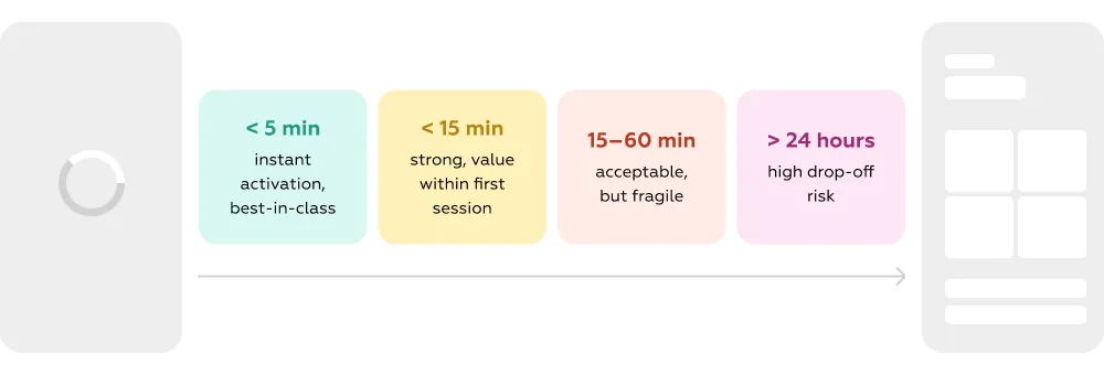
And the performance gap is significant:
In most enterprise systems, users don’t “decide” to leave. They gradually disengage as the path to value stretches.
It rarely comes from a single blocker. Instead, friction accumulates: extra steps that don’t move the user forward, navigation that requires exploration, interfaces that explain instead of guide, and flows where setup comes long before outcome.
Individually, these issues feel minor. Together, they reshape behavior.
This creates a predictable chain reaction: users slow down, lose context, postpone completion — and eventually abandon the process altogether. The product doesn’t fail technically; it fails to sustain progress toward value.
Reducing clicks is easy. Preserving momentum is harder.
Efficiency, in practice, means eliminating everything that delays the first meaningful result. It’s the difference between a product that guides and a product that forces users to figure things out.
In real scenarios, this looks different:
The key boundary is simple:
anything before the outcome is friction
anything after the outcome is experience
Products that win compress everything before value — and expand everything after it.
The highest-risk zones are early and high-stakes interactions, where users are still deciding whether the product is worth their time. Onboarding, the first transaction, the first successful action, and complex B2B scenarios are not just UX steps — they are conversion gates.
When these flows are slow or effort-heavy, the impact is immediate and measurable:
In SaaS, this is visible at scale:
Further along, in recurring operations or management flows, inefficiency works differently. It doesn’t always cause immediate drop-off, but it gradually reduces speed, increases fatigue, and lowers perceived product quality — all of which contribute to churn over time.
Time-to-Value didn’t suddenly become important — the environment made it unavoidable.
Products became more complex. Feature sets expanded, workflows stretched, and the distance between entry and outcome increased by default. Without intentional simplification, reaching value now requires more effort than ever.
At the same time, user expectations moved in the opposite direction. Exploration disappeared. Users expect immediate clarity and fast results, shaped by AI-driven experiences that respond instantly and reduce decision-making.
On the business side, the shift is just as strong:
And with acquisition costs rising, retention became the main battleground. Under these conditions, the fastest path to value is no longer a UX advantage — it’s a growth strategy.
TTV and Efficiency connect user behavior directly to financial outcomes — with almost no abstraction layer in between.
Behavioral impact:
Business impact:
The relationship is linear:
Time-to-value is one of the strongest predictors of retention and product adoption in 2026. The longer it takes users to reach value, the more likely they are to abandon the product before activation. Every extra step, second, or interaction translates into lost conversion, lower productivity, and higher operational costs.
There is one UX metric that translates into business impact almost too clearly:
how many users had to ask for help to complete a task.
Every unresolved action follows the same path — the user either abandons the process or contacts support. Both outcomes are expensive. One reduces revenue, the other increases operational cost.
This is why Support Deflection Rate has become a core UX metric in 2026.

As one of the key UX Metrics, support deflection reflects how well the product enables self-service.
At its ideal state, the formula disappears:
good UX means users don’t need support at all.
Support deflection doesn’t measure support performance — it measures product clarity.
When users contact support, it’s rarely because the system is broken. More often, it’s because the system is:
In other words, support demand is often a delayed signal of UX issues.
Typical patterns behind support tickets are surprisingly consistent:
Each of these creates hesitation. And hesitation turns into either drop-off or support load.
Support is one of the least scalable parts of any digital product.
At the same time, improving self-service has a direct financial upside:
This makes Support Deflection one of the few UX metrics with a clear ROI model.
Not all support interactions are equally expensive. The highest impact comes from flows where failure is both likely and costly.
High-impact scenarios
These are moments where users are under pressure. If the interface doesn’t guide them clearly, support becomes the fallback — and the cost per issue is significantly higher.
Medium-impact scenarios
Here, poor UX doesn’t always trigger immediate cost, but it increases long-term dependency on support and reduces perceived product quality.
Support deflection is not new — but its importance has accelerated due to structural changes.
Products became more complex
More features → more edge cases → more potential confusion
Support doesn’t scale efficiently
More users → disproportionate growth in support demand → rising costs
Self-service became the default expectation
Users expect to resolve issues instantly, inside the product, without switching channels. Studies show that the majority of users prefer self-service over contacting support when it’s available and effective.
AI raised the bar
With AI assistants and chat interfaces becoming standard, users now expect immediate, accurate answers. Waiting for human support is increasingly unacceptable, especially in high-stakes enterprise flows. Research by Markswebb highlights that poorly orchestrated hybrid interfaces — where chat and GUI compete or require mode-switching — cause users to hesitate, repeat actions, and abandon tasks, even when the AI is capable. In practice, this means UX metrics like Support Deflection and Cost-to-Serve are more critical than ever: the product must solve problems efficiently on its own, or operational costs and user frustration rise sharply.
High support demand is often not a product limitation, but a signal of poor UX clarity. In modern digital products, users expect to solve problems without contacting support. Products with high support deflection scale faster and more efficiently.
Conversion and Task Success are among the most direct UX Metrics linking user behavior to revenue. One of the most persistent analytical mistakes is treating conversion as a single number. It simplifies reporting, but it distorts reality.
Users don’t “convert in a product.” They convert inside specific scenarios: completing a payment, opening an account, finding a document, subscribing to a service. Each of these flows is independent in how it performs, where it breaks, and how much value it generates.
This is why Task Success Rate and scenario-based Conversion Rate should always be measured at the flow level. Task Success Rate shows how many users successfully complete a scenario. Conversion reflects how many reach the intended outcome within that flow.
Together, they reveal the real structure behind growth:

When conversion is broken down by scenario, the “average” disappears.
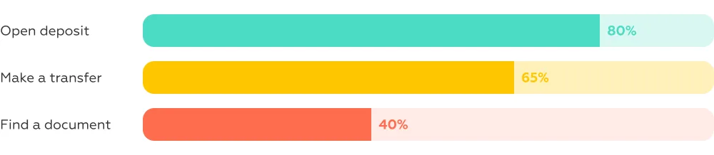
At the product level, this might look acceptable.
At the scenario level, it clearly shows where users struggle — and where revenue leaks.
This is the core advantage of scenario-based measurement: it exposes localized UX failures that remain invisible in aggregate metrics.
Failures rarely come from a single issue. More often, they emerge from a combination of friction points that disrupt the flow.
At the scenario level, even small issues become critical:
For example, in the Evoca Bank app, users reviewing their transaction history cannot see at a glance whether a transaction was incoming or outgoing. They must open each entry individually to understand basic financial activity, adding unnecessary steps and cognitive load. Providing clear visual cues, such as color coding or +/- symbols, ensures users can track inflows and outflows quickly and accurately, improving task completion and overall confidence in the app.

These factors compound. The longer the user stays uncertain, the lower the probability of completion.
This is also where other metrics intersect. For example, poor responsiveness (measured by INP) can interrupt the flow at key moments, reducing Task Success Rate even if the logic of the scenario itself is correct.
Each scenario represents a specific business outcome.
A failed action is not just a UX issue — it’s a measurable loss:
Unlike high-level metrics, Task Success Rate doesn’t require interpretation. It directly shows where the product fails to convert intent into value.
This makes it one of the most operational UX metrics: every percentage point is tied to a real financial outcome.
Products have evolved into systems of interconnected flows rather than single linear journeys. A single feature often includes multiple scenarios, each with its own success curve.
As a result, UX no longer “fails globally.” It fails in specific points of interaction.
This creates a paradox: a product can show strong overall metrics — including satisfaction or NPS — while underperforming in critical, revenue-generating flows. Without scenario-level measurement, these gaps remain hidden.
Leading companies have already shifted their focus accordingly. Instead of improving the product as a whole, they optimize individual flows. Platforms like Booking.com continuously refine checkout and booking steps, reducing friction at each stage. In fintech, the same approach is applied to payments and onboarding, where even small improvements in clarity or step reduction can significantly increase conversion.
Task Success Rate and scenario-based Conversion Rate operate at the exact intersection of user behavior and business performance.
They show, with precision, whether users are able to complete what they came for — and whether the product successfully captures that value.
Conversion is not a product-level metric — it is the sum of successful user scenarios. Revenue is lost not across the product, but within specific broken user flows. Task success rate is the most direct UX indicator of business performance. Measuring conversion at the scenario level reveals UX gaps that remain invisible in aggregate metrics.
In the environment of 2026, UX is no longer only about revenue — it also shapes the unit economics of the product. Where previously teams focused on increasing transactions and retention, a growing portion of expense now comes from supporting and serving users as they interact with the system. Every task a user completes, or fails to complete, carries a measurable operational cost that directly affects margin, scalability, and long‑term profitability.
CtS is one of the few UX Metrics that directly translates UX quality into operational cost. Cost‑to‑Serve measures the resources required to enable a user to complete a task — whether that happens autonomously inside the product, or through contact with support teams, or through manual intervention by operational staff. Operational impact in a UX context assesses how design quality influences the workload of teams, the efficiency of workflows, and the overall scalability of service delivery.
This shift is driven by two structural forces: the rising complexity of digital products, and the rising cost of human‑mediated support. Poor UX doesn’t just create friction for users — it creates work for people inside the organization.
Operational expense isn’t abstract — it manifests in concrete, per‑task costs that scale with usage:
According to industry analysis, a self‑service contact can cost around $1.84, while an agent‑assisted contact averages about $13.50, roughly 7× higher in expense. This gap is exactly where UX plays its economic role: better design shifts work away from expensive channels toward scalable ones.
When systems fail users early in a flow, they generate inquiries, tickets, and manual work that scale with the user base. In many teams, support tickets are growing faster than revenue because the product’s complexity outpaces its automation, forcing people into support channels with rising costs per interaction.
This cost disconnect demonstrates why UX must be treated as an operational lever, not just a behavioral metric.
Operational cost is fundamentally a function of how many interactions require human or manual intervention versus how many resolve through self‑guided paths. UX influences this balance through several factors:
When any of these breakdowns occur, users escalate to human support or require manual processing, and cost per task rises dramatically.
Some user flows are more sensitive to cost‑to‑serve inefficiencies because they represent high‑value or complex interactions. In enterprise contexts, these are the flows where support labor is most expensive and user frustration hits hardest:
High‑impact scenarios with high operational risk
For example, in the Robinhood app, a user wanting to understand commission fees for a specific stock cannot copy the stock’s ticker or name directly from the app. This forces the user to rely on memory and manually type the identifier when contacting support, creating room for errors and extra effort. TradingView addresses this elegantly: a "Share" button in the top-right corner lets users share ticker details instantly, reducing errors, streamlining communication, and lowering support demand. Small design decisions like this multiply operational costs when ignored at scale.
Medium‑impact scenarios
What makes these scenarios expensive isn’t just manual support volume — it’s the repetition and predictability of issues. A poor document upload flow or a confusing onboarding screen doesn’t generate one ticket: it generates thousands, each with a human cost that could have been avoided.
Research across multiple industries shows how dramatically self‑service can shift cost curves: organizations report 30–50% reduction in support costs thanks to effective self‑service systems, and significant decreases in handle time and agent workload. Another dataset finds that self‑service portals can cut routine support loads, increase first‑contact resolution, and free agents to handle more complex issues, boosting productivity and lowering backlog.
This isn’t theoretical: companies that invest in digital self‑service consistently see lower support headcount needs and better distribution of labor — meaning less manual work per user and fewer operational overhead issues. These efficiencies compound as the user base grows.
The cost‑to‑serve metric became critical in 2026 for a few reasons:
AI alone doesn’t reduce cost if the UX paths are broken; it only automates or magnifies existing flows. What actually lowers operational expense is better UX that deflects unnecessary work and prevents escalation.
Cost‑to‑serve makes the connection between UX and unit economics explicit. Higher costs per task mean lower margins and slower growth. That relation can be written as:
UX directly determines how much it costs to serve each user and complete each task. Every support request is not just a UX issue — it is a measurable operational cost. Products with low cost‑to‑serve scale efficiently, while poor UX leads to exponential cost growth. Improving UX is one of the most effective ways to increase product margins without changing pricing.
Together, these UX Metrics define how digital products generate revenue and control costs in 2026.
UX is no longer a separate layer of the product — it is embedded directly into product economics. Each UX metric now has a tangible impact on revenue, cost, and operational efficiency, and looking at them in isolation misses the bigger picture. Evaluating metrics as a system allows organizations to connect user experience with business outcomes and scale effectively.
Together, these metrics describe the full user journey — from first interaction to business outcome.
In 2026, UX impacts not only satisfaction but also economic performance. The gap between organizations that systematically measure and act on these metrics and those that do not is widening: leaders optimize flows, reduce costs, and accelerate revenue, while laggards accumulate inefficiencies that directly affect margins and scalability.
In 2026, UX metrics are not merely indicators of usability — they form the foundation of product performance, growth, and scalability.
What are UX metrics?
UX metrics are measurable indicators that show how effectively users interact with a product and achieve their goals. In 2026, they go beyond usability and satisfaction — they reflect how well a product performs in terms of speed, clarity, and outcome delivery. Metrics like INP, Time-to-Value, Task Success Rate, and Support Deflection help quantify not just the experience itself, but its impact on behavior and business results.
Which UX metrics impact revenue?
The most direct impact on revenue comes from metrics tied to user actions and completed scenarios. Conversion Rate and Task Success Rate determine how many users actually complete value-generating actions (payments, purchases, subscriptions). Time-to-Value influences how quickly users reach activation, while INP affects interaction confidence and flow continuity. Together, these metrics define how efficiently user intent is converted into revenue.
How to measure UX in enterprise products?
Effective measurement starts at the scenario level, not the product level. Instead of tracking aggregate metrics, enterprise teams should break down key user flows (e.g., onboarding, transactions, document retrieval) and measure performance within each of them. This includes tracking completion rates, time to complete tasks, error rates, and dependency on support. Combining behavioral metrics with operational ones (like Cost-to-Serve) provides a full picture of both user experience and business efficiency.
What is time-to-value in UX?
Time-to-Value (TTV) is the time it takes for a user to reach their first meaningful outcome after entering a product. It reflects how quickly the product proves its usefulness. A shorter TTV leads to higher activation, better retention, and stronger engagement, while a longer TTV increases the likelihood of drop-off. In modern products, especially in SaaS and fintech, TTV is one of the strongest predictors of adoption and long-term success.
We respond to all messages as soon as possible.
We’ve evolved dozens of successful financial services and are eager to prove that our expertise can be implemented in other industries and around the world. Have a look at our success stories!