
Contents
Regulation is no longer something that lives in legal documents or compliance checklists — it is rapidly becoming part of the product experience itself. This shift is at the core of UX for AI compliance, where regulatory requirements directly shape how users interact with digital products.
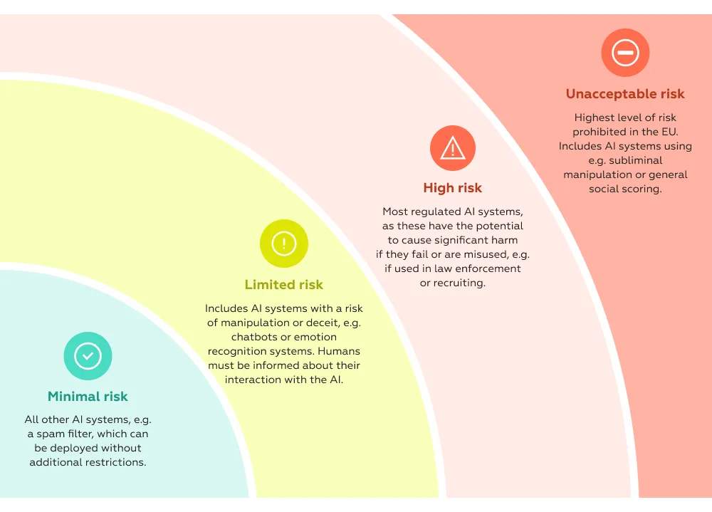
The shift is largely driven by the convergence of two forces: the maturity of EU AI Act and the already entrenched GDPR. Together, they form a dense regulatory layer that directly shapes how digital products behave, communicate, and make decisions. The AI Act alone introduces a binding, risk-based framework for AI systems across the EU, with strict obligations depending on use cases and penalties reaching up to €35 million or 7% of global turnover. At the same time, it does not operate in isolation — it sits alongside GDPR and other existing digital regulations, creating cumulative compliance pressure on products rather than isolated requirements.
What changes fundamentally is where compliance happens. It is no longer just backend governance — it becomes visible in the interface.
AI regulation expands the number of “compliance-critical” moments inside products — a shift that sits at the heart of UX for AI compliance. What used to be occasional legal touchpoints — like accepting terms or passing KYC — is now embedded across everyday interactions:
These are not edge scenarios. They are often core revenue or activation flows.
The implication is structural: every time a system makes or supports a decision, it may now require explanation, traceability, or user consent — all of which become part of regulatory UX. The AI Act explicitly targets high-risk use cases in domains like finance, healthcare, and employment, where decisions directly affect users’ rights and opportunities. Even lower-risk systems are subject to transparency obligations — for example, users must be informed when they are interacting with AI..
In practice, this turns compliance into a UX problem at scale.
This is exactly where the real challenge emerges.
Regulation demands:
Products, on the other hand, are optimized for:
These goals increasingly collide.
Every additional explanation screen, consent checkbox, or verification step introduces potential drop-off. But removing or hiding them is no longer an option — not only because of legal risk, but because transparency itself becomes a trust requirement. The AI Act explicitly positions transparency, traceability, and human oversight as core principles of compliant AI systems.
This creates a new design paradox:
The same interface must simultaneously reduce friction and increase accountability.
Historically, compliance could be “contained” — handled by legal teams, documented, and enforced through policies. That model is breaking down.
AI regulation forces product teams to answer questions that cannot be solved outside the interface — questions that sit at the core of UX for AI compliance:
In other words, compliance is no longer something you add to a product.
It is something you have to design for from the start — as part of a broader regulatory UX approach.
If regulatory UX is becoming part of the product, the weak spots are already visible — especially in the moments where compliance directly interrupts user intent.
These breakdowns are rarely about missing functionality. More often, they stem from how compliance logic is translated (or not translated) into the interface — a core challenge in UX for AI compliance.
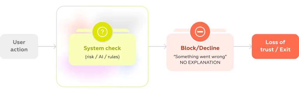
One of the most common failure points is decision opacity.
A payment gets declined.
An account is suddenly restricted.
A feature becomes unavailable.
From a compliance perspective, these actions are often justified — triggered by fraud models, risk scoring, or regulatory checks. But from the user’s perspective, they feel arbitrary.
Instead of clarity, users see generic messages:
This is where trust erodes the fastest — and where UX for AI compliance becomes critical. Research across financial services consistently shows that lack of explanation in critical moments is one of the strongest drivers of user frustration and churn, especially in high-stakes scenarios like payments or onboarding (industry studies, e.g. McKinsey, Deloitte).
The issue isn’t the decision itself — it’s the absence of meaningful, structured explanation.
Regulation requires transparency. Products often respond by adding more of it — everywhere.
Individually, each element is compliant. Together, they create cognitive overload.
Users are pushed through dense screens filled with legal language, multiple toggles, and unclear implications. Instead of informed consent, the result is mechanical behavior: scroll, accept, continue.
This is a well-documented pattern under the General Data Protection Regulation, where excessive or poorly designed consent interfaces reduce both comprehension and actual control.
In practice, transparency turns into friction — without delivering real understanding.
Few flows illustrate the UX–AI compliance conflict as clearly as KYC and identity verification.
These flows are inherently complex:
From a regulatory standpoint, each step is necessary. From a user standpoint, the experience often feels unpredictable and fragile.
Common issues include:
Industry benchmarks show that onboarding flows with heavy verification can lose a significant share of users before completion — sometimes over 20–30% depending on complexity and market (various fintech onboarding studies, including insights from Deloitte).
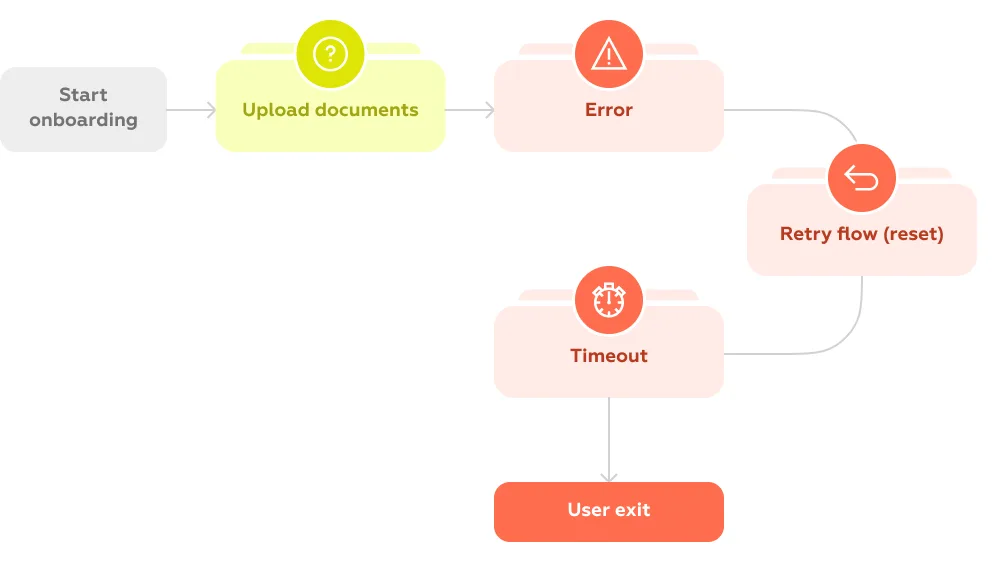
The core problem is that compliance steps are designed as checks, not as user journeys.
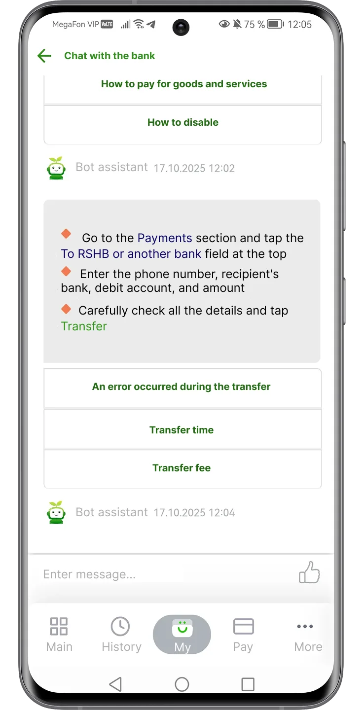
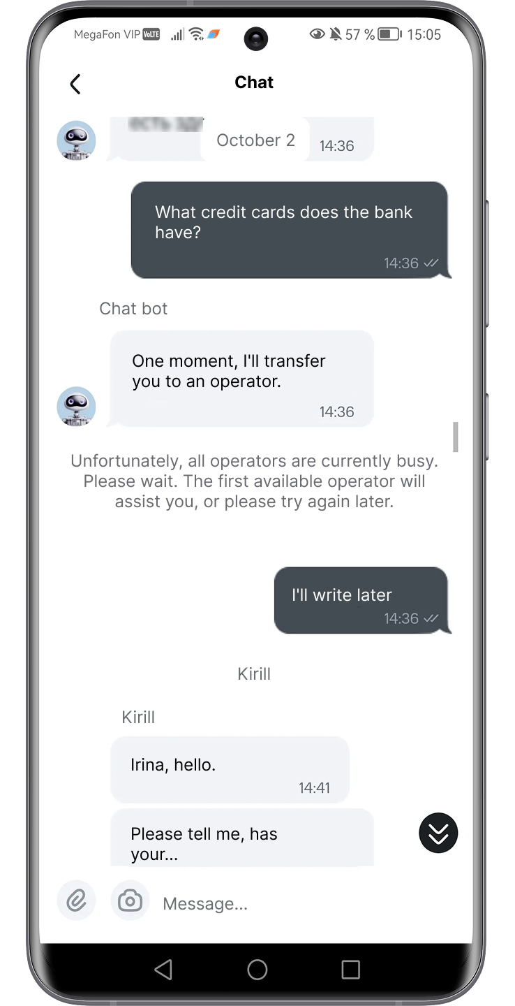
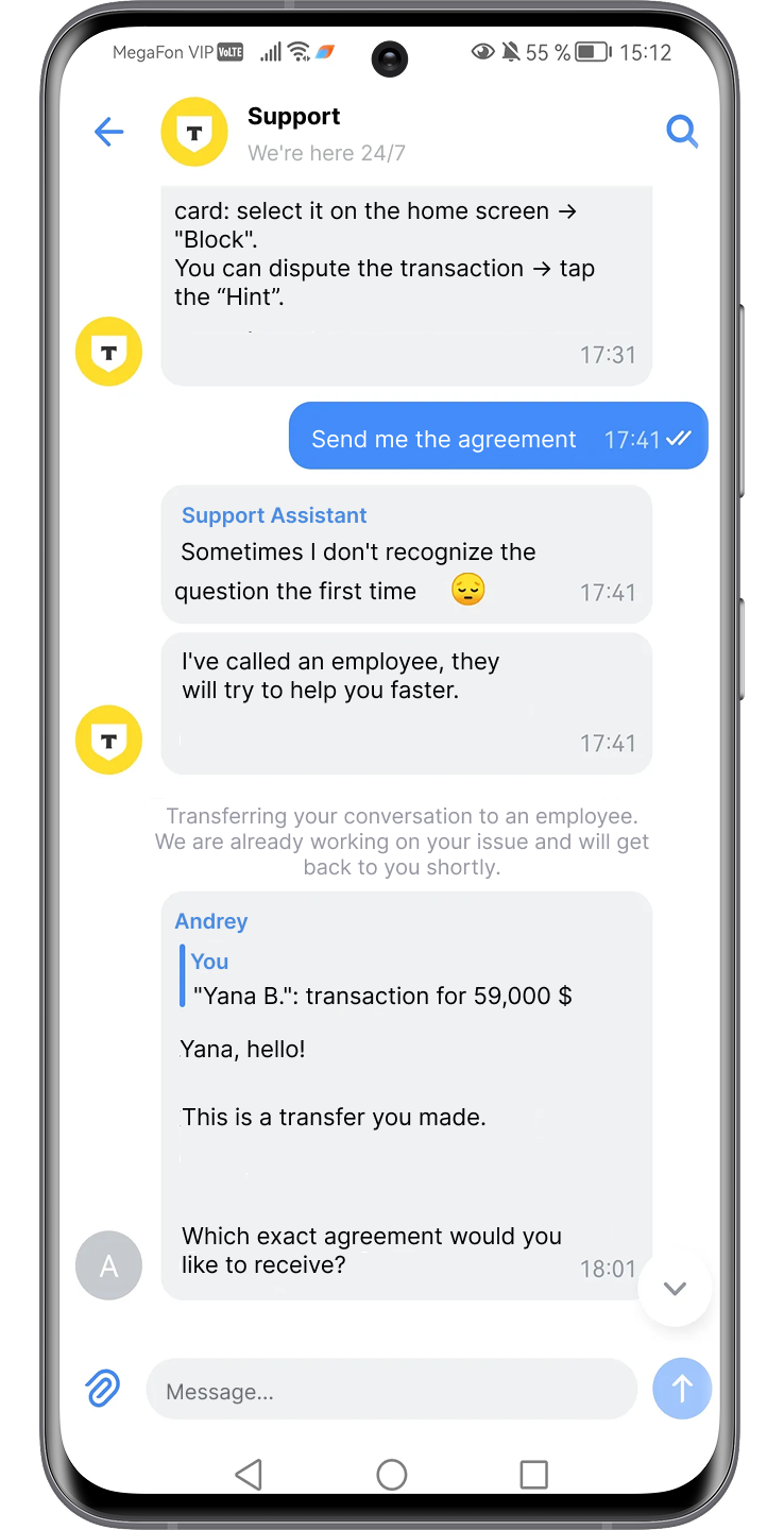
AI-powered support is supposed to simplify complex interactions. In compliance-heavy scenarios, it often does the opposite — exposing key gaps in UX for AI compliance.
When users ask:
Chatbots frequently respond with:
This creates a dead end: the system that made the decision cannot explain it in a usable way.
Under the EU AI Act, this becomes a structural issue. Users must be informed when interacting with AI and, in many cases, be able to understand the reasoning behind decisions — especially in higher-risk contexts. These requirements are a core part of regulatory UX.
Yet most conversational interfaces are not designed for explainability. They are designed for deflection.
Across these scenarios, a consistent pattern emerges:
AI Compliance is implemented as a system requirement, but experienced as a user disruption.
The gap lies in translation.
Legal, risk, and engineering teams define what must happen.
UX determines how (or whether) it makes sense to the user.
Right now, that translation layer is often missing — and that is exactly where regulatory UX needs to evolve next.
Once compliance becomes part of the product, the role of UX shifts from simplification to mediation — between regulatory requirements, system logic, and user expectations.
The challenge is not just to “make things usable,” but to make complex, constrained interactions feel understandable, controllable, and fair.
Regulation increasingly requires systems to disclose what they do — a core challenge in UX for AI compliance. But visibility alone is not enough.
Telling a user “this decision was made automatically” does little to build trust. What matters is whether the user can grasp:
This becomes especially critical in AI-assisted decisions — from fraud checks to content moderation — where outcomes directly affect user access or opportunities.
Under the EU AI Act, transparency is a formal requirement, particularly for higher-risk systems. But from a UX perspective, the real task is translation: turning system logic into explanations that are concise, contextual, and actionable.
Not full technical disclosure — but just enough clarity to make the outcome feel rational — which is exactly what strong regulatory UX aims to achieve.
Compliance flows often treat users as passive participants: accept, confirm, proceed.
But regulatory direction — reinforced by both the AI Act and the General Data Protection Regulation — increasingly emphasizes user agency.
In UX terms, this means every critical moment should answer a simple question:
What can the user do next?
Effective patterns include:
Without these options, even a compliant flow feels rigid and unfair. With them, the same flow becomes navigable.
Control doesn’t eliminate friction — but it makes friction acceptable.
A common misconception is that compliance inevitably leads to worse UX. In reality, strong UX for AI compliance shows the opposite.
In reality, the problem is not the presence of constraints — it’s how they are distributed.
Instead of stacking requirements into single, heavy steps (long consent screens, dense verification forms), leading products:
This approach aligns with both usability principles and regulatory expectations. For example, GDPR explicitly encourages clarity and accessibility of information, not volume.
The goal is not to remove friction entirely, but to reshape it into manageable, predictable moments.
Perhaps the most important shift is structural.
In many products today, compliance appears as an interruption:
This separation creates a mental break: “I was doing something — now I’m dealing with the system.”
Regulatory UX takes a different approach. It treats compliance as part of the core journey:
Instead of pausing the experience, compliance becomes one of its layers.
Across all these tasks, a broader pattern emerges:
The goal is not just to meet regulatory requirements, but to design how those requirements are experienced.
That distinction is where products either lose users — or build trust.
Because in a regulated environment, good UX is no longer just about ease of use.
It becomes a mechanism for making complex systems feel legible, fair, and reliable.
If regulatory UX defines what needs to happen, patterns define how it shows up in the interface.
Across products dealing with AI decisions, verification, and compliance checks, a set of recurring solutions is starting to emerge. They are not formalized yet as a single discipline — but in practice, they form the foundation of AI compliance UX.
At the core of compliant AI experiences is a simple but difficult task: explaining decisions.
Users don’t need model architecture or probability scores. They need a clear answer to:
Why did this happen?
Effective patterns focus on:
This aligns directly with transparency expectations in the EU AI Act, especially for systems that impact user rights or access.
The key is framing: not technical accuracy alone, but perceived fairness and clarity.
AI Compliance often comes with dense legal and technical detail. Showing all of it upfront overwhelms users — hiding it entirely breaks transparency.
Progressive disclosure resolves this tension by structuring information in layers:
This pattern is widely used in GDPR-driven consent design under the General Data Protection Regulation, but becomes even more critical in AI scenarios where explanations can quickly become complex.
The goal is to let users choose their level of depth without blocking the main task.
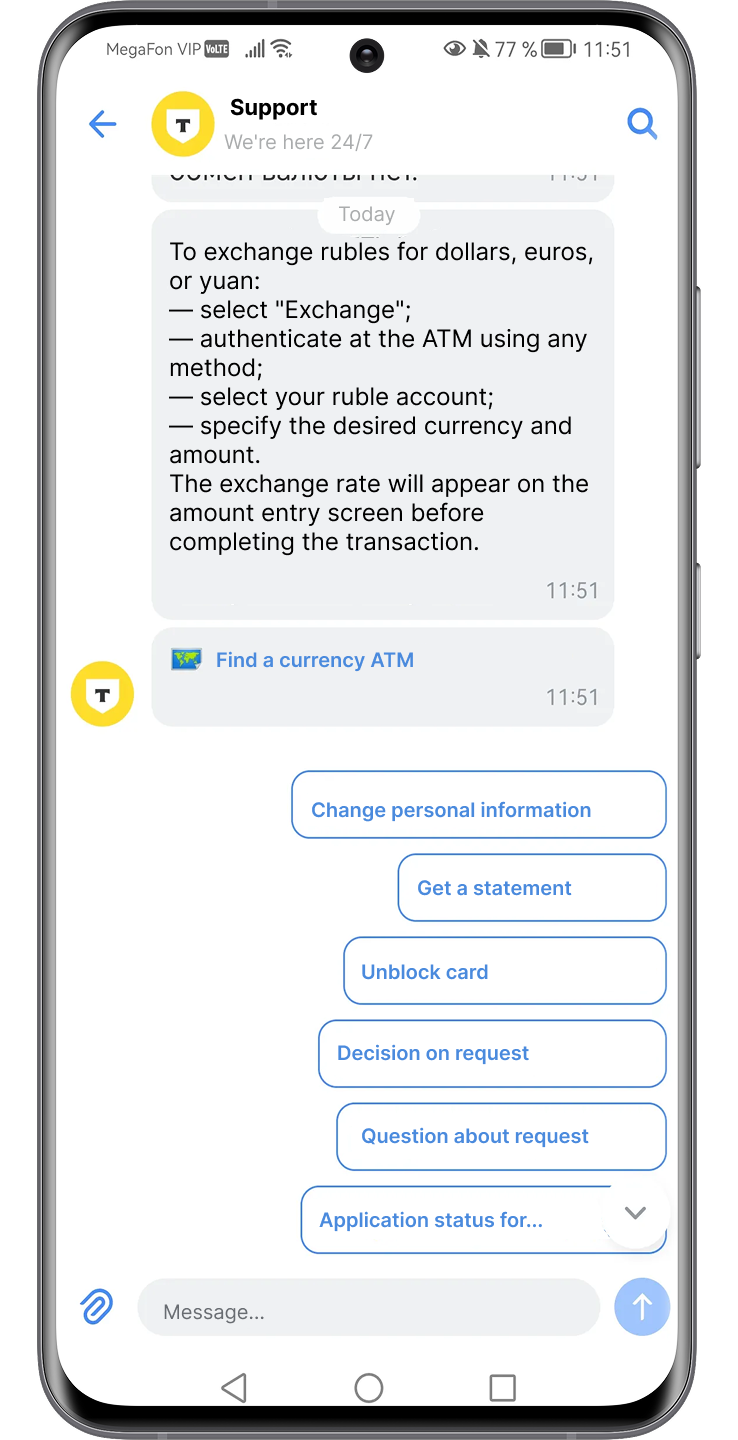
A compliant interface should not trap users in a single path.
Instead of binary “accept / decline” mechanics, effective UX introduces a set of control options that reflect real user needs:
These patterns operationalize the idea of user agency embedded in modern regulation. They also reduce frustration by turning blocked states into decision points rather than dead ends.
Compliance-heavy systems fail more often than typical flows — not because they are broken, but because they are restrictive by design.
This makes fallback scenarios critical — especially in the context of AI compliance UX.
In verification and chatbot flows especially, users need:
Without this, even a minor issue can lead to complete drop-off.
This is particularly visible in AI-driven support, where chatbots often cannot resolve compliance-related questions. Instead of looping users through generic answers, products need explicit recovery paths — including seamless escalation to human support when necessary.
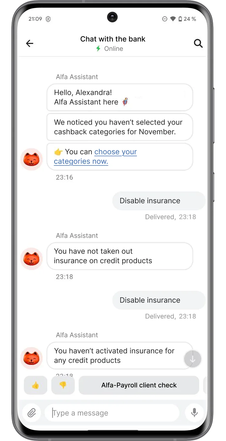
AI systems often operate behind the scenes. Users don’t see the process — only the outcome.
Trust signals help bridge that gap by making system state visible:
These signals don’t just inform — they reduce anxiety in moments where users would otherwise feel uncertain or powerless.
They also reinforce a critical perception: that the system is structured, predictable, and accountable.
Taken together, these patterns do more than ensure compliance.
They shape how users interpret the system:
In a regulated environment, this becomes a competitive differentiator.
Because while many products will meet the same legal requirements, far fewer will succeed in making those requirements feel clear, navigable, and human-centered.
While regulatory UX challenges are often discussed in abstract terms, chatbot interactions reveal how these problems actually play out in real products.
The Markswebb Chatbot Rank 2025 study provides a scenario-based view of how banks handle everyday and high-stakes user requests — including exactly the kinds of compliance-heavy situations where UX tends to break: card blocking, suspicious transactions, identity checks, and sensitive support queries. These scenarios are a practical reflection of UX for AI compliance in action.
The research focuses on real customer intents — not edge cases, but routine situations:
These are inherently compliance-driven moments, even if users don’t perceive them as such.
In strong implementations, chatbots act as a resolution layer — users can complete tasks like blocking a card or confirming a transaction directly in chat, without escalation. In weaker ones, even simple requests fail to resolve, forcing users to switch channels or repeat actions elsewhere.
The difference is not just functional — it’s deeply tied to how decisions and processes are communicated.
Across evaluated chatbots, several recurring breakdowns emerge — especially in scenarios involving restrictions, risk checks, or unclear outcomes.
1. Vague or circular explanations
Instead of explaining why something happened, bots often respond with generic statements or loop back to the same phrasing. This creates “conversation dead ends,” where users cannot move forward.
2. Misinterpretation of critical intent
In high-stress situations (e.g. “my card is missing”), bots frequently fail to recognize variations in phrasing, leading to irrelevant responses or delays
3. Lack of recovery paths
When something goes wrong, many bots either:

This is especially problematic in compliance contexts, where failure is expected — but recovery is not designed.
4. Context loss and repetition
Users are asked to re-enter information already provided, breaking continuity and increasing friction.
Taken together, these issues reflect a core gap: chatbots execute processes, but struggle to explain and guide them.
The study shows a significant gap — more than 2× in overall performance — between leading and lagging chatbot implementations.
This gap becomes most visible in compliance-heavy scenarios.
Leading chatbots:
Lagging chatbots:
In other words, leaders treat compliance interactions as flows, while laggards treat them as responses.
The contrast becomes especially clear in specific design patterns identified in the research:
These patterns directly map to regulatory UX requirements: explanation, control, and predictability.
Chatbot Rank makes one thing clear:
The biggest failures in compliance UX are not caused by regulation — but by how poorly systems communicate under constraint.
Chatbots sit at the intersection of AI decisions, user intent, and compliance logic. When they fail, users experience regulation as confusion. When they work, regulation becomes almost invisible — integrated into a clear, guided interaction.
That makes conversational interfaces one of the most revealing — and most critical — frontiers for UX in AI compliance.
Designing regulatory UX is only half the challenge. The other half is understanding how well it actually works — not in theory, but in real user scenarios shaped by constraints, uncertainty, and risk.
Traditional usability metrics are not enough here. Compliance-heavy interactions require a more structured, scenario-driven evaluation approach.
Regulatory UX cannot be meaningfully evaluated in isolation or through generic heuristics. It needs to be tested in specific, high-friction situations where compliance logic is triggered.
Typical scenarios include:
This approach is widely used in benchmarking studies like Chatbot Rank 2025, where products are evaluated based on their ability to resolve realistic user intents end-to-end.
You’re not evaluating features — you’re evaluating how the system behaves under constraint.

Across compliance-driven flows, four criteria consistently determine UX quality:
Clarity
Can the user understand what happened and why?
Are explanations specific, contextual, and actionable?
Continuity
Does the experience maintain flow, or does it break into disconnected steps?
Are transitions (e.g. to verification or support) smooth and predictable?
Control
Does the user have meaningful options to proceed?
Can they retry, fix, escalate, or choose an alternative path?
Recovery
What happens when something goes wrong?
Is there a clear way forward — or a dead end?
These criteria reflect a shift from classic usability to resilience and transparency.
Regulatory UX is still an emerging field, which makes internal evaluation insufficient on its own.
Without external benchmarks, it’s difficult to answer:
Comparative analysis helps identify not just absolute problems, but relative weaknesses — the gaps that directly impact competitiveness.
Regulatory UX is often perceived as a cost center — something that slows down funnels and adds friction.
But when measured properly, its impact becomes visible:
Research from organizations like McKinsey & Company shows that improving critical journeys directly correlates with higher completion rates and customer satisfaction.
Regulatory UX cannot be evaluated as a checkbox exercise.
It requires:
In the context of the EU AI Act, this turns UX into a measurable layer of compliance — and a real competitive advantage.
Regulation is no longer just a constraint to work around. It is becoming a design space — one that directly affects how users perceive, trust, and interact with digital products.
As the EU AI Act and the General Data Protection Regulation reshape requirements, the difference between products will not be defined by compliance alone — but by how that compliance is experienced.
Most companies will meet the same regulatory standards.
Far fewer will:
This creates a clear divide.
In regulated environments, UX becomes the layer that turns mandatory complexity into either friction — or trust.
Products that invest in regulatory UX early gain an advantage not just in usability, but in:
One of the biggest blockers today is organizational, not technical.
Compliance is typically owned by legal teams.
Implementation sits with product and engineering.
User experience is treated as a final layer — if considered at all.
This model doesn’t work anymore.
Regulatory UX requires cross-functional ownership:
Without this collaboration, the result is predictable: compliant systems that users don’t understand.
Traditionally, compliance flows are built in a linear way:
This leads to heavy, fragmented experiences.
A more effective approach reverses the logic:
The shift is subtle but critical.
Compliance is no longer something you add to the interface.
It is something you design through the interface.
Regulatory pressure will only increase — not just in AI, but across identity, payments, data usage, and digital trust.
The question is no longer whether products need to adapt.
It’s whether they can do it without breaking the experience.
At Markswebb, we work with product teams to evaluate and design compliance-heavy user journeys — from onboarding and KYC to AI-driven interactions and support flows.
If you’re facing growing regulatory pressure and want to turn it into a product advantage — let’s talk.
We respond to all messages as soon as possible.
We’ve evolved dozens of successful financial services and are eager to prove that our expertise can be implemented in other industries and around the world. Have a look at our success stories!