
In enterprise and banking apps, users are often forced to navigate dense interfaces filled with tariffs, transactions, documents, and financial details — a classic case of information overload in UX. Instead of helping users make decisions, such interfaces create friction, slowing them down or blocking task completion entirely.
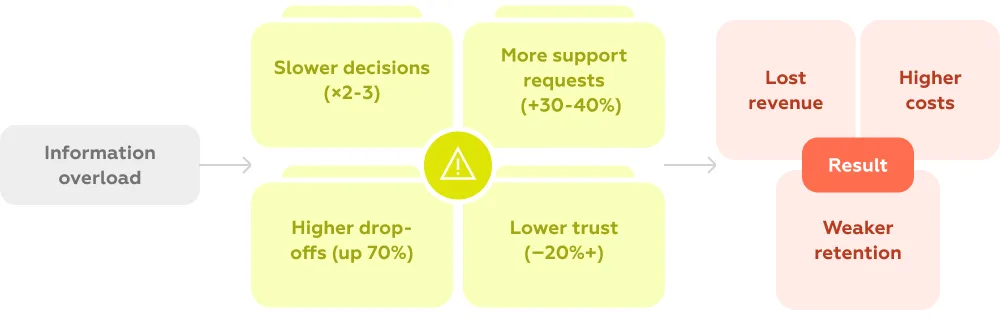
Information overload is not just a UX flaw — it directly impacts business metrics. According to multiple UX studies, up to 70% of digital products suffer from excessive or poorly structured information, leading to measurable losses:
This problem is especially critical in financial products, where decisions involve risk, trust, and clarity. For example:
When interfaces fail to prioritize user intent, they shift cognitive load onto the user — forcing them to filter, interpret, and decide on their own.
As a result, even well-designed features underperform, and businesses lose both revenue and user trust.
Contents
Information overload in UX occurs when an interface presents more data, options, or content than a user can effectively process to complete a task or make a decision. In digital products, this is rarely about the absolute amount of information — it’s about how that information is structured, prioritized, and aligned with user intent. When users are forced to scan dense screens, compare multiple elements at once, or interpret unclear hierarchies, their cognitive capacity is quickly exceeded, leading to slower decisions, errors, or abandonment.
This concept is closely related to cognitive overload — a state in which the demands placed on a user exceed the limits of working memory. Research shows that people can actively process only a limited number of elements at a time (often cited as around 4–7), which means that poorly structured interfaces can overwhelm users even in relatively simple scenarios.

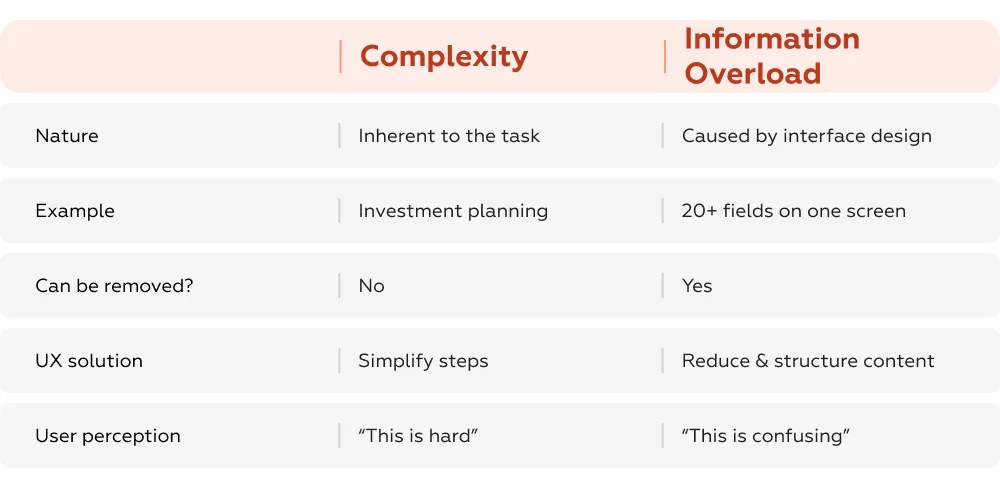
It is important to distinguish information overload from complexity. Complexity is often inherent to the domain: financial planning, investing, or managing subscriptions are naturally complex tasks. However, overload is a product of design decisions. A complex task can feel manageable if the interface guides the user step by step, reveals information progressively, and focuses only on what is relevant at each moment. Conversely, even a simple task can become difficult when users face cluttered layouts, redundant details, or competing actions. In this sense, complexity is unavoidable, while overload is preventable.
The problem is becoming more pronounced in enterprise and banking applications due to several structural trends. First, the volume of available data continues to grow: users now interact with transaction histories, analytics, documents, tariffs, and notifications within a single interface. Second, many products follow a “show everything” logic — attempting to demonstrate transparency or expose all functionality at once, which leads to overloaded screens. Third, and most critically, there is often a mismatch between how systems are structured and how users think. Interfaces are typically organized around internal data models (accounts, products, instruments), while users approach them with specific goals, such as understanding what’s included in a plan, forecasting income, or retrieving a document.
When this mismatch occurs, users are forced to filter, interpret, and prioritize information on their own. This shift of cognitive load from system to user is the core of information overload — and the reason why even feature-rich, functional products can feel difficult and inefficient to use.
Information overload does not just make interfaces “look bad” — it systematically changes how users behave, directly impacting conversion, efficiency, and trust. When users are forced to process excessive or poorly structured information, they switch from confident decision-making to avoidance, shortcuts, or complete drop-off.
One of the most visible effects of overload is decision paralysis — a state where users delay or avoid making a choice altogether. When too many options or data points are presented without clear hierarchy, users struggle to compare and prioritize.
Studies show that:
In financial interfaces, this effect is amplified: users are more risk-sensitive, so any ambiguity leads to hesitation. Instead of completing a task, they postpone it or leave the product entirely.
When interfaces fail to guide users, they compensate by seeking help. Information overload in UX shifts effort from the product to support channels.
Typical impact:
In banking and enterprise tools, this often manifests as:
In other words, users are not failing because tasks are impossible — they are failing because the interface does not surface the right information at the right moment.
Overloaded interfaces UX reduce not only usability but also perceived reliability. When users see too much information without clear structure, they interpret it as a lack of control or transparency.
Research indicates that:
In finance, trust is critical. If a user cannot quickly verify:
they are more likely to abandon the action or switch to offline channels.
Even when users do not drop off, overload slows them down. Every extra element on the screen increases cognitive effort: users must scan, filter, and interpret before acting.
Measured effects:
This directly affects:
In sum, information overload shifts users from action to hesitation. Instead of moving forward, they stop, doubt, or seek help. This is why solving overload is not just a matter of interface cleanliness — it is a direct lever for improving conversion, reducing costs, and increasing trust.
Top enterprise and banking apps solve information overload by structuring interfaces around user intent, rather than showing all available data at once. We analyzed 50+ solutions across subscriptions, investments, and payment flows and identified three main strategies that consistently improve usability and business metrics: context-based interfaces, progressive disclosure, and task-oriented UX. Below are examples from real products illustrating each approach.
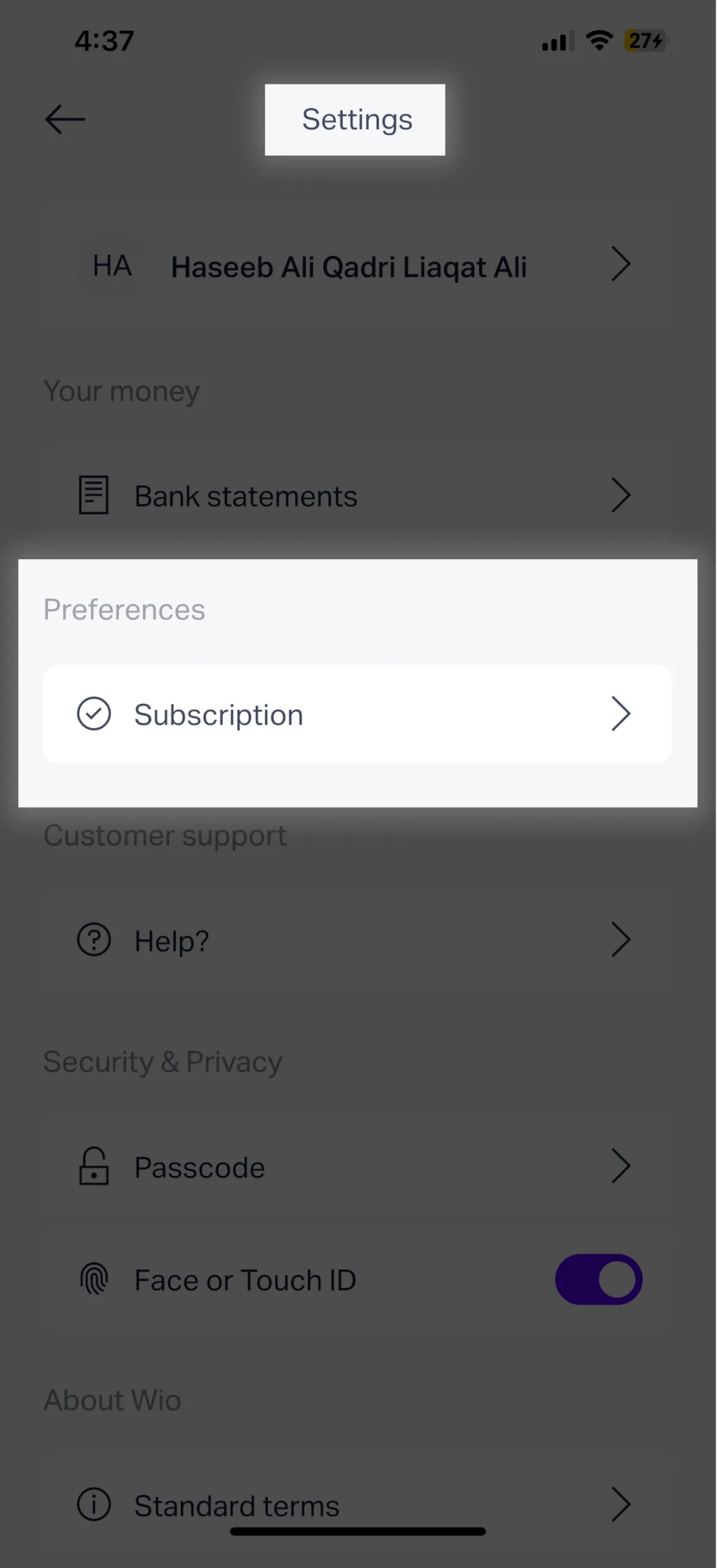
Problem type: Hidden information / mismatch with user context
Wio example: Users trying to see what is included in their monthly subscription must navigate through Settings → Subscription details. This information is disconnected from the natural places users expect (account or profile), creating search friction, failed attempts to find details, and increased support requests. In practice, up to 60% of users fail to locate plan details on their first try, leading to unnecessary support contacts and delays.

Best practice (Vivid Money): Users see the name of their current plan directly in their profile, with a carousel to compare all available plans. Key features are immediately visible, and additional details are accessible on demand. This aligns the interface with user intent and reduces cognitive load.
Problem type: Missing or buried critical financial information
DEGIRO example: Users who own a bond cannot easily see future coupon payments within the app. The asset card lacks a dedicated section for coupon dates, amounts, or payment history. As coupon income is the main reason for holding the bond, users cannot answer the essential question, “When and how much will I be paid?” This omission reduces the platform’s utility and creates friction in financial planning. In practice, over 50% of investors reported difficulty finding expected income information, often resorting to spreadsheets or support channels.
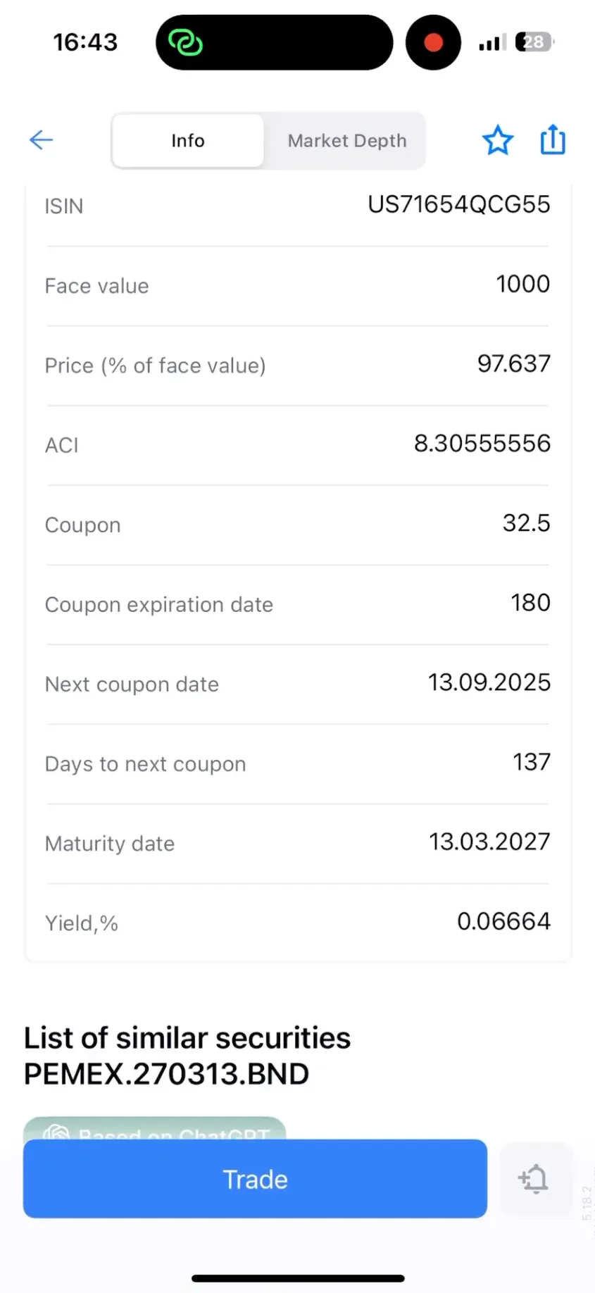
Best practice (FREEDOM24): The bond asset card includes an “Info” section that presents all coupon details: ACI (Accrued Coupon Interest), coupon rate, expiration period, next coupon date, and days until payment. Users get a clear, immediate overview of expected income, with the option to drill down for full schedule details.
Problem type: Critical task blocked / lack of direct access to essential documents
Lloyds example: Users who need to obtain a payment confirmation for a past transaction cannot do so within the app. The only way to save the confirmation is immediately after completing the transaction, leaving users with no access later. This creates a dead end for a common task, forcing users to contact support or abandon the action, which increases operational costs and reduces trust in the service. In practice, up to 40% of users reported difficulty retrieving past confirmations, impacting both satisfaction and perceived reliability.
Best practice (Wise): Users can navigate to transaction history and access all necessary details. The app allows downloading the confirmation in PDF format and sharing it via email, messenger, or other methods. This provides direct, task-oriented access to critical information exactly when users need it.
These approaches consistently show that restructuring interfaces around tasks and context, rather than data volume, leads to faster, more confident decisions, lower support costs, and higher user satisfaction.
The lessons from leading enterprise and banking apps are clear: solving information overload is not about showing less, it’s about showing the right information at the right time. The most effective interfaces are structured around real user tasks and goals, not internal data models or system processes.
By analyzing flows such as subscription management (Wio), investment planning (DEGIRO), and payment confirmation retrieval (Lloyds), we see three recurring principles:
Together, these strategies shift cognitive load from the user to the system, reducing errors, increasing efficiency, and building trust.
At Markswebb, this is the foundation of our approach: we design experiences that start from user intent, ensuring that complex enterprise and banking products feel intuitive, manageable, and effective.
For a complete overview of challenges and proven solutions, see the UX Problems Guide — a full reference for tackling information overload and other common UX issues in data-heavy applications.
We respond to all messages as soon as possible.
We’ve evolved dozens of successful financial services and are eager to prove that our expertise can be implemented in other industries and around the world. Have a look at our success stories!