
European investment services are competing not only by fees and asset range, but by the quality of everyday investor experience. The strongest apps reduce friction at critical moments: when users compare instruments, assess risk, make decisions, and return to their portfolio with confidence.
Contents
European investors do not always need more features. They need clearer journeys, better explanations, and interfaces that help them understand what is happening before they commit money.
In the State of Digital Investment in Europe 2025–2026, Markswebb found that the market is already highly developed, but the digital experience remains uneven. Even leading platforms show gaps in core user scenarios: from account opening and portfolio analysis to order management, risk visibility, and long-term investment planning.
This creates a practical barrier to adoption. Users may have access to stocks, ETFs, crypto, funds, and other instruments, but still struggle to compare options, understand costs, assess risk, or see how each decision affects the whole portfolio. For cautious beginners, this increases fear of mistakes. For deliberate investors, it slows down decision-making. For active traders, weak analytics and fragmented order flows reduce control.
The strongest European apps solve this by turning complexity into guided action. They make costs transparent, explain instruments in context, support portfolio analysis, and help users move from interest to investment without losing confidence.
Many users want to invest, but still perceive the market as complex and risky. If the app does not explain asset dynamics, risks, fees, order types, or portfolio changes in context, users delay the decision or choose a simpler platform.
What this means for product teams:
In a dense market, users can easily switch between banks, brokers, neobrokers, crypto platforms, and hybrid ecosystems. That makes the first product steps business-critical: account opening, verification, funding, and the first investment action.
If these scenarios feel long, unclear, or disconnected, the platform loses the user before the portfolio starts growing.
What this means for product teams:
The European investment market is already mature and highly competitive. Banks, brokers, neobrokers, crypto platforms, robo-advisors, and hybrid financial ecosystems compete for the same user attention, while basic investment access is no longer enough to stand out.
Markswebb’s State of Digital Investment in Europe 2025–2026 shows this shift clearly. The study mapped 316 services across 32 European countries and benchmarked 20 major apps to understand how leading platforms support real investor scenarios: from onboarding and asset discovery to portfolio analysis, trading, and long-term investment decisions.
The findings show that product maturity is uneven. Many services already cover the basic investment journey, but the quality of explanation, comparison, analytics, and decision support still varies significantly. This creates a practical opportunity for product teams: instead of inventing every solution from scratch, they can study proven UX mechanics from leading European services and adapt them to their own product context.
The strongest practices usually solve one of four tasks:
For investment apps, best practices are valuable because they show how to turn a broad product offering into a clearer user journey: fewer dead ends, stronger confidence, and faster movement from interest to action.
In many investment apps, the asset catalogue works like a static list. Users can search, filter, and open asset cards, but they cannot easily compare instruments by the metrics that matter to them.
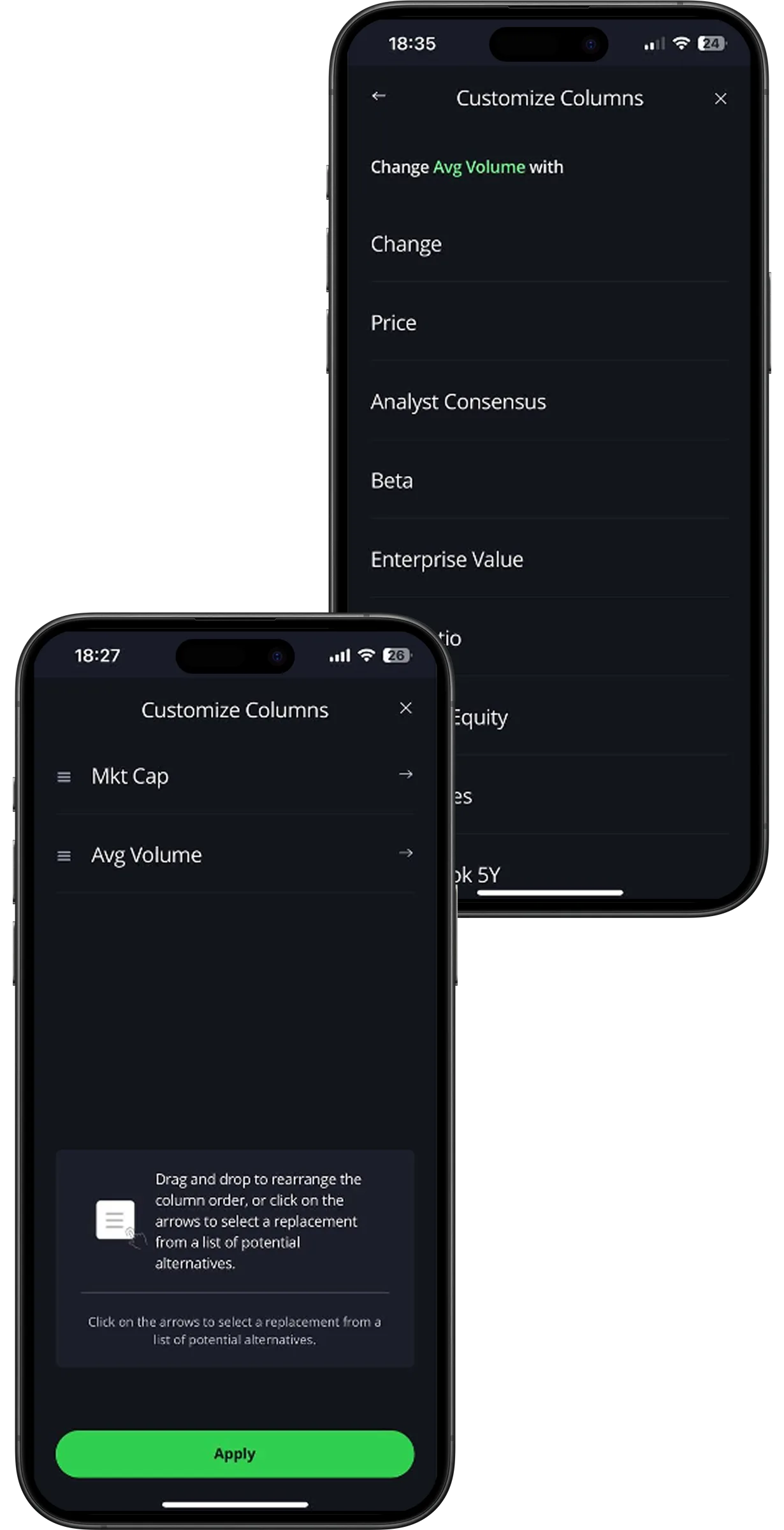
eToro solves this by allowing users to customize the stock catalogue. Users can choose which metrics to display, such as P/E ratio, market capitalization, volume, and other indicators. They can also change the order of columns and save the configuration.
This reduces cognitive load and helps investors compare assets without constantly opening separate pages. The catalogue becomes a real analysis workspace, not just a navigation layer.
Give users control over the data they see. For active investors, personalization of analytical views can be more valuable than adding another generic filter.
Order placement is one of the most sensitive moments in an investment journey. Users need to understand what action they are taking, what will happen next, and what risks are involved.
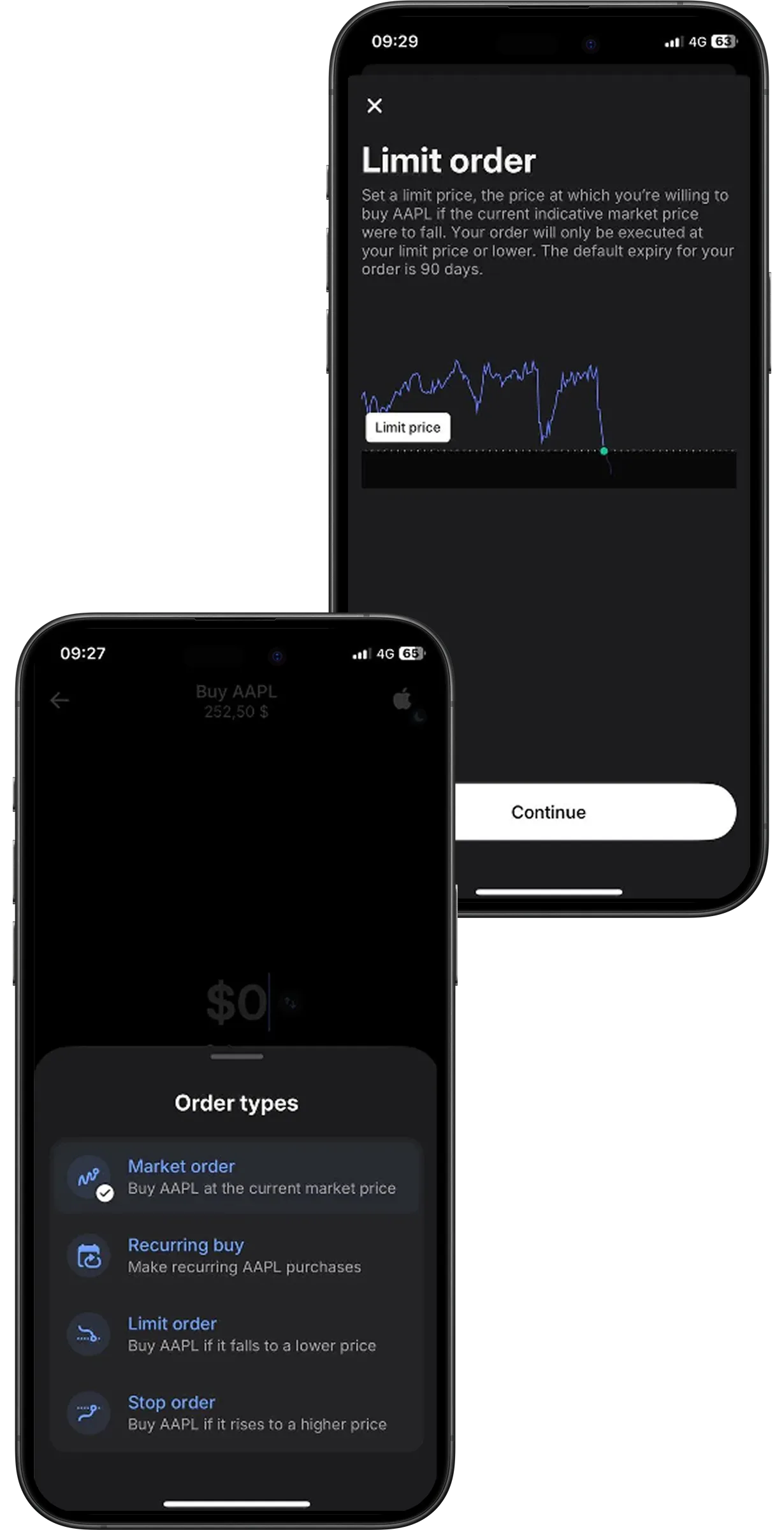
Revolut supports this scenario with short explanations of order types directly in the trade flow. Each order type is accompanied by a simple one-line description that helps users understand the difference without leaving the screen.
The user does not have to interrupt the transaction, search for help, or guess the meaning of a financial term. This lowers anxiety and supports faster, more confident decision-making.
Explain complex investment actions at the moment of choice. The best place for education is often not a separate knowledge base, but the exact screen where the user needs to decide.
Many apps show price charts, historical dynamics, and basic asset data. But for many users, raw data is not enough. They need help understanding what the data means.
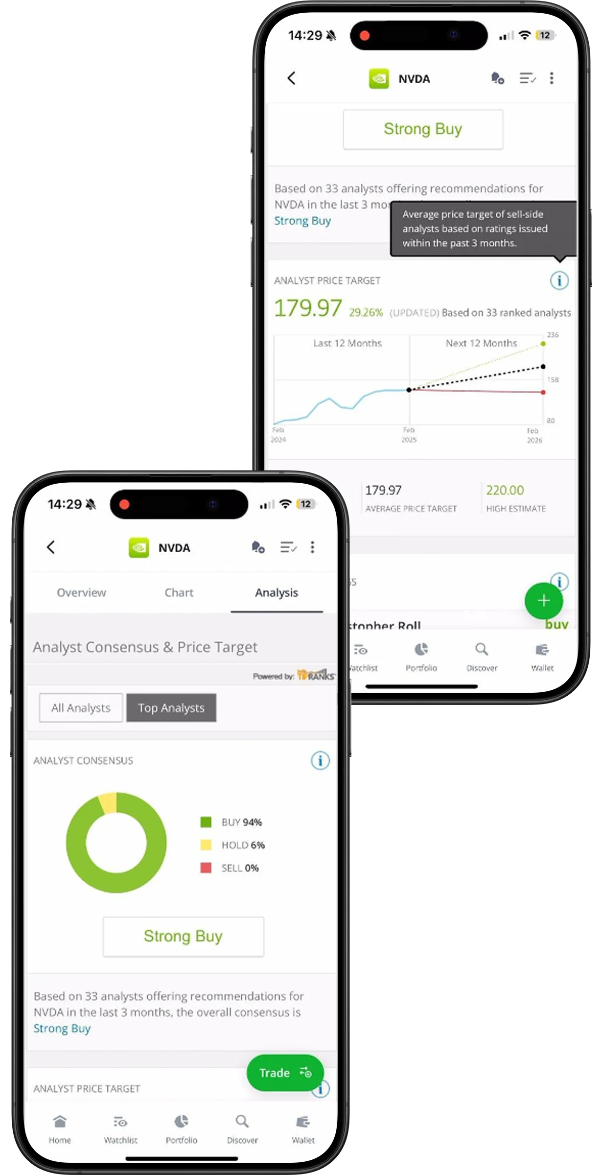
eToro adds an interpretation layer to asset analytics. In the asset card, users can see analyst consensus, recommendation distribution, target price ranges, and forecast dynamics. The service also separates estimates from all analysts and top analysts, helping users assess data reliability.
This gives users a clearer basis for action. Instead of switching between the app, external media, analyst websites, and spreadsheets, users can evaluate an asset within one interface.
Analytics should not stop at visualization. Strong investment UX helps users understand signals, compare perspectives, and connect data to a decision.
Forecasting is usually difficult for retail investors because it combines market data, analyst opinions, volatility, and time horizons.
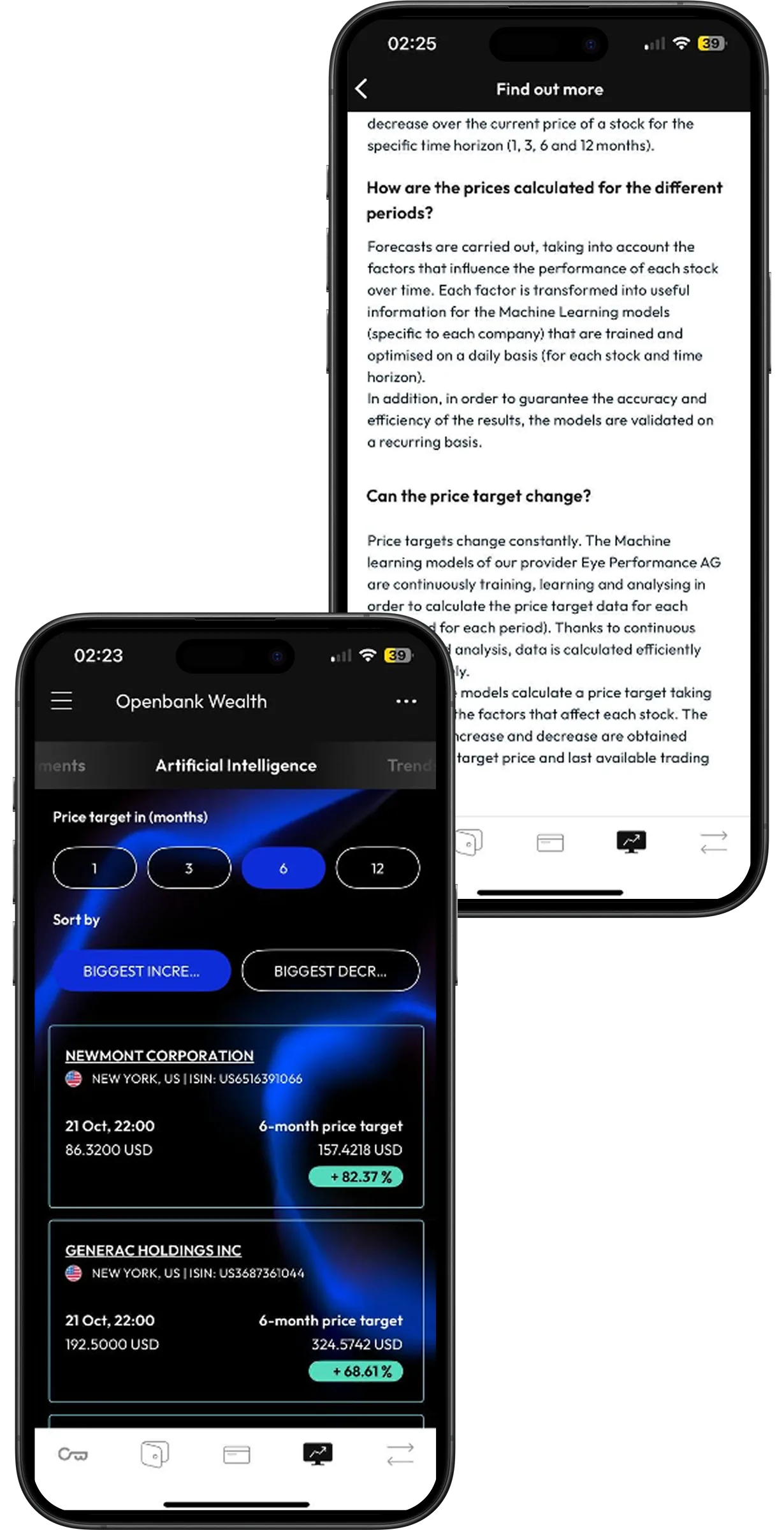
Openbank makes this more accessible through AI-based price forecasts. Users can see expected asset dynamics across several horizons — for example, 1, 3, 6, and 12 months — with potential percentage changes.
This turns complex market expectations into a more readable decision-support layer. The user can quickly understand possible scenarios and compare short-term and longer-term outlooks.
AI in investment UX should not be added as a decorative feature. It is most useful when it simplifies interpretation, explains uncertainty, and helps users compare potential outcomes.
These examples solve different tasks, but they follow the same principle: they reduce the gap between access and confident action.
A good investment app should not only allow users to buy assets. It should help them understand:
In this sense, the next stage of competition in investment UX is not about the number of instruments available. It is about how well the service supports the investor’s thinking process.
European investment services already contain many strong UX solutions, but they are distributed unevenly across the market. One platform may have a strong trade flow, another may offer better portfolio analytics, and a third may solve onboarding or asset discovery more clearly.
For product teams, this means that systematic best-practice analysis can shorten the R&D cycle. Instead of spending months testing isolated ideas, teams can start from proven mechanics, understand where they work, and adapt them to their own audience and business goals.
The full State of Digital Investment in Europe 2025–2026 report by Markswebb provides a broader view of this market: investor profiles, a map of 316 digital investment services, UX benchmark results for 20 major apps, two evaluation systems for savings-oriented and speculative investing, and a curated library of best practices.
Explore the full State of Digital Investment in Europe 2025–2026 results to compare leading European investment services, identify UX gaps in your own product, and find proven solutions for faster roadmap decisions.
We respond to all messages as soon as possible.
We’ve evolved dozens of successful financial services and are eager to prove that our expertise can be implemented in other industries and around the world. Have a look at our success stories!


