
One of the biggest bank onboarding problems today is the conflict between UX and KYC requirements. As a result, up to 60% of users abandon onboarding before completing identity verification.
Bank onboarding UX is one of the most critical and problematic parts of digital banking. Despite high user intent, up to 60% of users abandon account opening flows due to friction, complexity, and poor design.
Contents
Account setup in digital banking has become one of the most paradoxical parts of the user journey. On the one hand, it’s the moment of highest intent — users arrive ready to open an account, share their data, and start using the service. On the other, it’s where the experience most often collapses. The reason isn’t accidental. Across both academic research and industry practice, onboarding is consistently described as a high-friction zone shaped by a fundamental tension: strict security and regulatory requirements versus user expectations of a fast, intuitive, and seamless digital flow.
This tension is not just theoretical — it translates directly into measurable loss. According to research by UserTesting, up to 60% of users abandon the process of opening a digital bank account before completion. That means more than half of highly motivated users — people who have already decided to become customers — drop off during onboarding.
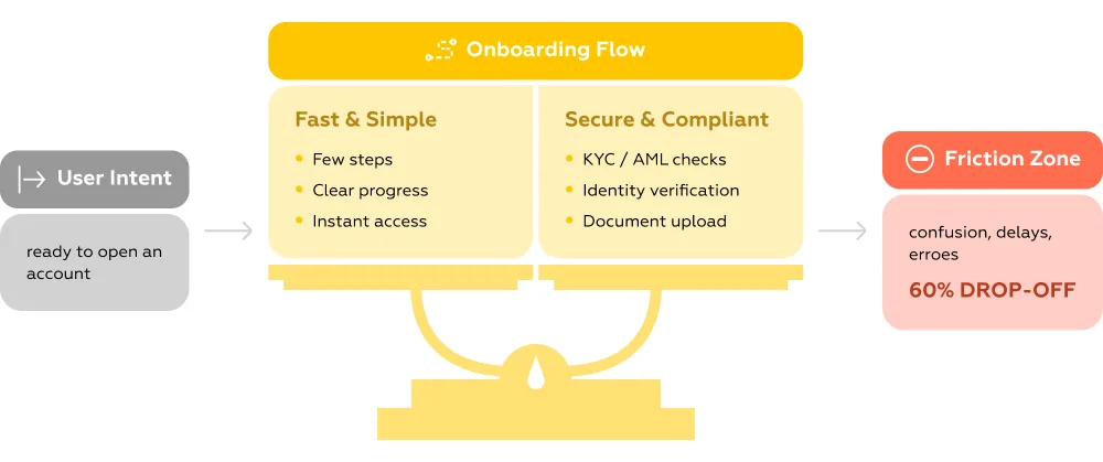
What makes this especially critical is that onboarding is no longer just a technical step. It’s the first real product experience, where users form their perception of the bank’s reliability, clarity, and competence. When flows become overly complex, fragmented, or opaque — often due to KYC (Know Your Customer) requirements — users don’t interpret this as “necessary security.” They interpret it as poor UX.
This creates a classic case of KYC onboarding friction, where regulatory steps interrupt user flow and reduce conversion.
As a result, the onboarding stage becomes a bottleneck where business goals, compliance demands, and user needs collide. Understanding how and why this conflict emerges is the first step toward fixing it — and toward designing bank account UX that doesn’t force users to choose between trust and convenience. These digital banking onboarding problems are not just UX issues — they directly impact conversion, CAC, and activation rates.
The challenges around bank account UX and onboarding are not isolated incidents or local market quirks. They form a consistent, global pattern — confirmed by both academic research, industry benchmarks, and proprietary UX analysis. Across regions and datasets, the same conclusion repeats: account-related scenarios remain one of the most failure-prone parts of the digital banking experience.
Large-scale academic studies provide some of the clearest evidence — not from assumptions, but from real user behavior at scale.
A 2025 study published in The British Accounting Review analyzed over 1 million user reviews (1,015,859) of mobile banking apps in India using LDA topic modeling. Among all identified pain points, account management issues emerged as one of the four key drivers of dissatisfaction.
What stands out is the nature of these issues. Users consistently struggle not with advanced functionality, but with fundamental flows:
The same research highlights login failures and post-update issues as separate categories of frustration — meaning even previously working account flows often break, turning routine actions into blockers.
Another 2025 study indexed in DOAJ reinforces this pattern: 30% of users report obstacles when using banking apps, with the most frequent complaint being difficulty accessing the application. This directly ties onboarding, authentication, and session management to overall UX perception.
Industry benchmarks make the business impact impossible to ignore.
A key insight here is behavioral: users compare bank onboarding not to other banks, but to e-commerce experiences, where speed, clarity, and predictability are standard.
Markswebb’s research across digital banking services in Eastern Europe adds another layer — showing not just that problems exist, but where exactly they concentrate.
The data reveals that registration and login scenarios are the most overloaded with UX issues, significantly outperforming other user journeys in terms of friction.
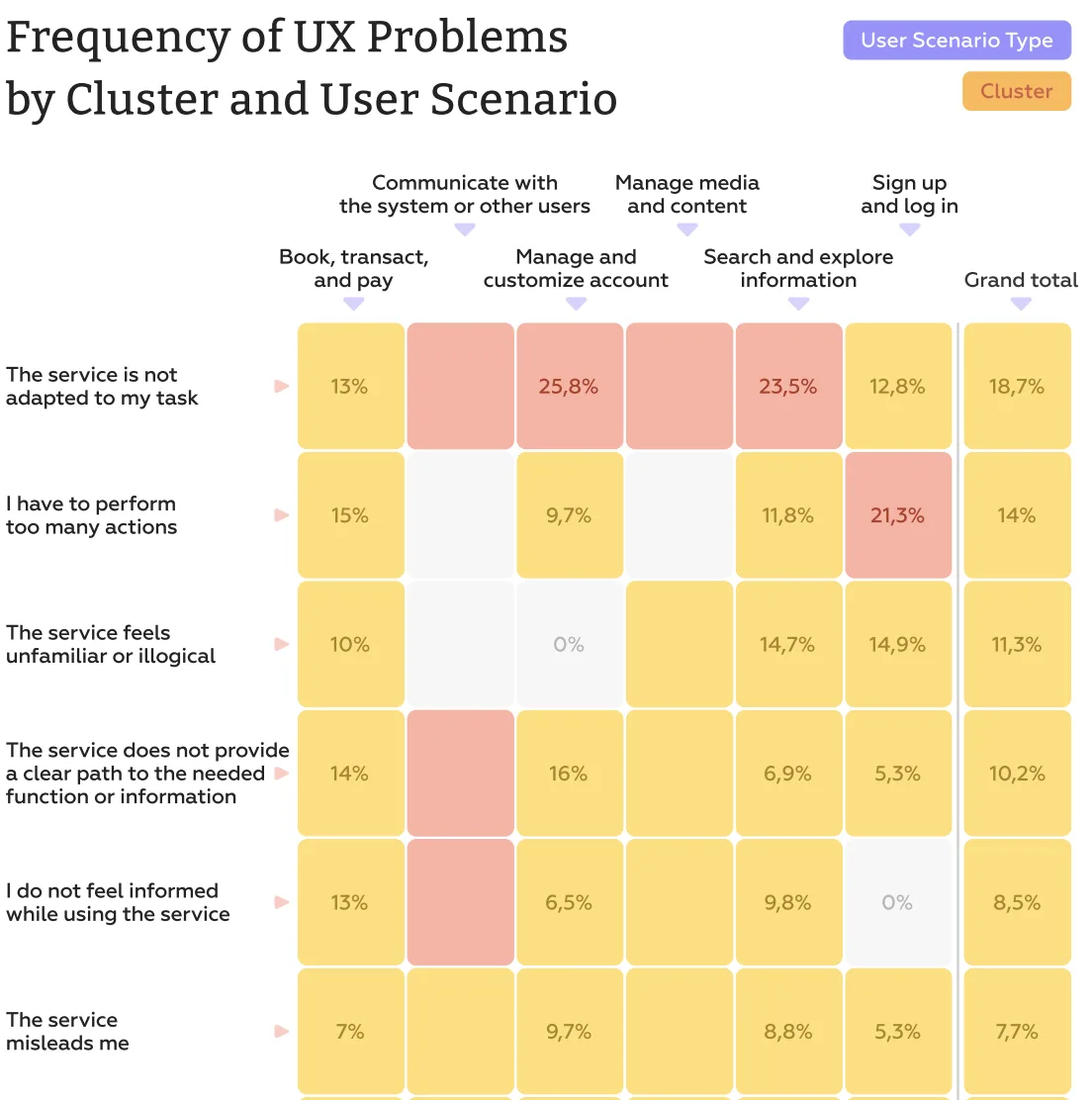
In onboarding-related scenarios, the most frequent issues include:
These are not edge cases — they form a systemic pattern where users lose clarity and control early in the journey.
A more granular view at the UI level makes the problem even more explicit.
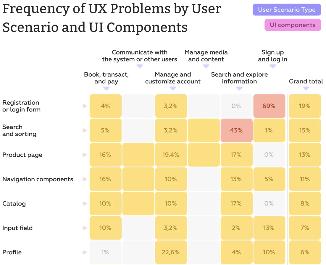
The registration and login forms stand out dramatically, with up to 69% of identified UX issues concentrated in this single component. This makes them the single most problematic interface element across all analyzed scenarios.
Other contributing friction points include:
What makes these findings important is their consistency.
Different countries, different methodologies, different datasets — yet the same pattern:
This is not a matter of “bad design decisions” in individual products. It is a structural issue, where compliance-driven logic overrides user-centered design.
And until this balance is rethought, onboarding will continue to be the point where banks lose the majority of their potential customers — right at the moment they are most ready to convert.
At the core, the issue is not poor execution — it’s a structural conflict. Bank onboarding sits at the intersection of two opposing forces: strict regulatory requirements and user expectations shaped by modern digital products. One side demands thorough verification, risk control, and compliance. The other expects speed, clarity, and minimal effort. The result is a process that tries to satisfy both — and often fails at both.
The strongest source of friction is the trade-off between risk mitigation and experience. To comply with KYC and AML requirements, banks introduce multi-step verification, document uploads, and redundant data entry. From a compliance perspective, this is justified. From a user perspective, it feels excessive and inconsistent. Research shows that many of these measures deliver limited fraud reduction while significantly damaging conversion — for example, requiring ID uploads can dramatically slow down onboarding and increase drop-off rates. In practice, this means banks are often optimizing for edge-case risks at the expense of the majority of legitimate users.
On top of that, onboarding flows are frequently constrained by legacy infrastructure and back-end-first design logic. Instead of being designed as seamless user journeys, they are assembled as a sequence of technical requirements: data fields, validation rules, and system checks. This leads to fragile and unintuitive experiences — forms that reset unexpectedly, unclear input requirements, or rigid formats that don’t accommodate real user contexts. Researchers and industry experts consistently point out that these “small” issues compound, gradually eroding trust at the very first interaction with the product.
Finally, there is a fundamental issue of clarity and perceived progress. Unlike leading digital products, many banking onboarding flows fail to communicate where the user is in the process or how much effort remains. Studies show that when users don’t see a clear path forward — how many steps are left, what the outcome will be — their motivation drops sharply. Combined with technical delays or errors (often caused by high system load and complex integrations), this creates a perfect scenario for abandonment.
In essence, onboarding becomes problematic not because of a single flaw, but because multiple constraints — regulatory, technical, and experiential — are addressed in isolation. Without a unified UX strategy, they accumulate into one thing the user immediately feels: friction.
Understanding that onboarding and account flows are high-friction zones is one thing — seeing exactly how that friction manifests is another. Here are three concrete examples from the Markswebb UX Problems Guide that illustrate how small UX gaps can block critical user actions and erode trust. Each case highlights the mismatch between what users need and what digital banking apps deliver.
What the problem looks like: In the DEGIRO app, a user explores a bond asset card to check future coupon payments, only to find no dedicated section showing dates, amounts, or payment history.
Why it’s a problem: Coupon income is the primary reason investors buy bonds. By omitting this information, the app fails to provide core value, leaving the user without answers to essential questions: “When and how much will I be paid?”
Impact on the user: Users are unable to make informed decisions, undermining the platform’s reliability and utility. The absence of this critical data creates doubt and dissatisfaction right at the point where trust should be reinforced.
What the problem looks like: When making an intra-bank transfer with ADCB, the beneficiary form asks for the recipient’s address — a detail users often don’t have immediately available.
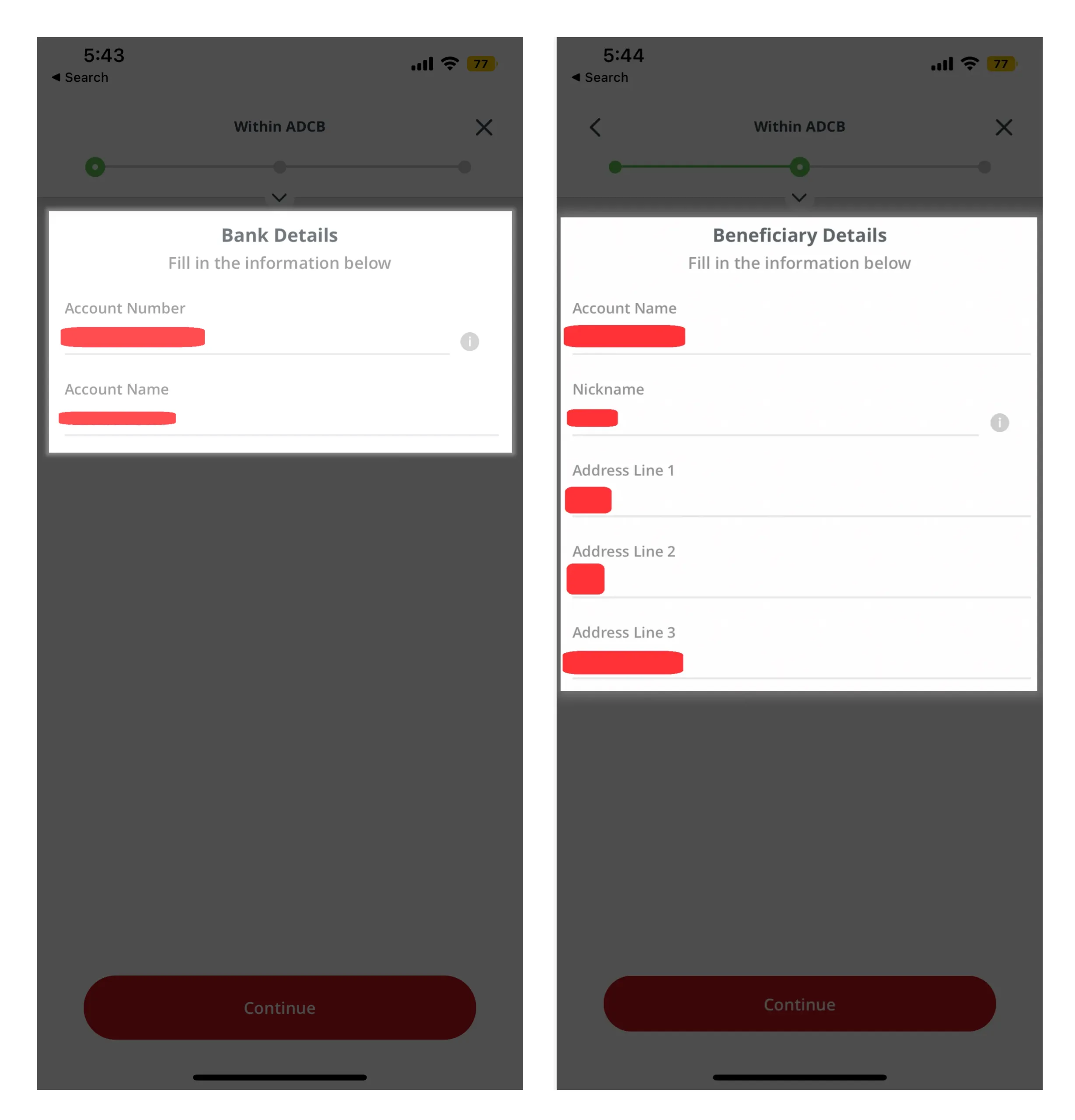
Why it’s a problem: The app assumes access to data that may be unavailable, introducing a hard blocker in a high-priority scenario.
Impact on the user: This creates stress and urgency: users may miss payment deadlines (e.g., rent or bills), risk financial consequences, or need to contact the recipient urgently. The friction here isn’t minor; it directly affects user confidence and the perception of the bank’s reliability.
What the problem looks like: After logging in successfully with a PIN in the BT mobile app, a user attempts to view and pay bills. The system unexpectedly asks for full login credentials again before granting access to the bills section.
Why it’s a problem: The repeated verification feels unnecessary and disruptive, interrupting the flow and breaking the sense of progress.
Impact on the user: Users experience frustration and confusion, making a simple task feel overly complicated. This can lead to task abandonment and reinforces the perception that banking apps are cumbersome and time-consuming, even when users have already proven their identity.
These examples show that friction in digital banking often comes not from complex functionality, but from missing information, unnecessary demands, and opaque flows. Each small UX gap compounds the overall friction, turning motivated users into drop-offs and eroding trust in services that should feel secure, predictable, and effortless.
Solving onboarding friction isn’t as simple as adding a new feature or redesigning a single screen. The persistence of these issues across banks globally shows that any change must be carefully balanced: it should improve user experience without compromising security, adding complexity elsewhere, or creating hidden blockers.
Based on real-world successes, three best practices illustrate how banks can reduce friction while maintaining trust and compliance.
Practice: The Octopus app allows users to view and pay internet bills without requiring login credentials for this section. Once a user is recognized via a PIN or initial authentication, the bills area is immediately accessible.
Why it works: By eliminating redundant verification, the app reduces cognitive load and speeds up task completion. Users can perform high-priority actions quickly without compromising overall account security.
Result: Immediate access to recurring financial tasks builds confidence in the app, reduces frustration, and lowers drop-off rates during critical interactions.
Practice: When adding a new beneficiary for an intra-bank transfer, Al Hilal Bank allows users to add recipients using just a mobile number directly within the transfer form. If users prefer, they can still add a beneficiary using an account number — but only one piece of information is required to proceed.
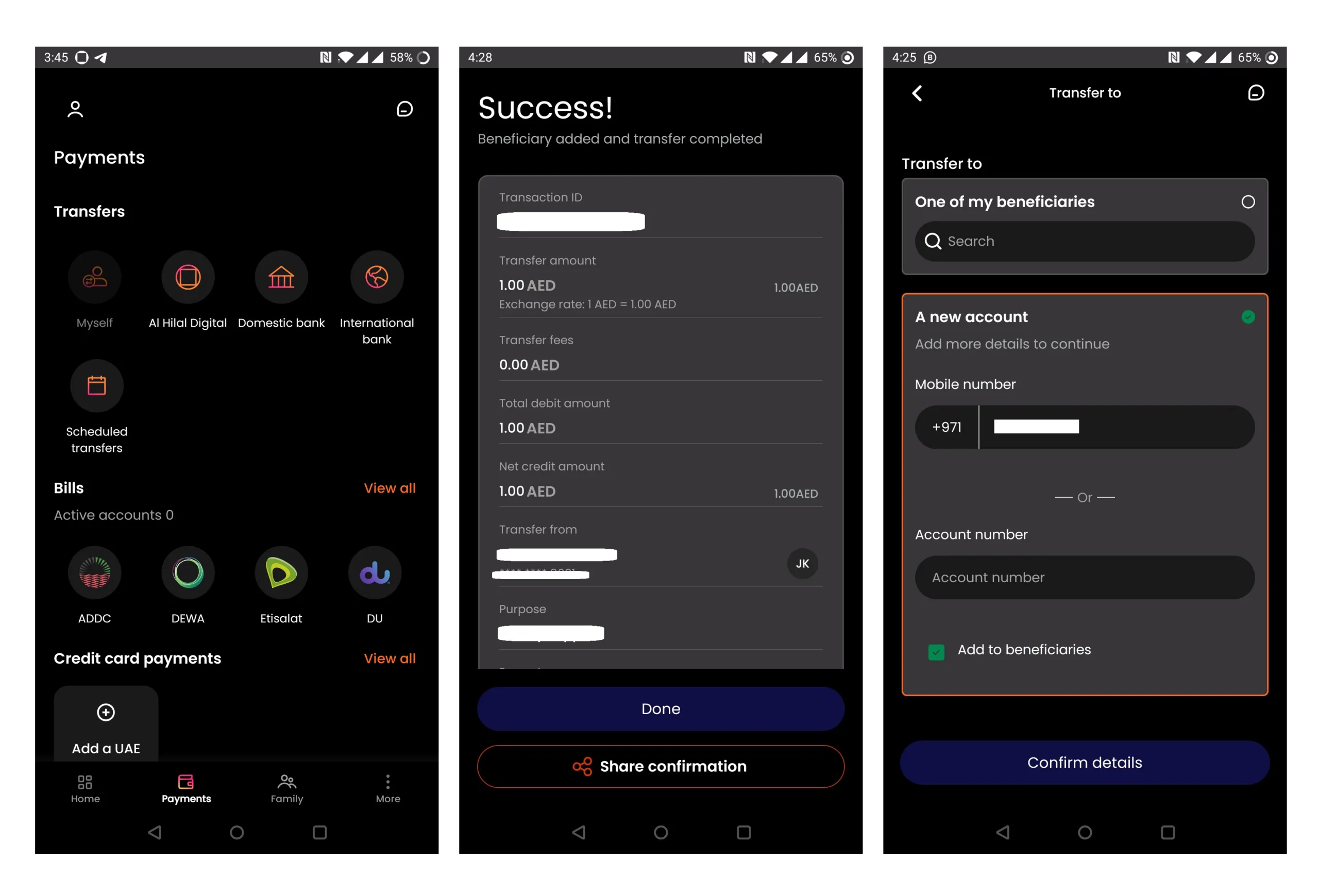
Why it works: This approach removes unnecessary barriers where users may not have complete information. Embedding the functionality within the task itself avoids extra navigation or separate setup flows.
Result: Transfers become fast, smooth, and low-stress, even in urgent scenarios. Users can complete transactions confidently without compromising compliance, as identity is verified with minimal yet sufficient credentials.
Practice: FREEDOM24 enhances the bond asset card by including a dedicated “Info” section with all coupon details: Accrued Coupon Interest (ACI), coupon rate, expiration period, next coupon date, and countdown to payment.

Why it works: Users can immediately see critical financial information without searching or navigating multiple screens. This transparency supports decision-making while maintaining full regulatory compliance.
Result: Investors gain clarity and control, which strengthens trust and perceived reliability. The app delivers core value while preventing confusion or misinterpretation.
Key takeaway: Effective onboarding UX isn’t about shortcuts or removing security — it’s about intelligently reducing friction, anticipating user needs, and presenting critical information clearly. Banks that adopt these practices can improve completion rates, enhance user satisfaction, and maintain compliance, all at the very first point of interaction. Solving bank onboarding problems requires rethinking how KYC is integrated into the user journey — not as a compliance barrier, but as part of the experience.
At Markswebb, we’ve helped clients rethink onboarding and complex account flows by combining deep UX research with a structured evaluation framework. One recent case involved a mid-sized digital bank struggling with high drop-off rates during account setup. Users were abandoning registration due to multi-step forms, redundant verifications, and unclear progress indicators.
Our approach included:
The result: a streamlined onboarding flow that reduced unnecessary steps, clarified progress, and presented critical information upfront — all without compromising security or regulatory requirements. Post-launch, the client saw measurable improvement in conversion rates and user satisfaction.
At Markswebb, we don’t offer one-size-fits-all fixes. Every bank, every product, and every flow has unique constraints and user needs. If you’re facing challenges in onboarding or account management, we can analyze your flows, benchmark them against industry best practices, and craft solutions tailored to your users, stakeholders, and regulatory requirements.
If you want to evaluate your bank onboarding UX, identify friction points, and benchmark against competitors — get in touch with our team via WhatsApp or email to discuss your case.
Why do users abandon onboarding in banking?
Users abandon onboarding due to complex flows, excessive data requirements, and high KYC friction.
What is KYC onboarding friction?
KYC onboarding friction refers to interruptions in the onboarding flow caused by identity verification and compliance steps.
How to reduce onboarding abandonment in banking?
Simplifying flows, reducing steps, and integrating KYC more seamlessly into UX helps improve completion rates.
We respond to all messages as soon as possible.
We’ve evolved dozens of successful financial services and are eager to prove that our expertise can be implemented in other industries and around the world. Have a look at our success stories!