
Financial education is a widely promised benefit in many digital banking and fintech products. It is positioned as a tool to help users understand their finances, manage money better, or make smarter investment decisions. In practice, however, it often falls short. Users may read articles, watch short videos, or complete tutorials, but these actions rarely translate into meaningful changes in behavior or improved financial outcomes. People leave the content with knowledge, yet struggle to apply it when making real financial decisions.
The root of the problem is not the quantity or quality of the content itself — many products already have extensive libraries of educational materials — but the way this education is delivered. In most cases, it exists as a separate section, a “learning hub” or blog, entirely detached from the user’s current tasks. It is treated as an optional resource, a nice-to-have feature, rather than a strategic tool that actively supports decision-making.
The most effective financial education is not a passive repository of information. Instead, it acts as a guided path to action. When education is embedded within the user journey, tailored to context, and designed to support real decisions, it becomes a powerful driver of activation. Users not only gain knowledge but are encouraged to apply it immediately — turning understanding into measurable outcomes such as completing transactions, saving regularly, or making informed investment choices.
In essence, the challenge for fintech and banking products is to move financial education from theory to practice, transforming it from a background resource into a core component of the product experience that actively guides users toward better financial behavior.
In our research across multiple financial products, we consistently observe that financial education is treated as a separate, optional feature. Users can access it, but in most cases, they do not, and when they do, it rarely impacts their actual financial decisions. From our analysis, several patterns emerge that explain why education often fails to produce meaningful outcomes:
Most financial education content relies on the user to take initiative. Long-form articles, tutorials, or videos are made available, but users must actively seek them out. In reality, financial decisions are often made in moments of uncertainty, stress, or time pressure — not when users are curious or motivated to learn. For example, a person deciding which savings plan to choose is unlikely to read a 10-minute guide before making a choice. By providing content only as optional reading, products miss the opportunity to offer active, timely support when it matters most.
Educational content is usually designed for a broad audience. It explains general concepts like budgeting, saving, investing, or managing debt, without connecting these lessons to the user’s personal financial situation. For example, a tutorial on investment principles may not differentiate between a first-time investor and someone with a diversified portfolio. Without context, the content feels abstract, and users struggle to see its relevance. As a result, interest wanes quickly, and the content fails to influence real decisions.
Many products focus on explaining concepts rather than helping users act. Users may leave a lesson understanding the theory, but they are still uncertain about what to do next. For instance, explaining the difference between fixed and variable interest loans is useful knowledge, but without guidance on which option suits the user’s personal finances, the lesson remains theoretical. Users need practical decision support — tools or recommendations that help them choose the right path, not just understand it.
Education is typically siloed in a dedicated section of the app or website. Users must leave their current task, such as transferring money or opening an account, to access learning materials. This separation introduces friction and reduces the likelihood that knowledge will be applied immediately. For example, a user might read an article about retirement planning, but once they return to the main app, the insight is disconnected from the action they intended to take. Seamless integration is critical for turning learning into behavior.
Users are often skeptical of educational content because it can feel like marketing or generic guidance. Without transparency, users question the relevance and reliability of advice. They want to understand why a recommendation is made and what assumptions underlie it. For example, suggesting a high-yield savings account without explaining interest rates, fees, or risk factors leaves users doubtful. Lack of clarity prevents action and diminishes the value of education.
Even when users engage with educational content, they often encounter a dead end. There is no clear next step, no call-to-action, and no guidance on applying what they have learned. A blog post explaining investment strategies is informative, but if it does not include a way to create an investment plan or start a portfolio, the insight remains abstract. Without a practical pathway, education fails to activate users, limiting both engagement and product adoption.
Financial education only becomes truly valuable when it helps users make decisions and take action. Based on our research, the most effective UX patterns focus on context, simplicity, and activation. When embedded in the user journey, these practices transform passive knowledge into real behavior.
Education works best when delivered exactly at the moment it is needed, not in a separate section or library. Instead of long lessons, micro-learning provides short, bite-sized explanations that fit directly into the user’s flow. These small interventions reduce cognitive load and allow users to apply knowledge immediately.
Examples of micro-learning patterns:
Why it works: Users don’t have to switch context, and the content is immediately actionable. Learning becomes integrated with the task, not an abstract exercise. Micro-learning reduces hesitation and helps users make informed decisions without leaving the flow.
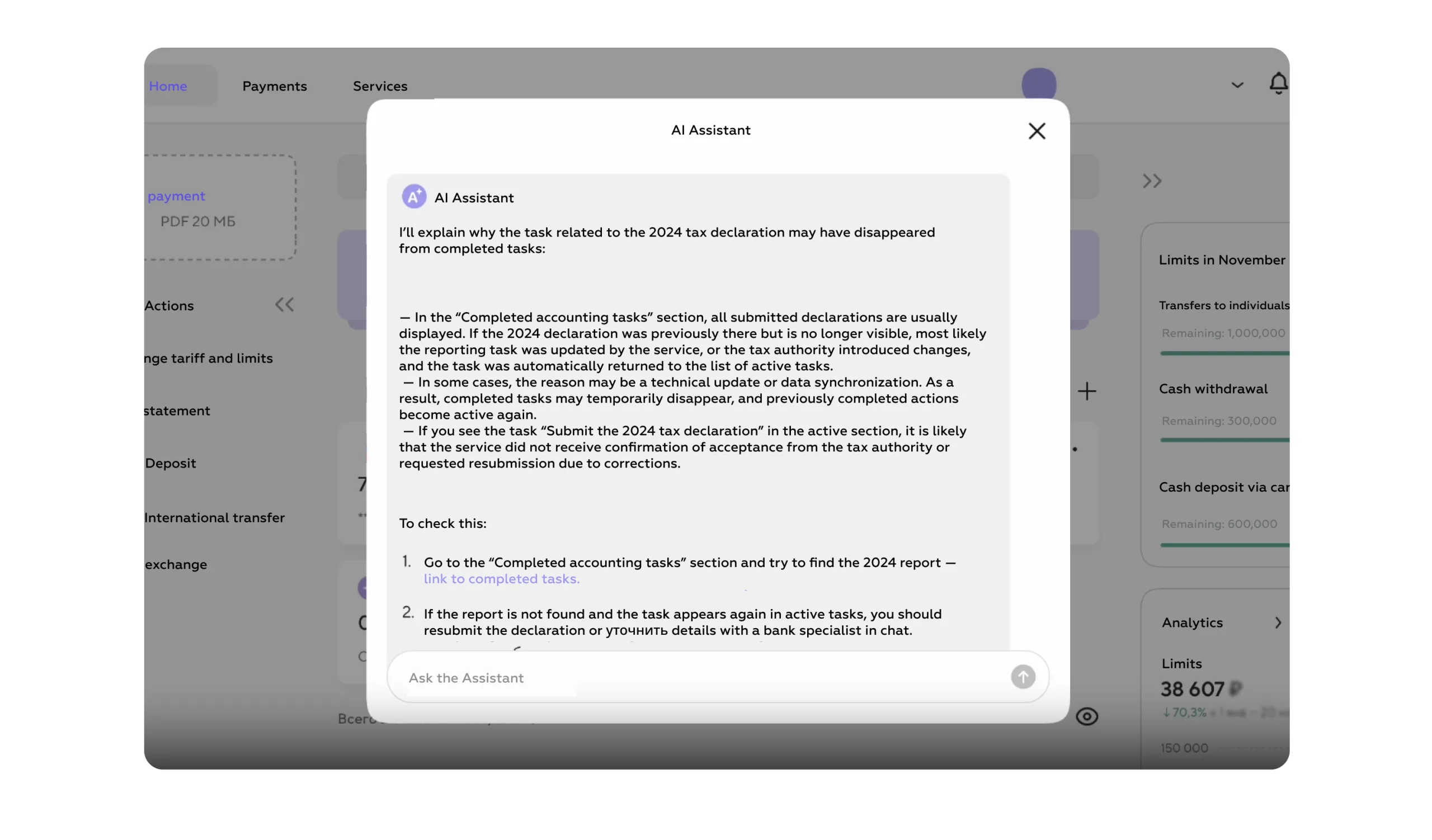
Users don’t just need knowledge—they need help choosing the right option. Education is most effective when it acts as a decision support system rather than a lecture. By guiding users through choices, it transforms understanding into immediate action.
Examples of decision-based patterns:
Why it works: Decision-based education reduces uncertainty and overload. Users are empowered to act because the system translates abstract knowledge into clear, personalized recommendations.
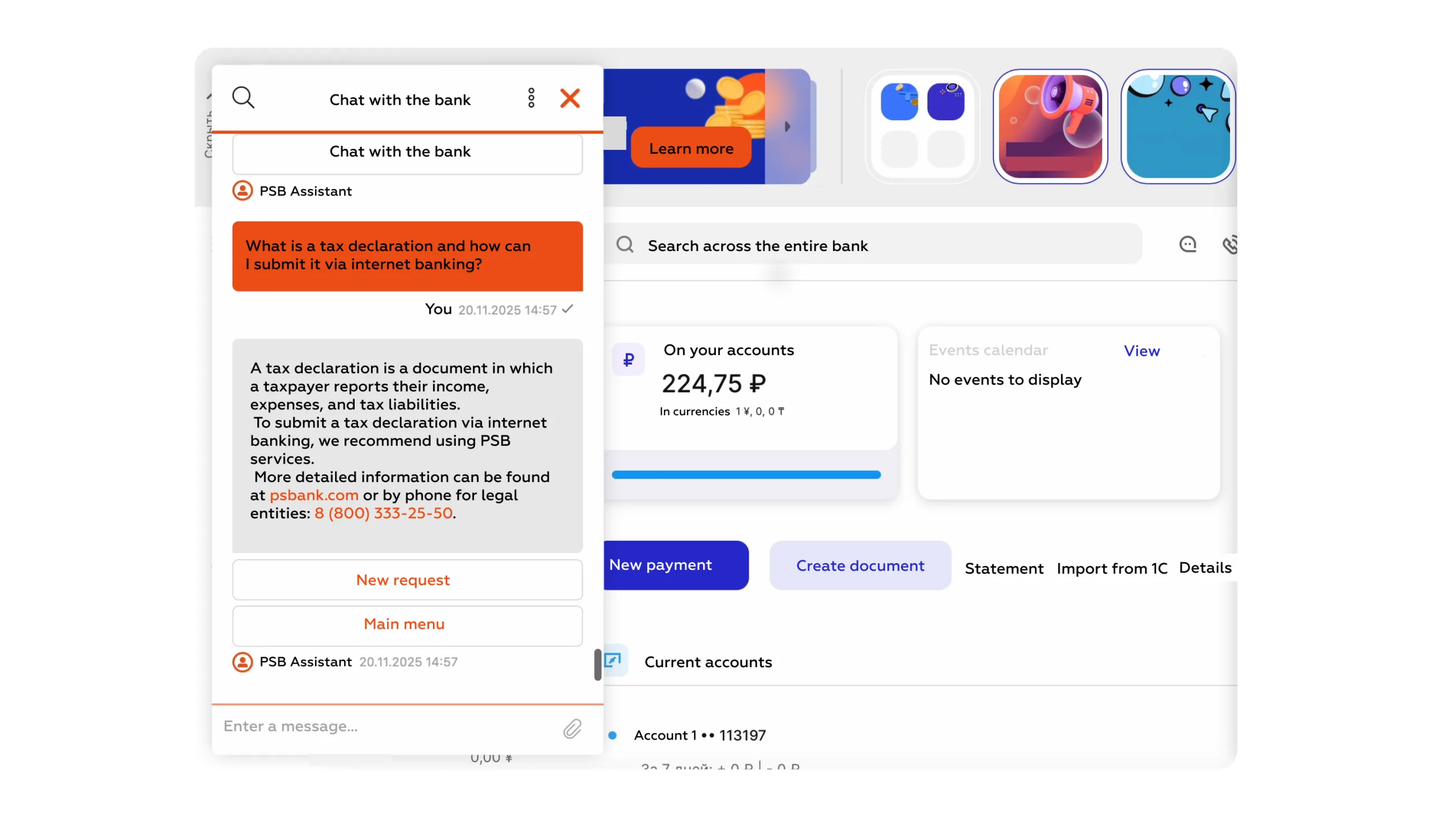
Active learning drives engagement. Users retain knowledge and gain confidence when they interact with tools rather than passively reading or watching. Interactive elements turn theory into practice and allow users to see the impact of their choices in real time.
Examples of interactive patterns:
Why it works: Interactivity builds understanding and confidence. Users feel in control, experiment safely, and are more likely to take action because they can visualize consequences before committing.
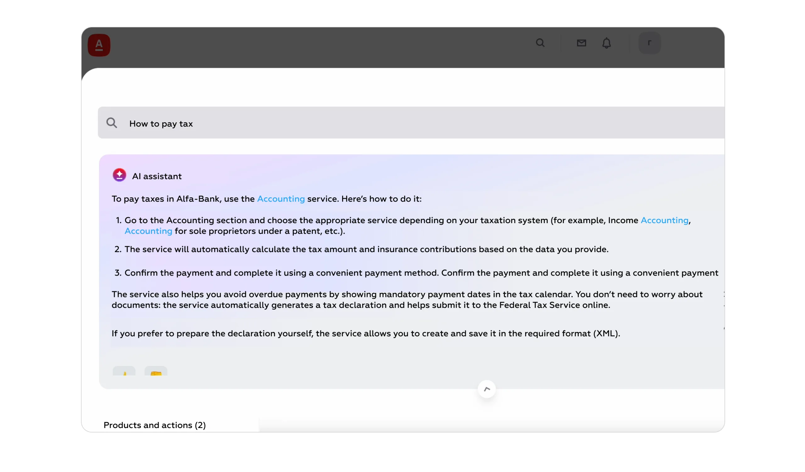
Users trust recommendations when the underlying logic is clear and transparent. Explaining assumptions and reasoning turns generic advice into credible guidance, increasing the likelihood of action.
Examples of transparent reasoning patterns:
Why it works: Transparency builds trust and reduces hesitation. When users understand the rationale behind a recommendation, they are more confident in acting, leading to higher engagement and better decisions.
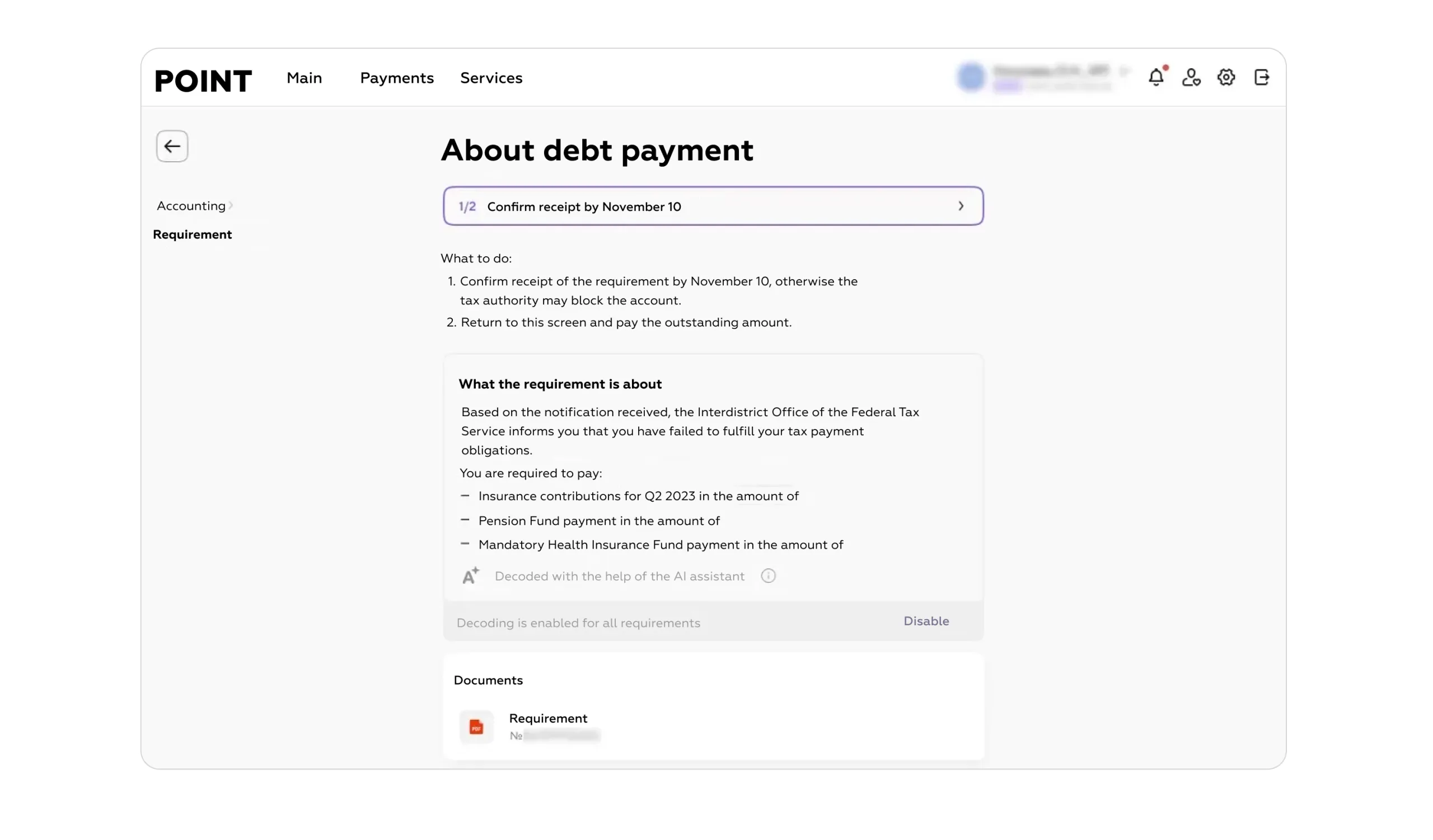
Education is more motivating when structured as a path with progress indicators and achievements. Users are more likely to stay engaged when they can track their learning, complete steps, and celebrate milestones.
Examples of progressive education patterns:
Why it works: Progress visualization encourages continued engagement. Users see tangible achievements, reinforcing learning and creating habits that translate into long-term behavior change.
Financial education should not be a side feature—it should be integrated into the core product experience. When education is part of the primary flows, it reduces friction, builds confidence, and directly improves adoption and retention.
Examples of integration patterns:
Why it works: Embedding education transforms it into a functional advantage. Users perceive it as part of the product’s value, not an optional resource, which increases engagement, trust, and adoption.
Turning financial education into an actionable UX tool requires a structured, step-by-step approach. The goal is to move education from a passive resource into a strategic mechanism that drives real behavior and product activation. Here’s how teams can implement it effectively:
The first step is to identify where users make financial decisions, hesitate, or abandon flows. These moments represent the highest value opportunities for embedding education. By focusing on decision points, products can deliver guidance when it is most needed, increasing the chances of action.
Example: A user is about to open a savings account but hesitates between multiple plans. This is the perfect moment to provide contextual advice, highlighting benefits, risks, and which option aligns with the user’s goals.
Why it works: Mapping decision moments ensures that educational content is timely and relevant, rather than generic or disconnected from the user’s needs.
Next, determine what actions, behaviors, or conditions will trigger educational content. Triggers ensure that learning is proactive and delivered at the right moment, without overwhelming or interrupting the user unnecessarily.
Example:
Why it works: Triggers deliver education just-in-time, making it actionable rather than theoretical, and reducing decision fatigue.
Instead of long articles or videos, create short, focused educational interactions that fit seamlessly into the user journey. The goal is to provide guidance that can be absorbed in seconds and immediately applied.
Example:
Why it works: Micro-interactions reduce cognitive load, keep users engaged, and make learning part of the task, not a separate activity.
Every educational element should end with a clear next step. Users need guidance on how to apply what they’ve learned to make real financial decisions.
Example:
Why it works: Calls-to-action bridge learning and behavior. Users move from understanding to action, turning education into measurable outcomes.
Finally, track the impact of educational UX on user behavior and continuously refine the approach. Both quantitative and qualitative metrics are essential for understanding what works and what needs adjustment.
Key metrics:
Iteration:
Why it works: Continuous measurement ensures that education evolves alongside user needs and behaviors, maximizing its effectiveness as a driver of activation.
When financial education is designed as a UX tool for activation, it produces tangible business outcomes. The value is not in users knowing more — it is in users doing more, making better decisions, and staying engaged. Embedding education into the product flow transforms it from a passive resource into a driver of growth, adoption, and loyalty.
Education reduces uncertainty and builds confidence. When users understand what a product does, why it suits them, and how to use it effectively, they are more likely to complete onboarding and finalize transactions.
Example: A user considering a high-yield savings account sees a brief, contextual explanation of interest rates, expected returns, and benefits during account setup. Feeling informed, they are more likely to proceed and fund the account immediately.
Business impact: Increased conversion improves acquisition efficiency and directly affects revenue generation, as more users successfully complete key actions
Users are more likely to engage with new features when they understand their purpose and benefits. Education embedded in the flow ensures that features do not remain unused.
Example: Interactive tutorials for a budgeting tool within the banking app guide users to categorize transactions and set goals. Users complete the tutorial and continue using the feature, turning it into an integral part of their financial management.
Business impact: Higher adoption rates drive feature utilization, reduce churn, and strengthen the overall value of the product.
Contextual education reduces the number of basic questions and complaints. When users receive guidance at the moment of decision, they are less likely to contact customer support.
Example: A loan calculator embedded in the application explains repayment schedules, interest, and fees. Users can make informed choices without needing to call support.
Business impact: Lower support demand reduces operational costs and allows support teams to focus on complex inquiries, improving efficiency.
Transparent, personalized education improves user trust. When users feel that the product understands their situation and supports their goals, they are more likely to develop long-term loyalty.
Example: A “Why this is recommended” note explains investment suggestions based on a user’s risk profile. Users perceive the advice as credible and feel supported in their decisions.
Business impact: Higher trust strengthens retention and promotes long-term engagement, leading to increased lifetime value of customers.
When education leads to action, users make smarter financial decisions. They save more, invest wisely, manage debt better, and develop sustainable financial habits.
Example: A progressive education flow encourages users to set up a savings plan, automate contributions, and track progress. Users achieve their goals faster and with more confidence.
Business impact: Users who succeed financially are more satisfied, loyal, and likely to explore additional products, creating a mutually beneficial relationship between the user and the product.
By designing financial education as an embedded, actionable UX tool, products move beyond providing information and start shaping behavior, improving financial literacy, and delivering measurable business value.
Financial education only delivers value when it drives real action, not just knowledge. Simply providing articles, videos, or tutorials is insufficient; users need guidance that is embedded in their journey, directly tied to decisions, and designed for immediate application.
When education is separated from the core product, it remains passive — users may never engage with it, and even if they do, it rarely leads to behavioral change. The most effective UX approaches transform learning into action through a combination of:
In other words, the goal of financial education is not to teach — it is to activate. When implemented effectively, it reduces uncertainty, builds confidence, and motivates users to make smarter financial decisions. For fintech and banking products, this means higher conversion, improved adoption, reduced support load, stronger trust, and ultimately better financial outcomes for users.
The strongest products view education as a strategic mechanism, seamlessly guiding users from insight to action, and turning knowledge into measurable business value.
Contact us via WhatsApp, send an email, or fill out the form below to learn more.
We respond to all messages as soon as possible.
We’ve evolved dozens of successful financial services and are eager to prove that our expertise can be implemented in other industries and around the world. Have a look at our success stories!