
Innovation often begins with bold hypotheses, but not every idea turns into a successful product. Some ideas never reach implementation, while others enter the market too early — long before users are ready to adopt them. To avoid this, it is critical to test the viability and usability of solutions before development begins, especially when the goal is to create a differentiated, future-ready digital experience.
In this case study we worked with a mobile-app project aimed at an international market. The client team developed two concepts: a conventional one based on a traditional interface structure, and an innovative one built entirely around a single search field — with no menus or tabs. In essence, the task was to rethink the entire navigation model of the app. The central challenge was to evaluate this innovation before writing any production code.
The research timeline spanned one and a half months — from preparation to final recommendations. The objective was to determine which concept solves user tasks more effectively while also providing strategic competitive advantage in global markets. This work builds on our broader expertise in evaluating international digital products — including insights from the EU Digital Investment Map, where we analyse how leading European investment apps implement new interaction patterns, ad
Contents
At first glance, one might assume that choosing between concepts can be done purely with quantitative methods — for example, A/B-tests or online surveys. But when it comes to a fundamentally new idea, such methods can deliver distorted outcomes. Users often assess interfaces by what they’re used to and may not be able to imagine how they would use something they’ve never seen before.
Moderated usability testing is a method that allows us to observe real user behaviour and to clarify their responses right away. This format helps to not only collect statistics, but obtain deep feedback, understand the reasons for difficulties, emotional reactions and thought processes. The researcher sees where the user gets lost, what causes frustration, and what evokes trust and satisfaction. Even with a small sample — 10-15 respondents — behavioural patterns appear quickly and qualitative comments provide context.
We treat usability testing as a tool for comprehensive analysis, enabling us to obtain a variety of insights.
To validate the hypothesis, you don’t need a finished product. A prototype — even partially clickable or static — is sufficient.
This approach saves resources and allows you to quickly answer key questions: Is the logic of the interface clear to users? Can they complete their tasks? Where do barriers arise and what causes confusion?
Testing hypotheses on prototypes is very resource-efficient:
During usability tests, the researcher always works with two layers of data: user behaviour and user comments/words. People may say everything is clear, yet take a long time to find the right button. Or conversely — they may criticise the interface but complete the scenarios successfully. This is the paradox of usability: there is often a gap between what people say and what they do. The moderator’s task is to identify these contradictions and understand the reasons behind them. These observations allow the researcher not only to assess the interface’s convenience, but also the cognitive mechanisms behind user behaviour — how a user learns something new and what habits hinder that process.
In our case users generally preferred the familiar over the new — not because the new was worse, just because it required learning and time to figure out.
Key moment — during the test, when we still can talk directly with the user:
Once testing is complete, it’s important not to rush to conclusions. We analyse data in three stages:
If the user is dissatisfied but still successfully completes the task, the cause might be unfamiliarity rather than an interface bug. If dissatisfaction is accompanied by long task time or unsuccessful scenarios — then we are dealing with a real UX-problem. This multi-layer analysis helps separate emotions from actual obstacles and better understand exactly what the barrier is.
In our research the result turned out to be ambiguous, at first glance: both concepts showed almost equal effectiveness. Metrics, task completion time and overall satisfaction were nearly identical. At the same time, half of the participants preferred the familiar version—for clarity and alignment with expectations—and the other half preferred the innovative one, citing speed and universality.
It may seem like the research didn’t resolve anything. But in fact, this is very telling. If the innovative concept shows up not worse than the familiar one — that’s already a success. Users managed to complete the tasks, even though they had no experience interacting with such an interface. Which means that after a short learning period, effectiveness will most likely increase. In such cases the innovative solution has greater scaling potential and can become a strategic competitive advantage.
One of the strongest signals that innovation has real value is that, over time, it stops looking like “innovation” — and becomes a foundation for entire ecosystems.
When WeChat introduced Mini Programs in 2016, it looked like an unusual experiment: a single entry point that allowed users to search and launch lightweight services without installing apps. Today, this architecture powers massive ecosystems across different markets.
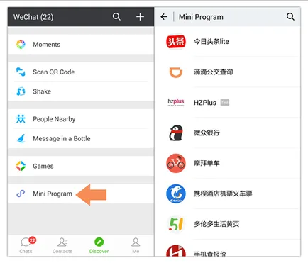
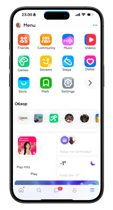
Modern superapps — such as large platform apps in Eastern Europe (e.g., city services, e-commerce aggregators, lifestyle ecosystems) — borrow the same principle:
This demonstrates a clear pattern: an interface that initially feels unfamiliar or even “too innovative” can later become a market standard that reshapes user expectations.
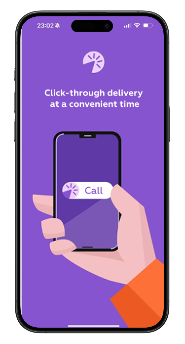
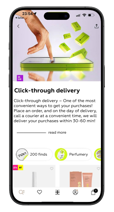
Another example of innovation that once seemed niche is on-demand, click-to-deliver logistics. Early versions were perceived as situational convenience, not a mainstream scenario. Today, the model is adopted by major platforms — large marketplaces, same-day delivery retailers and specialised beauty/lifestyle players.
Users now expect:
What started as an experiment in convenience has turned into a baseline expectation across the market.
These cases highlight an important insight: innovations gain traction when they address a real behaviour pattern and reduce friction. But to reach this point, the product must guide the user through unfamiliar territory.
Even the most promising ideas fail when users don’t understand how to interact with them. Innovation rarely collapses because the idea is weak; in most cases it fails because the transition was not designed. Users face uncertainty, can’t find familiar actions, or don’t understand how the new model improves their experience. As a result, they revert to old habits or abandon the service entirely.
For innovation to work, teams must create the right conditions that help users adapt gradually and confidently. This applies equally to search-based navigation models, redesigned home screens, predictive interfaces, or scenario-driven user journeys.
Across our practice and observations of global products, four elements consistently determine whether an innovative solution succeeds or fails.
When a product introduces a fundamentally new interaction model, onboarding cannot be superficial. A single card with “Here’s what’s new” is not enough: unfamiliar interaction requires a structured explanation of what changed, why it changed, and how to use it effectively.
Guidance works if it:
reduces the cognitive load of the first experience,
positions the new model as a logical improvement rather than a disruption,
helps users form new mental models for navigation and tasks.
Practical examples include:
explaining how a redesigned home screen is structured and where familiar actions moved,
showing how to use a new search-centric interface where navigation is fully replaced by a single input point,
walking users through new filtering logic or improved tab structures so they don’t rely on outdated assumptions.
Clear and thoughtful guidance reassures users that the product is still recognisable, nothing “disappeared,” and the new model ultimately simplifies their journey rather than complicating it.
Not all users want to learn everything immediately — especially experienced or highly confident users who prefer self-navigation. Forcing onboarding often leads to frustration and creates the impression that the product is “getting in the way.”
A skip option signals respect for user autonomy. It allows:
experienced users to proceed directly to their tasks,
returning users to avoid repetitive explanations,
teams to maintain a lightweight first launch without overwhelming the user.
This small flexibility significantly reduces friction and helps avoid early negative sentiment toward the innovation.
A common issue in digital products is that onboarding appears only once — at the moment when the user is least ready to absorb new information. People often rush to complete urgent tasks and ignore onboarding entirely, even if they need it later.
Allowing users to revisit guidance at any time dramatically improves adaptation, especially in complex services such as:
financial applications,
investment and trading platforms,
healthcare and insurance apps,
ecosystem apps with many interconnected services.
As users discover new features or encounter unfamiliar UI elements, they should be able to reopen onboarding, walkthroughs or feature explanations on demand. This makes learning gradual and context-driven rather than forced and time-bound.
Contextual help is one of the most effective ways to support users during real interactions — not in an abstract onboarding sequence. Micro-prompts, subtle highlights, and one-time hints bridge the gap between intention and action when users face a new or redesigned element.
Well-designed contextual assistance helps when:
a newly introduced widget explains its function in place and in context,
a redesigned home screen highlights the new location of familiar actions,
important information is revealed gradually instead of being pushed all at once,
the product detects hesitation or repeated errors and offers a targeted hint.
These lightweight mechanisms make innovation feel safe. They minimise the risk of errors, reduce anxiety, and reinforce the sense that the product is guiding — not forcing — the user through change.
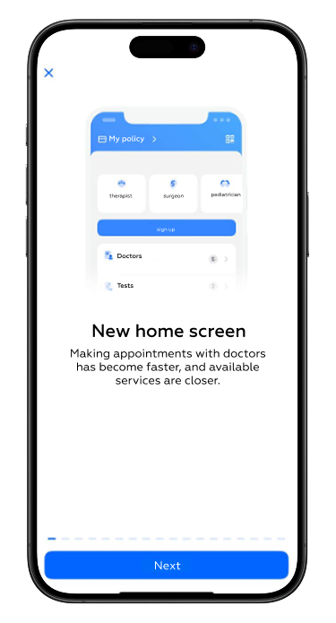
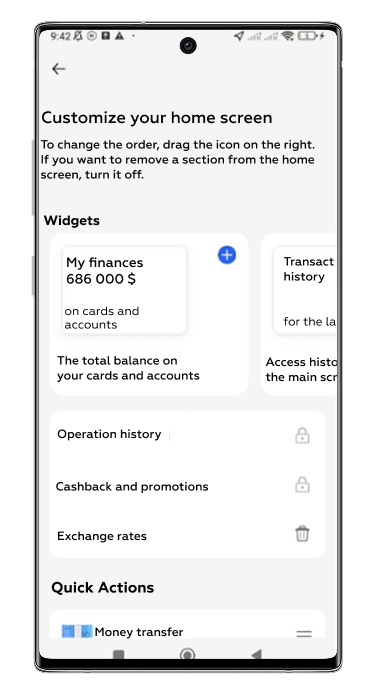
But even if the product is objectively better, users perceive change painfully. Unfamiliarity causes anxiety and resistance. Therefore, it’s important not simply to update the interface, but to accompany the user through the transition — via tool-tips, training, the option to revert to old functionality or temporarily skip changes.
At Markswebb we help evaluate innovations and turn them into working products — minimizing risk.
If you want to systematically apply these insights in your own product, explore our databases or contact us to learn how we can help your team use global UX best practices to accelerate growth.
We respond to all messages as soon as possible.
We’ve evolved dozens of successful financial services and are eager to prove that our expertise can be implemented in other industries and around the world. Have a look at our success stories!


